Our most recent update ships with a new filter option for the DevExpress Blazor TreeView control. As you would expect, this filter option allows you to locate information displayed in tree nodes with ease.
Integrate Filtering into Your Blazor-powered App
To display our Blazor TreeView's filter panel, you must first set the ShowFilterPanel option. Our Blazor TreeView component will display matching nodes (including parent nodes) when your end user enters filter values. You can use the control's FilterString property to specify filter criteria within code. Use the FilterMode property to control filter options. You can limit the display to matching nodes, nodes with parents, or force the control to display the entire tree branch once a filter has been applied.
Filter operations begin with three input symbols. Use the FilterMinLength property to increase or decrease the required symbols.
Custom Filter
You can integrate custom filter logic to better address your business needs. When creating a custom filter, you'll need to implement a Boolean function that defines whether the search string meets a user's filter criteria. The following example shows how your app can search for values separated by a comma:
Our most recent update introduced multi cell selection support to the DevExpress Web Forms and MVC Grid View, Vertical Grid, and Tree List controls. This new feature allows users to select a cell range by hovering the mouse over the control - then copying the range (and pasting it into grid cells, external controls, or Microsoft Excel).
To enable multi cell selection in your DevExpress-powered WebForms or MVC app, set edit mode to Batch and the EnableMultipleCellSelection property to true.
This new feature allows users to select values as they would in Microsoft Excel. Specifically, multi-select allows users to:
Select multiple cells via a pointing device or the keyboard.
Use our built-in context menu and shortcuts (Ctrl+C, Ctrl+V) to copy/paste cell values.
Copy and paste selected cells in the same grid, or in a spreadsheet document.
Copy values and paste them in all selected cells.
Cell Selection API
The following API allows you to integrate cell selection within your WebForms and/or MVC app:
The SelectCell method selects a cell.
The UnselectCell method deselects a cell.
The GetSelectedCells method obtains information about the selected cells.
The CellSelectionChanging event fires when a user selects or deselects a cell.
To explore this feature in greater detail, navigate to the following online demo: Multiple Cell Selection
Your Feedback Matters
Do you find the multi cell selection features useful in your application and helpful for your end users? Which other customization capabilities for the DevExpress ASP.NET Data Grid do you want to see in the future?
As you may already know, the DevExpress Blazor Grid (v22.1) ships with inline row editing support. In this post, I’ll summarize all 3 edit modes and describe how to introduce inline row editing within your Blazor-powered app.
Different Edit Modes
In previous versions of our Blazor Grid, you could select one of the following data edit modes:
EditForm— The Grid displays a standard edit form instead for the target row.
PopuEditForm— The Grid displays an edit form within a pop-up window.
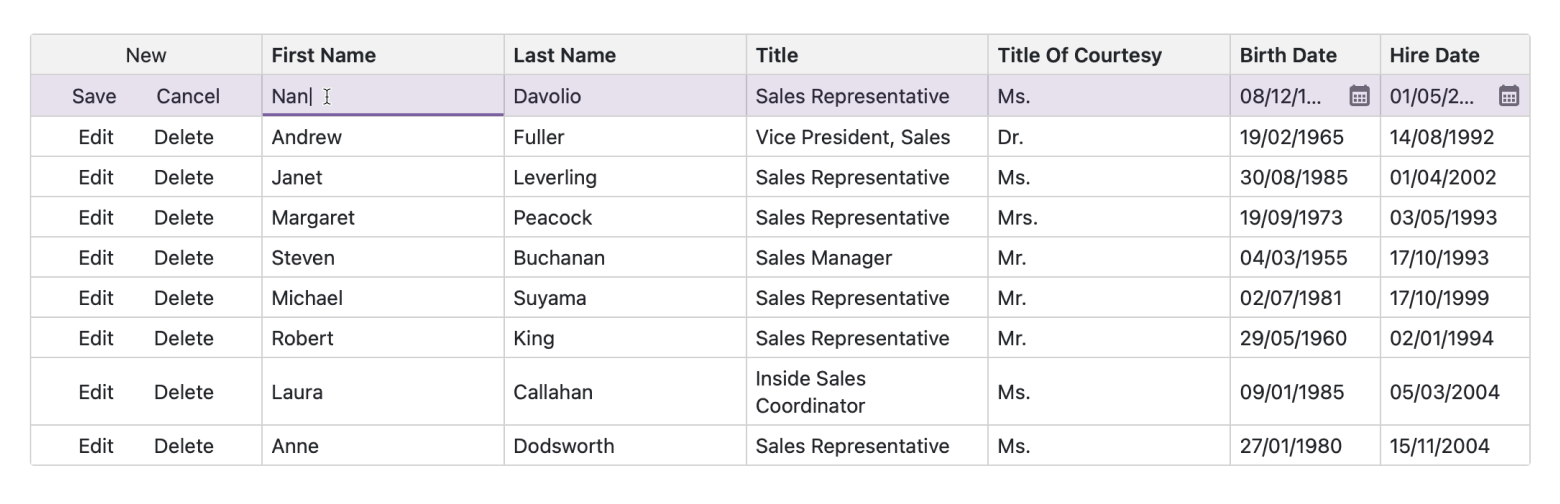
You now have access to one more edit mode option — EditRow. If enabled, once the Edit button is clicked inside a grid row, all row values can be modified dynamically within grid cells. This option allows users to edit data directly within the grid (no need to open an edit form with multiple editors). The benefits of inline data editing include a more compact view. Users can also visually associate edits with specific grid columns.
To activate this new mode, set the EditMode property to EditRow. Once set, you will need to specify the edit template used for row cells in one of two ways:
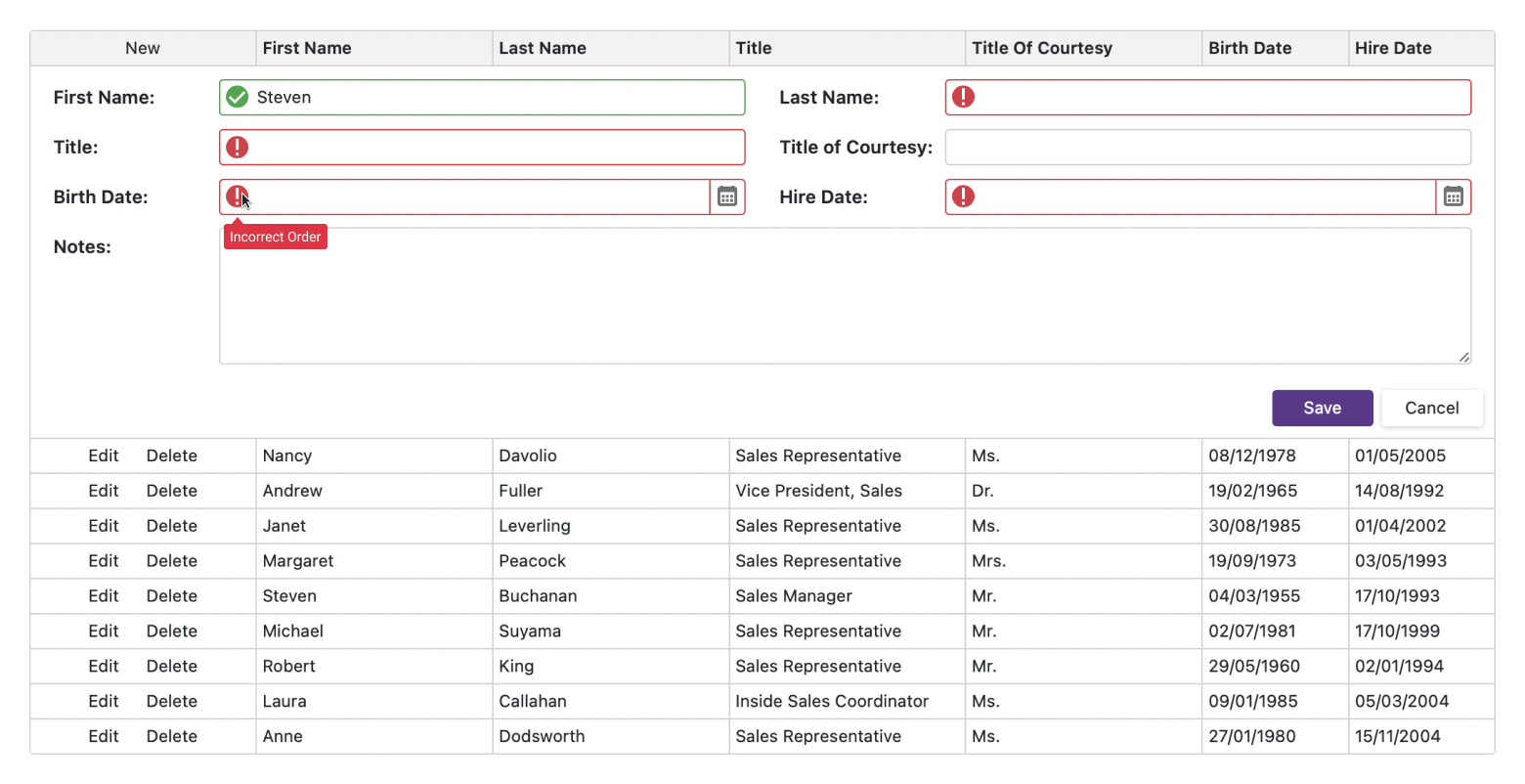
Our Blazor Grid's new EditRow mode supports data validation. The Grid's built-in validation engine is based on DataAnnotationValidator. The Grid verifies input data for fields with data annotation attributes. When a user enters invalid data into a cell and navigates away (or attempts to save the edited row), DataAnnotationValidator marks an editor with an invalid value (using a red outline).
If you wish to display additional information about validation errors, you can obtain the validation message from the EditContext property. For example, the code below displays an error icon with a tooltip next to an invalid editor:
Once you configure data editors for your columns and specified validation error logic, you may wish to reuse your code in other Grids within your Blazor app. Those of you familiar with WPF know that cell templates there can be stored and reused as resources. In Blazor, the best way to reuse the UI is to create components (https://docs.microsoft.com/en-us/dotnet/architecture/blazor-for-web-forms-developers/components).
For Inline Editing, you can create components that implement the following functionality:
Define a common UI for the display of validation errors.
Create a component used as a cell editor by multiple columns of the same type (e.g., a currency editor).
Create a component used as a "fallback cell editor" if no other editor is defined for a column.
In this blog post, I'll summarize new Blazor Grid features we expect to deliver in our next major update (v22.2) this fall. Please feel free to share your feedback via the inline survey questions below.
The information contained within this blog post details our current/projected development plans. Please note that this information is being shared for INFORMATIONAL PURPOSES ONLY and does not represent a binding commitment on the part of Developer Express Inc. This blog post and the features/products listed within it are subject to change. You should not rely or use this information to help make a purchase decision about Developer Express Inc products.
Export to Excel
Data export is a frequently requested Blazor Grid feature. We expect to add data aware export functionality in our next major release (export to XLS, XLSX, and CSV file formats). Exported documents will retain the following grid data shaping features:
Data Grouping — allows end users to collapse/expand groups within a worksheet.
Data Sorting and Filtering — allows end users to display relevant data in a desired order.
Total and Group Summaries — allows end users to modify/change formulas.
You can take a look at our WebForms demo for Excel Data Aware Export to see this feature in action. Our Blazor Grid’s export engine will offer similar capabilities.
Search Panel
The DevExpress Blazor Grid will ship with a new, built-in Search Panel. As you might expect, the Search box will allow users to search against text displayed within any visible grid cell, filter out rows that don't match the search string, and highlight search results.
Our Blazor Grid will ship with an API designed to limit search to specific columns, get/set the current search string, and configure search box visibility.
New Render & Size Mode Support
The DevExpress Blazor Grid will switch from Bootstrap to its own rendering engine. The new rendering engine will help us deliver a consistent appearance across DevExpress Blazor controls.
With this new rendering engine, our Grid will support three different size modes with improved control spacing.
New size modes will apply to all controls that use the new rendering engine (Grid, Editors, Layout components) and allow you to create "dense" interfaces with more relevant information on the screen.
In addition to size modes, we expect to add a frequently requested feature. With our next major release, our Blazor Grid can be set to a fixed height regardless of how many rows displayed within it.
Important Note. If you develop apps that make use of the four DevExpress themes, you will only see changes in font size and margins/paddings for specific elements. However, if you are working with a Bootstrap-based theme, you should plan an upgrade path in advance. Once the new rendering engine ships, DevExpress controls that support it (Grid, Data Editors) will only take CSS variable values (colors, fonts) from your Bootstrap theme. Other theme settings (paddings & margins, colors defined in widgets, shadows, border thickness, rounded corners, pseudo-classes) will be ignored.
Filter Rows by Display Text
Our Blazor Grid will ship with a setting that enables filtering by display text for specific columns in the filter row. Displayed text can be supplied using the following methods:
Filtering by display text is especially useful for lookup columns that store IDs and retrieve their values from a separate table.
Focused Row
The DevExpress Blazor Grid will highlight the focused (current) row and expose an API to get/set the focused row or its index (it will also get notifications when the focused row changes).
This feature will simplify certain usage scenarios:
where external actions need to apply to the current row
when an app displays a detail pane next to the Grid)
Select All
At present, the checkbox in the column header only selects rows on the current page, and also ignores rows within collapsed groups. Our next major update will introduce a new selection mode. When used, the column header checkbox will select rows across all pages, in both expanded and collapsed groups, as long as they meet currently applied filter criteria.
Filter Expression API
We will implement an API to get/set the filter expression applied to the Blazor Grid and get notified when this filter expression changes. This will make it easier to implement an external filtering UI tailored to specific usage scenarios.
As you may already know, our most recent major update (v22.1) includes a new Office 365 Dark Theme for DevExpress ASP.NET Controls.
Many companies like Google, YouTube, Facebook, Twitter, and Reddit have recognized the benefits of dark themes, and have introduced a dark mode feature within their apps. Emma Lunn from Forbes believes that dark themes can:
Potentially reduce eye strain and dry eyes in low-light conditions
Use less energy so your phone battery will last longer
Some experts say dark mode can help people with light sensitivity or visual impairment
There will be less 'blue light' emitted from your phone - which can keep you awake if you use your device before you go to bed
How To Use New Theme
At design time, you can set the Theme Name attribute to the theme name in the Web.config file’s themes configuration section:
Unlike other themes, Office365Dark can automatically change a page's background color. This theme affects the background color of a web page when you apply the theme to:
The entire website (the DevExpress or ASP.NET mechanism). Note that the theme does not affect pages without DevExpress controls.
You can define a page's background color for the Office365Dark theme. To do this, use the following example of a CSS selector combination:
.dxTheme-Office365Dark > body {
    background-color: white;
}
Demo
Test out the new Dark theme by visiting any of our ASP.NET Control demos, click the settings icon at the top right, and select the "Office 365 Dark" option:
In a previous post, I shared new Blazor Grid features we expect to deliver in our v22.2 release cycle. Today, I'll describe our v22.2 plans regarding Blazor Data Editors. Please feel free to share your feedback via the inline survey questions below.
The information contained within this blog post details our current/projected development plans. Please note that this information is being shared for INFORMATIONAL PURPOSES ONLY and does not represent a binding commitment on the part of Developer Express Inc. This blog post and the features/products listed within it are subject to change. You should not rely or use this information to help make a purchase decision about Developer Express Inc products.
New Render & Size Mode Enhancements
DevExpress Grid, Data Editors, Layout, and Navigation components will switch from Bootstrap to our own rendering engine. The new rendering engine will help us deliver:
Improved performance with fewer JavaScript interop calls.
Consistent appearance across DevExpress Blazor controls.
In addition, we expect to significantly improve our Size Modes. New size modes will apply to all controls that use the new rendering engine (Grid, Data Editors, Layout, and Navigation components) and allow you to create "dense" interfaces with more relevant information on the screen.
Important Note. If you develop apps that make use of the four DevExpress themes, you will only see changes in font size and margins/paddings for specific elements. However, if you are working with a Bootstrap-based theme, you should plan an upgrade path in advance. Once the new rendering engine ships, DevExpress controls that support it (Grid, Data Editors, Layout, and Navigation components) will only take CSS variable values (colors, fonts) from your Bootstrap theme. Other theme settings (paddings & margins, colors defined in widgets, shadows, border thickness, rounded corners, pseudo-classes) will be ignored.
Masked Input Enhancements
We will rewrite our Blazor Mask Engine to avoid JSInterop calls, improve performance & stability, and fix longstanding usability issues.
In addition, DevExpress Blazor Data Editors will support the following mask types:
DateTimeOffset
TimeSpan
Command Buttons
Our Blazor text editors will ship with an API to specify custom command buttons displayed within the edit box. You will also be able to hide or customize built-in command buttons (such as the one that opens a dropdown).
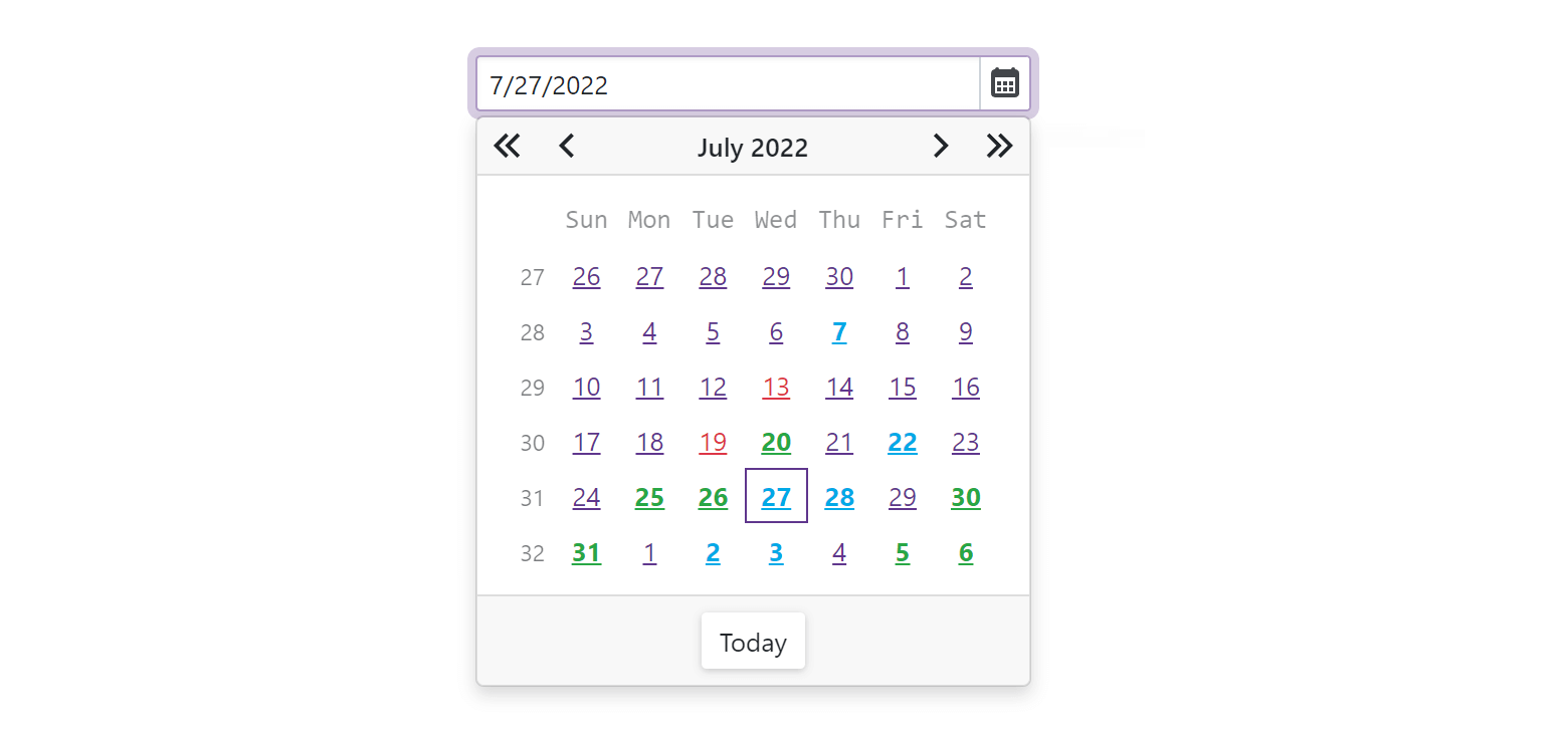
Date Picker — Highlight Special Dates
We will implement an API to highlight specific dates (such as holidays) in the Date Picker's dropdown:
DevExpress Blazor ComboBox and TagBox components will automatically highlight the first match after filtering. Once implemented/enabled, end-users can select values faster by typing a keyword and pressing Enter.
In this blog post, I'll summarize Blazor Layout & Navigation features we expect to ship this fall/winter (v22.2). Please feel free to share your feedback via the inline survey questions below.
The information contained within this blog post details our current/projected development plans. Please note that this information is being shared for INFORMATIONAL PURPOSES ONLY and does not represent a binding commitment on the part of Developer Express Inc. This blog post and the features/products listed within it are subject to change. You should not rely or use this information to help make a purchase decision about Developer Express Inc products.
Form Layout, Pager, and Toolbar — New Render & Size Mode Support
In our next major release, our Blazor Grid, Data Editors, Layout, and Navigation components will switch from Bootstrap to our own rendering engine. This new Blazor rendering engine will help us deliver:
Improved performance with fewer JavaScript interop calls.
Consistent appearance across DevExpress Blazor controls.
In addition, we expect to significantly improve our Size Modes. New size modes will apply to all controls that use the new rendering engine (Grid, Data Editors, Layout, and Navigation components) and allow you to create "dense" interfaces (and display more relevant information on-screen).
Important Note. If you develop apps that make use of the four DevExpress themes, you will only see changes in font size and margins/paddings for specific elements. However, if you are working with a Bootstrap-based theme, you should plan an upgrade path in advance. Once the new rendering engine ships, DevExpress controls that support it (Grid, Data Editors, Layout, and Navigation components) will only take CSS variable values (colors, fonts) from your Bootstrap theme. Other theme settings (paddings & margins, colors defined in widgets, shadows, border thickness, rounded corners, pseudo-classes) will be ignored.
Accordion — Selection
The DevExpress Blazor Accordion control will support single item selection and expose an API to get/set the currently selected item.
Form Layout — Collapsible Groups
The DevExpress Blazor Form Layout control will support collapsible groups. These groups will display an expand/collapse button in their header section and will offer similar functionality to the Accordion component.
Tab Control — Disabled Tabs
The DevExpress Blazor Tab Control will ship with an API to disable specific tabs. Disabled tabs cannot be selected and are greyed out.
As you may already know, the DevExpress Blazor Grid (v22.1x) allows you to save and restore its UI layout settings. A saved layout object includes the following data:
data pager settings (current page, number of rows per page)
filter criteria
settings for individual columns (sort index & direction, position, width, group index, type, etc.)
Essentially, this capability allows your end-users to customize the Blazor Grid to match personal preferences and reload the same layout each time they log into your app.
Our Blazor Grid automatically fires its LayoutAutoSaving event when settings change (so you can auto-save the layout). The event is asynchronous and does not block data grid rendering processes (your users will have a seamless experience).
The LayoutAutoLoading event fires when our Blazor Grid loads and allows you to auto-restore the layout.
async Task Grid_LayoutAutoLoading(GridPersistentLayoutEventArgs e) {
    var json = await GetLocalStorageItemAsync(LocalStorageAutomaticSaveKey);
    if (!string.IsNullOrEmpty(json))
        e.Layout = JsonSerializer.Deserialize<GridPersistentLayout>(json);
}
Save & Restore Layout on Demand
The DevExpress Blazor Grid also allows you to handle its state manually by using SaveLayout and LoadLayout methods. For example, you can place two buttons on a page to manage the data grid’s layout: Save Layout and Load Layout.
The following GitHub example demonstrates how you can save different Blazor Grid layouts and load these layouts using external buttons: Save and Load Layout Information.
Where to Persist Layout Settings
As you may know, the following are the most common storage locations for a data grid’s layout settings:
Browser storage
Server-side database
Browser storage is easier to manage – there is no need to track users or clean up unused records. However, it’s not available during prerendering (unlike a server-side database), because an existing page is not available in the browser during HTTP request prerendering. When working with browser storage, it is necessary to either disable prerendering, or defer page load operations with layout settings until the browser is connected to the circuit.
With v22.1, you can now customize the DevExpress Blazor Grid to better address your business requirements (our Blazor Grid allows you to modify the appearance of 30+ grid UI elements (rows, cells, edit form, filter row, group panel, footer, etc)).
You can also apply unique formatting based on specific rules. By incorporating rule-based formatting, you can help users identify trends, recognize exceptions, and compare relevant data points in a more efficient manner.
To activate this feature, handle the CustomizeElement event, and specify which UI elements to customize and which styles or CSS classes to apply. Thanks to the power of CSS, you can create any grid design with relative ease.
As you may know, our most recent major update (v22.1) introduced a new Mail Merge feature within the DevExpress Blazor Rich Text Editor.
Mail Merge automates the creation of many business-specific documents, including catalogs, reports, and external communications. To integrate this feature in your Blazor app, you need to bind a data source to a rich text document with merge fields. Our Rich Text Editor will automatically replace merge fields in the document with information from the bound data source.
To begin, simply assign a data source to the Data property (to bind data to your document template):
Add { MERGEFIELD "field name" }fields to you document to create a document template. Our Blazor Rich Text Editor's UI allows you to insert merge fields based on the bound data source, preview merged data, and “navigate” through data records.
The Rich Text Editor’s built-in Mail Merge dialog allows you to configure mail merge settings and start mail merge operations. Once the operation is complete, the control exports result to a file (using the specified format) and downloads the file to the local machine.
The following image demonstrates merge results. In this document, merge results are separated with paragraphs, but the component can also start each result with a new page.
Please let us know if mail merge is an important requirement within your Blazor app. If it is, please describe your current implementation and how we can extend this particular feature to better address your business needs.
As you may already know, we introduced a series of UI customization options for the DevExpress Blazor Rich Text Editor in our v22.1 release cycle. The following customization options should help you personalize the Rich Text Editor to better address business requirements and end-user needs:
Hide the Ribbon for read-only documents.
Display a compact toolbar instead of the large ribbon.
Hide built-in tabs and items.
Customize the appearance and behavior of built-in items.
Create and display new tabs, groups, and items.
Ribbon Customization
The new CustomizeRibbon event allows you to customize the built-in ribbon as needs dictate. Use the event's argument to locate and manage ribbon elements (tabs, groups, and items).
To illustrate what's possible and how you can customize ribbon elements to address specific requirements, let's consider the following use case: a Blazor app that only allows a user to load and save documents to/from specific storage, and only allows an admin to download documents.
First, we'll need to handle the CustomizeRibbon event and access the File tab group (in this instance, the File tab group contains the appropriate items):
Next, we'll need to access the Open and Save buttons and customize associated behavior:
IBarButton saveDocButton = (IBarButton)fileCommonGroup.Items[RichEditBarItemNames.SaveDocument];
// Displays and enables the Save button that is hidden and disabled by default
saveDocButton.GetVisible = () => { return true; };
saveDocButton.GetEnabled = () => { return true; };
saveDocButton.Click = async () => {
    // Save the document to custom storage here
};
IBarButton openDocButton = (IBarButton)fileCommonGroup.Items[RichEditBarItemNames.OpenDocument];
openDocButton.Click = async () => {
    // Open a custom dialog to select and load a document here
};
Finally, we'll need to keep the default Download menu within the File tab for the 'admin' and remove this menu for other users:
var user = (await authenticationStateTask).User;
if (user.IsInRole("admin")) {
    if (fileCommonGroup.Items[RichEditBarItemNames.DownloadMenu] == null)
        fileCommonGroup.Items.AddDefaultItem(3, RichEditBarItemNames.DownloadMenu);
}
else
    fileCommonGroup.Items.Remove(RichEditBarItemNames.DownloadMenu);
If you're considering our Rich Text Editor for your next Blazor app or need to customize its Ribbon, please explore the following demo/help topic for more information: Online Demo and online help topic.
Toolbar Customization
The DevExpress Blazor Rich Text Editor v22.1 includes a new built-in toolbar. This toolbar includes our most popular action elements. Set the BarMode property to Toolbar to display the toolbar instead of the default ribbon.
<DxRichEdit BarMode=BarMode.Toolbar />
Toolbar customization is much like ribbon customization. Handle the CustomizeToolbar event and use this event's argument to access and manage toolbar elements — groups and items.
For instance, the following code snippet removes the Print button from the toolbar:
The DevExpress Rich Text Editor for Blazor does not handle app-specific exceptions that may arise when a user interacts with built-in/custom items. To handle such exceptions, v22.1 ships with a new BarItemExceptionRaised event.
Event arguments include Exception and Handled properties. Use the Exception property to obtain detailed information about the exception itself. Set the Handled property to true if your code handles the exception and you don't want the Blazor Rich Text Edit to raise the exception again:
<DxRichEdit BarItemExceptionRaised=OnBarItemExceptionRaised .../>

void OnBarItemExceptionRaised(BarItemExceptionEventArgs args) {
    var exeption = args.Exception;
    // Process the exception here
    args.Handled = true;
}
Your Feedback Matters
Please take a moment to respond to the following survey question.
In this blog post, I’d like to demonstrate how you can display a Context (Popup) Menu when a user clicks a Blazor Grid element. For this example, the Context Menu will appear when you right-click a Grid column header or row.
As you know, a context menu can help improve usability in several ways. For instance, it can replace an external toolbar component or a Grid command column (saving a lot of screen space). In general, a Data Grid’s context menu will include row-related (add a new row, delete, start editing) and column-related (hide a column, sort/group, etc) actions. You can also add other options, such as show filter row or display the Grid’s column chooser.
To associate a custom context menu with your DevExpress Blazor Grid, you’ll first need to disable the browser’s default context menu (when you right-click the DevExpress Blazor Grid). Specify the oncontextmenu:preventDefault attribute in the Grid’s markup to disable the browser’s default context menu.
In our most recent release, we extended the Grid’s CustomizeElement event and you can now access 33 Grid elementsin the event handler. Use these elements to subscribe to the oncontextmenu attribute and display your custom context menu:
The GridContextMenuContainerrazor component contains all available context menus in the app. In this example, there are two context menus: for a column header and row. The GridContextMenuHelperclass populates these context menus with items and reacts to item state changes (visible, enabled, selected). The GridContextMenuHelper class also implements Context Menu item click handlers. These handlers use our Blazor Grid's APIto execute commands as needed:
public static void ProcessColumnMenuItemClick(ContextMenuItem item, IGridColumn column, IGrid grid) {
    var dataColumn = column as IGridDataColumn;
    grid.BeginUpdate();
    switch(item.ItemType) {
        case GridContextMenuItemType.FullExpand:
            grid.ExpandAllGroupRows();
            break;
        case GridContextMenuItemType.FullCollapse:
            grid.CollapseAllGroupRows();
            break;
        /*...*/
    }
    grid.EndUpdate();
}
In this blog post, I'll share a link to a GitHub example that demonstrates how to add drag-and-drop support when using the DevExpress Blazor Grid component. The sample project illustrates how to move rows within a single data grid (reorder rows) and move rows (records) between two data grids.
Note: The GitHub example uses the following JQuery widgets:
As you’ll recognize once you review the example, the project retains information on row attributes on the server (stores a row’s visible index and where a user drags a row). On the client side, JQuery widgets are initialized as needed. When a user drops a row, a request is sent to the server to reorganize data based on the drag and drop operation itself.
If you are new to Blazor or are considering our Blazor component suite for a future project, feel free to review the following Blazor-related GitHub examples to learn more about the DevExpress Blazor Grid.
Should you have implementation related questions or if you encounter issues with these sample projects, please submit a support ticket via the DevExpress Support Center. We’ll be happy to follow-up.
Data Binding
Bind to a Web API Service: Implements a simple Web API service and uses it to populate our Blazor Grid component with data.
Drag-and-Drop Rows (Records):When a user drags and drops individual grid rows, you’ll need to update related data sources to reflect changes. Refer to this example to learn more.
Record Selection
Delete Selected Rows:This sample project allows users to select multiple data rows and delete them with one click.
Save and Load Layout Information: Our Blazor Grid includes a built-in API to save/load a component’s layout when needed. Refer to this example to learn more.
We’d love to hear your thoughts on our GitHub examples. Are they helpful? If you’d like us to create a custom example, please detail your use case/requirements below.
As many of you already know from our previous posts, our next major Blazor component update (v22.2) will ship with a new rendering engine (replacing Bootstrap). The purpose of this post is to document the changes you can expect, how to prepare for the changes, and how these changes will benefit those of you targeting the Blazor platform going forward.
We will contact all users that may be affected by this change via email to help with the transition/upgrade process.
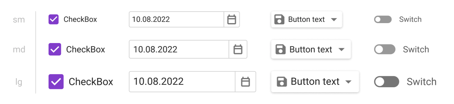
New Size Modes
Thanks to our new rendering engine, v22.2 we will significantly improve the capabilities of existing Blazor Size Modes:
Blazor Components (regardless of size mode used) will be downsized to cater for "dense" interfaces and display more relevant information on screen. Our new Large Size Mode will mirror what we now call “Medium.” Our new Medium mode will be closer to what we now call “Small.” And our new Small mode will allow you to deliver interfaces similar to desktop apps such as Microsoft Outlook.
New size modes will apply to our Blazor Data Grid (DxGrid), Tabs, Flyout, and other UI components that did not support size modes previously.
Size modes will offer a more consistent user experience and will affect all spacings/sizes across supported Blazor components. For example, our Blazor Form Layout component will adjust paddings between items/groups based on selected size mode.
New Visual Features
Apart from enhanced size modes, our new Blazor rendering mechanism will introduce new visual features for the DevExpress Blazor Grid and Data Editors library.
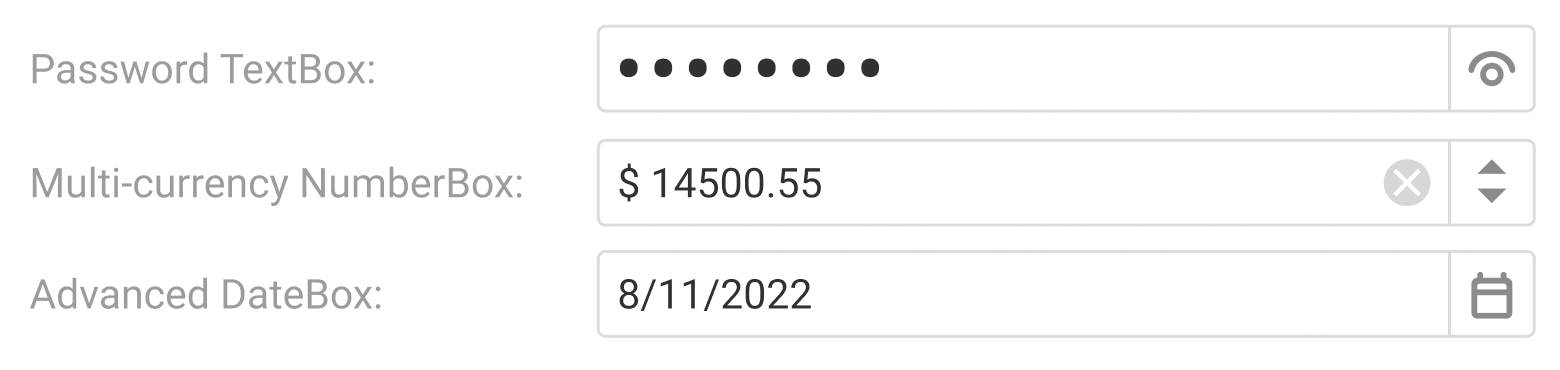
Blazor Data Editors — Built-in Validation UI
Our Blazor Data Editors (when used standalone or within data grid cells) can optionally display icons and tooltips indicating associated validation state.
Blazor Grid — In-place Editor Appearance
The DevExpress Grid will have the option to integrate data editors into its cells so that the editor and its cell share the same border.
The screenshot above was taken from an internal work-in-progress build. In-place editor appearance might change in the final version.
Blazor Grid — Support for Fixed and Relative Height
The DevExpress Grid will support usage scenarios where height is either fixed or set as a percentage of its parent container height / viewport height. In such instances, the footer element will remain at the bottom regardless of the rows displayed within the Grid.
Support for Bootstrap v5.2
Since our new rendering engine does not rely on Bootstrap, your DevExpress UI will look consistent regardless of the Bootstrap version referenced by your app. We will also make certain that Blazor UI components that have not been ported to our new rendering engine correctly follow Bootstrap v5.2 guidelines.
Affected Components
Changes in rendering will directly affect the following components.
Major components:
DxGrid
DxScheduler (inner elements such as editors and buttons)
DxRichEdit (toolbar elements and context menus)
Data Editors:
DxCalendar
DxCheckBox
DxComboBox
DxDateEdit
DxListBox
DxMaskedInput
DxMemo
DxSpinEdit
DxTagBox
DxTextBox
DxTimeEdit
Layout:
DxTabs
DxFormLayout
DxPopup
DxDropDown
DxFlyout
Navigation:
DxPager
DxToolbar
DxAccordion
DxContextMenu
Blazor components not listed above will continue to use our current Bootstrap rendering engine. As you might expect, you can continue to use these components as you did previously.
Changes to Built-In Blazor Themes
If your Blazor app uses one of our built-in Blazor themes (Blazing Berry, Blazing Dark, Office White, Purple) without customizations, you can expect a smooth automatic migration path. In such instances, v22.2 will only adjust sizes, spacings, and introduce minor visual tweaks.
Changes to Bootstrap-Based Themes
Our new rendering engine will use CSS variables (colors, fonts) from Bootstrap-based themes. Other theme settings and CSS styles will be ignored.
The impact of this change depends on which Bootstrap theme your Blazor app uses, since some themes lean more heavily on individual CSS styles than others. Also, many DevExpress controls (such as DxGrid) ignored specific Bootstrap theme settings to achieve their own appearance prior to v22.2.
If you are using the standard Bootstrap theme that comes with default Blazor templates, you can expect minimal changes to sizes, paddings, and colors:
Other Bootstrap-based themes will experience more drastic changes. The images below demonstrate a couple of examples from the Bootswatch theme library.
Changes to Custom Code
The new rendering engine completely overhauls the internal visual structure of DevExpress Blazor components:
DevExpress CSS classes will use the ".dxbl" prefix instead of ".dxbs" to avoid conflicts with previous styles.
Many DevExpress CSS classes will be removed with no direct alternative in the new rendering engine.
The internal element structure of many DevExpress components will be reworked and simplified.
Any application code that relies on the internal structure instead of public API may stop working. Here are a few examples of things to look for.
A CSS selector that references internal DevExpress CSS class names.
.dxbs-grid-header-row {
    display: none;
}
HTML elements that use internal DevExpress CSS classes.
In addition, custom themes based on DevExpress built-in themes (Blazing Berry, Blazing Dark, Office White, Purple) will need to be updated manually. This can be done by applying the same changes to new versions of built-in themes or by comparing new versions to old versions and customized versions using three-way merge tools such as KDiff3.
Your Feedback Matters
If you have questions about this change, need personal assistance, or want to be the first to try the new rendering engine beta, feel free to contact us via the DevExpress Support Center.
We’d also love to hear your thoughts on this upcoming change:
This post includes links to a series of interesting support tickets, new GitHub code examples, and newly created help topics. We hope you find the contents of this post of business value. If you have any questions about a specific support ticket, feel free to post a comment in the DevExpress Support Center.
Documentation Updates
We added a new Document Management section to the ASP.NET Core Spreadsheet control's help file. This section includes task-based topics for our ASP.NET Core MVC Spreadsheet control:
Retrieve a document as a byte array from a database and assign the array to the DocumentContent property to open a given document in the Rich Text Editor. If your database stores the document in a format other than DOCX, you should also assign the format to the DocumentFormat property.
ExportDocumentAsync method overloads allow you to export an open document to a byte array (using the required file format). Export the document and write the result byte array back to the database to save pending changes.
As you may already know, the DevExpress Blazor Rich Text Editor is now available for the Web Assembly (WASM) hosting model. When used in WASM applications, our Rich Text Editor component provides the same functionality as that of a Blazor Server application:
Advanced text editing and formatting support
Comprehensive API for document management and document content editing/formatting
Floating text boxes and image support
Dynamic content (field support)
Mail merge
Spell check
UI customization
Localization
Refer to the following Microsoft help topic for more information about Blazor hosting models, their advantages and disadvantages: ASP.NET Core Blazor hosting models.
Blazor Rich Text Editor Demos
Like other DevExpress Blazor UI components, our Blazor Rich Text Editor ships with a series of online demos. To learn more about the capabilities of the component, feel free to explore the following Rich Text Editor demos:Rich Text Editor - Overview. Note: Our Rich Text Editor demos are a Blazor Server application.
If using the DevExpress .NET Product Installer to install our Blazor components, you can find demo source code for both hosting models in the installation folder (should you wish to run demos locally). The default folder for DevExpress Blazor Demos (v22.2) is: C:\Users\Public\Documents\DevExpress Demos 22.2\Components\Blazor.
The demo folder includes BlazorDemo.ServerSide and BlazorDemo.Wasm subfolders. Each folder contains source code for corresponding hosting models. To run DevExpress Blazor demos locally, open a solution from one of these subfolders and start the application using one of following browsers:
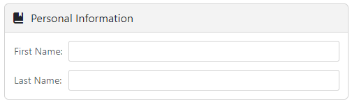
The DevExpress Blazor Form Layout control now ships with extended group layout capabilities – including new customization options.
Expand and Collapse Group Content
With v22.2, you can allow users to expand/collapse groups as requirements dictate. Display the expand button to enable this feature in the UI or use the Expanded property to enable this capability in code. Apply the slide animation effect for smooth content expand\collapse operations.
You can also replace expand and collapse buttons with custom icons.
The DevExpress Rich Text Editor for Blazor (v22.2) ships with built-in spell check capabilities and includes a customizable spell check service. In this blog post, we'll describe our built-in service and how to customize it as requirements dictate.
Enable Spell Checking in Your Blazor App
Our Blazor Rich Text Editor's built-in spell check service includes a dictionary for the American English language. By default, the service can detect spelling errors and suggest corrections (but it does not allow users to add words to the dictionary itself). To check spelling, you can use this service as is. If using the service as is, configuration involves two steps:
Call the AddSpellCheck extension method in the Program.cs file to register the built-in spell check service:
using DevExpress.Blazor.RichEdit.SpellCheck;
public class Startup {
	public void ConfigureServices(IServiceCollection services) {
		builder.Services.AddDevExpressBlazor().AddSpellCheck();
	}
}
Set the component's CheckSpelling property to true to enable the spell check feature:
<DxRichEdit CheckSpelling="true" />
Once complete, the built-in service checks spelling against its default dictionary.
Customize Our Built-in Spell Check Service
If you need to check spelling in multiple languages and/or allow users to add words to a dictionary, you can configure our built-in spell check service as follows...
You can access and customize service options within the AddSpellCheck extension method call. The Dictionaries option allows you to add a simple, Hunspell, or ISpell dictionary in addition to the default dictionary. To disable the default dictionary, simply add another dictionary for the same culture ("en-US"). Do not forget to assign a file provider to the FileProvider property before you add a dictionary, so that the service can access dictionary files.
To save new words to the dictionary, create a method that accepts the selected word and the document's culture, and writes the word to the appropriate dictionary storage. Once complete, assign this method to the AddToDictionaryAction property:
Once you add and customize the built-in service, it’s time to configure our Blazor Rich Text Editor component. Set the CheckSpelling property to true to enable spell checking. Assign the name of an open document’s culture to the component’s DocumentCulture property to check spelling against the appropriate dictionary.
The Rich Text Editor checks spelling against all dictionaries when the DocumentCulture property corresponds to an invariant culture. Otherwise, the Rich Text Editor uses only the dictionaries whose culture is invariant or matches the document’s culture. So, update the DocumentCulture property value after a document is loaded in the Rich Text Editor.
Note: If our built-in service does not address all your requirements, you can also implement a custom spell check service. Refer to the following help topic for more information: ISpellCheckService.
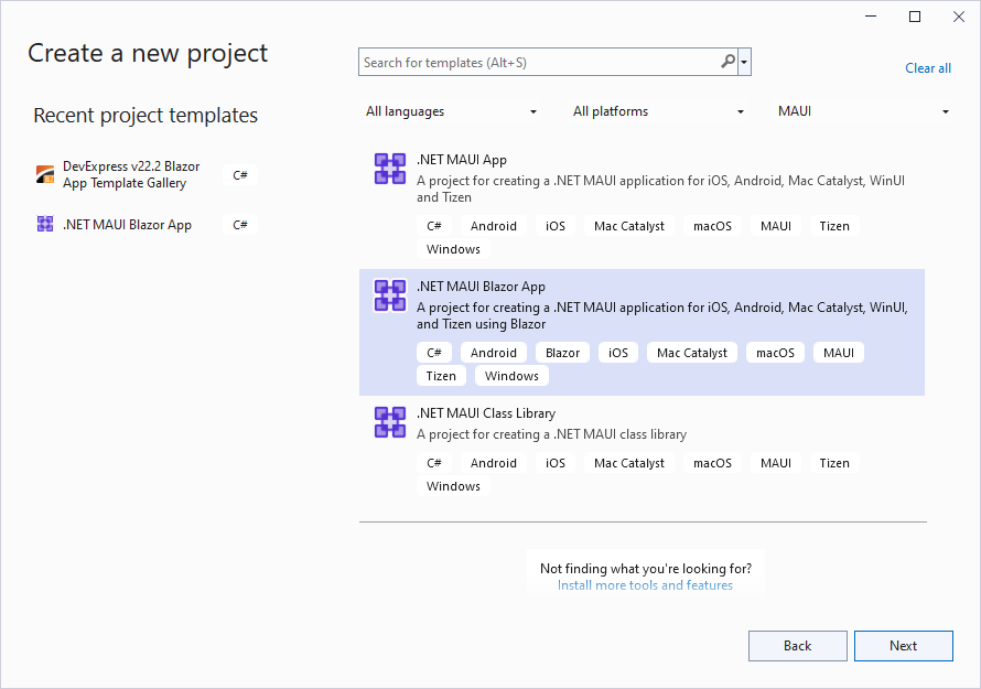
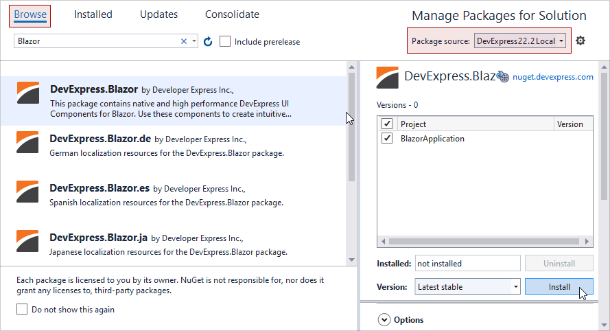
Our most recent release (v22.2) ships with Blazor Hybrid support (Community Tech Preview - CTP). As such, you can now embed DevExpress Blazor components into native MAUI, WinForms, and WPF Blazor applications.
Hybrid applications have the following advantages:
They combine web/native technologies and take advantage of associated benefits.
They allow you to reuse code and components across different hosting models and multiple platforms. When used, mobile, desktop, and web applications will look/work in a similar fashion.
You can easily set up your Hybrid project to use DevExpress Blazor components – simply use standard Microsoft templates to create your project, then add DevExpress resources to it. The code you write to configure DevExpress components is not dependent on the hosting model. For more information on how to embed components, please review the following step-by-step tutorials:
Register the DevExpress.Blazor namespace in the _Imports.razor file:
@using DevExpress.Blazor
Open the MauiProgram.cs file and add using DevExpress.Blazor. Once complete, call the AddDevExpressBlazor method and specify the global BootstrapVersion option:
/* ... */
using DevExpress.Blazor;

public static class MauiProgram {
    public static MauiApp CreateMauiApp() {
        var builder = MauiApp.CreateBuilder();
        /* ... */
        builder.Services.AddDevExpressBlazor(
        	configure => configure.BootstrapVersion = BootstrapVersion.v5);
        return builder.Build();
    }
}
Add DevExpress Blazor components to a Razor page (for example, to Index.razor). The following code adds our DxGrid and DxButton components to the Index.razor page.
@page "/"
@using System.Collections.ObjectModel

<DxButton Text="Add New Day"
        Click="(e) => AddNewForecast()" />
<p />
<DxGrid Data="@WeatherForecastData">
    <Columns>
        <DxGridDataColumn FieldName="Date" DisplayFormat="D" />
        <DxGridDataColumn FieldName="TemperatureC" Caption="@("Temp. (\x2103)")" />
        <DxGridDataColumn FieldName="TemperatureF" Caption="@("Temp. (\x2109)")" />
    </Columns>
</DxGrid>

@code {
    public class WeatherForecast {
        public DateTime Date { get; set; }
        public int TemperatureC { get; set; }
        public double TemperatureF => Math.Round((TemperatureC * 1.8 + 32), 2);
        public string Forecast { get; set; }
        public string CloudCover { get; set; }
        public bool Precipitation { get; set; }
    }

    int DayCount { get; set; } = 0;
    ObservableCollection<WeatherForecast> WeatherForecastData { get; set; }
    static readonly Random Rnd = new Random();

    protected override void OnInitialized() {
        WeatherForecastData = new ObservableCollection<WeatherForecast>();
        foreach (var date in Enumerable.Range(1, 5).Select(i => DateTime.Now.Date.AddDays(i))) {
            AddNewForecast();
        }
    }

    void AddNewForecast() {
        WeatherForecastData.Add(new WeatherForecast() {
                Date = DateTime.Now.Date.AddDays(++DayCount),
                TemperatureC = Rnd.Next(10, 20)
            });
    }
}


