Our next major product release is a couple of months away. This post details some the Blazor-related features included in our first Early Access Preview (EAP) and a summary of additional features we expect to ship in November. As always, we welcome your thoughts and feedback.
If you own an active DevExpress Universal or DXperience Subscription, and would like to learn more about our Blazor product line or are ready to explore the features described herein, point your browser to the DevExpress Download Manager and download our EAP build at your convenience. You’ll find demo source code in the DevExpress product installation folder (default path is C:\Users\Public\Documents\DevExpress Demos 21.2\Components\Blazor\). You can execute our sample solutions directly from this folder, or if you prefer, use the DevExpress Blazor Demo Center to view our demos. For more information on how to run Blazor demos locally, refer to the following help topic: Demos.
Early Access and CTP builds are provided solely for early testing purposes and are not ready for production use. This build can be installed side by side with other major versions of DevExpress products. Please backup your project and other important data before installing Early Access and CTP builds.
This EAP may not include all features/products we expect to ship in our v21.2 release cycle. As its name implies, the EAP offers an early preview of what we expect to ship in two months.
New DropDown Component
Our first Blazor EAP includes ships with an entirely new Blazor DropDown component. This new UI element allows you to display a non-modal drop-down window within a Blazor application. The DevExpress Blazor DropDown component ships with the following built-in features:
Header, Body, and Footer Customization
Use the component’s HeaderText, BodyText, and FooterText properties to customize text for the corresponding UI element. To customize window content and appearance, simply use the templates below:
- HeaderTextTemplate
, BodyTextTemplate, FooterTextTemplate: Allows you to customize the DropDown’s content region. Predefined content alignment and paddings apply.
- HeaderTemplate
, BodyTemplate, FooterTemplate:
Allows you to customize the entire DropDown (all elements). Predefined appearance settings do not apply.
Position
Use one of the following properties to specify the DropDown’s position within your Blazor app:
- PositionTarget property - specifies the selector of the element relative to which the DropDown component is displayed.
- PositionRectangle property - specifies the area relative to which the DropDown component is displayed.
The PositionMode property defines DropDown orientation (absolute, relative, bottom, center, etc) when the component is activated.
Position Restrictions
The RestrictionMode property defines a restriction zone for the DropDown (Viewport, Page, Rectangle, Selector) inside which the DropDown appears. Use the DropDown’s RestrictionTarget (if you select the DropDownRestrictionMode.Selector option) or RestrictionRectangle (in for the DropDownRestrictionMode.Rectangle option) property to specify the restricted area. If the DropDown exceeds the boundaries of this zone, component behavior will be based on settings applied to RestrictionHandlingMode:
- Ignore - the DropDown ignores the restriction.
- Fit - the DropDown remains inside the restriction zone even if the DropDown's target element moves outside the zone.
- Hide - the component is hidden on the client, but the DxDropDown.IsOpen property is equal to true.
- Close - the DropDown closes. You can use the Closing event to prevent the close operation.
Custom Size and Resizing Capabilities
Use the component’s Width and Height properties to specify desired dropdown size. Activate the AllowResize property to allow end-users to modify dropdown size. When enabled,end-users can drag the component's border to modify both width and height.
Show and Close Actions
Call the ShowAsync and CloseAsync methods to show and close the DropDown component in code.
Demo: Navigation and Layout - DropDown
Grid
We’ve extended the capabilities of our new Blazor Grid. This EAP includes the following new features
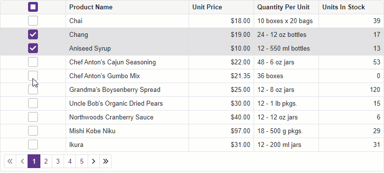
Row Selection
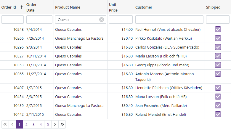
Our Blazor Grid now supports both single and multiple row selection. The new SelectionMode property specifies current mode.
Selection via Mouse Clicks
Users can easily select and deselect rows via mouse clicks. To enable this capability, set the AllowSelectRowByClick option to true. To specify and access selected data items, implement two-way binding for the SelectedDataItems property.
![]()
<DxGrid Data="GridDataSource" AllowSelectRowByClick="true"
    @bind-SelectedDataItems="@SelectedDataItems"><Columns>
            @*...*@</Columns></DxGrid>
@code {
    IEnumerable<object> GridDataSource { get; set; }
    IReadOnlyList<object> SelectedDataItems { get; set; }
    // …
}
Selection Column
Our Blazor Grid ships with a new column type - DxGridSelectionColumn. This column can display checkboxes in multiple selection mode and radio buttons in single selection mode
![]()
<DxGrid Data="GridDataSource" ...><Columns>/<DxGridSelectionColumn />
        @*...*@</Columns></DxGrid>
Selection in Code
The following new methods allow you to manage Blazor Grid related selection options in code.
Add rows or data items to selection:
- SelectRow
-
SelectRows
- SelectDataItem
- SelectDataItems
-
SelectAllOnPage
Remove rows or data items from selection:
-
DeselectRow
-
DeselectRows
-
DeselectDataItem
-
DeselectDataItems
-
DeselectAllOnPage
You can also call the ClearSelection method to reset all selection options.
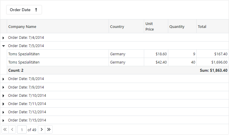
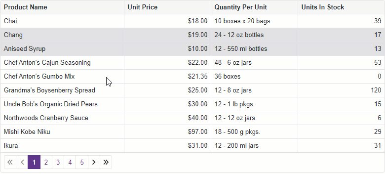
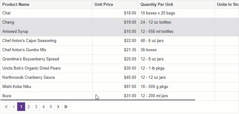
Vertical and Horizontal Scrolling
Our Blazor Grid now displays a vertical scrollbar when the height of its content exceeds the height of the component itself.
As you would expect, a horizontal scrollbar appears when the total width of all columns exceeds the width of the component itself.
![]()
The horizontal scrollbar appears when the total width of all columns
exceeds the width of the component itself.
![]()
Column Width Enhancements
v21.2 includes the following column width related enhancements:
- When you specify a column’s
Width property in pixels, the Grid renders the column with the defined width. The column’s cell content no longer affects column width.
- If the total width of all columns exceeds the width of the component
itself, the Grid shows the scrollbar (as demonstrated in the previous
section).
- If the total width of all columns is less than the component width, the
empty space remains to the right.
- If you do not specify column widths, the Grid renders columns with equal
widths.
- If you specify widths for specific columns only, the Grid renders these
columns with the defined widths and divides the remaining space between
other columns equally.
We also limited the minimum column width to 50 pixels and introduced a new MinWidth option that allows you to modify this constraint.
Pager Position
You can now control the display of our Blazor Grid’s built-in data pager. Use the PagerPosition property to display the pager at the bottom, the top, or both the top and the bottom.
<DxGrid Data="GridDataSource" PagerPosition="GridPagerPosition.TopAndBottom"><Columns>
        @*...*@</Columns></DxGrid>
Column Text Alignment
Our Blazor Grid automatically aligns text within column data cells/footer cells based on column/bound data type. With v21.2, you can use the new TextAlignment option to modify text alignment as requirements dictate.
<DxGrid Data="GridDataSource" …><Columns><DxGridDataColumn FieldName="ProductName"
            TextAlignment="GridTextAlignment.Center"/>
                @*...*@</Columns></DxGrid>
Access Data Item
You can now access the processed data item within data-related event handlers (CustomSort,
CustomGroup,
CustomSummary, and so on) and the
CellDisplayTemplate.
<DxGrid Data="GridDataSource" …><Columns><DxGridDataColumn FieldName="ProductName"><CellDisplayTemplate>
            @{
                var dataItem = @context.DataItem;
                //...
            }</CellDisplayTemplate></DxGridDataColumn>
        @*...*@</Columns></DxGrid>
Rich Text Editor
New UI Dialogs
We have extended the capabilities of our Blazor Rich Text Editor and introduced the following new UI dialogs:
- Insert Table
-
Hyperlink
-
Bookmark
-
Font
-
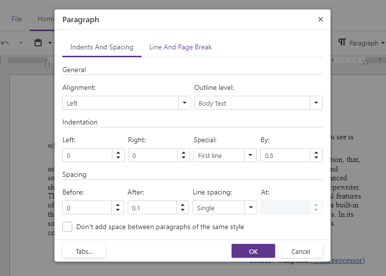
Paragraph
-
Tabs
- Insert Cells
- Delete Cells
- Split Table Cells
- Find and Replace
- Page Setup
-
Alert
![Graphical user interface, application
Description automatically generated]()
![]()
New Context menu
The DevExpress Blazor Rich Text Editor now includes built-in context menu support. This menu displays different options based on the clicked element and allows users to initiate actions without using the ribbon.
New API
Our Rich Text Editor ships with a new
ReadOnly option. This option allows you to place the editor in read-only mode. We have also added a Modified property. As its name implies, this property indicates whether the current document has unsaved changes.
With the Rich Text Editor’s DocumentFormat setting, you can specify the format used to store document content (allows you to open and save documents using a format other than OpenXml).
And finally,
GotFocus,
LostFocus allow you to handle corresponding events when the control receives and loses focus.
Web Report Designer Enhancements
Updated User Interface
![The Web Report Designer's Updated UI]()
Please review the following article for information related to UI enhancements introduced in this EAP: Reporting — Updated Web Report Designer UI (Coming Soon in v21.2).
To explore this new UI, be sure to check out the following online demo: Web Report Designer - Online Demo.
Cross-Tab
Our Web Report Designer ships with a new Cross-Tab report control. We’ve also included a Cross-Tab report wizard to help you create cross-tab reports with ease.
![Web Report Designer - Cross-Tab]()
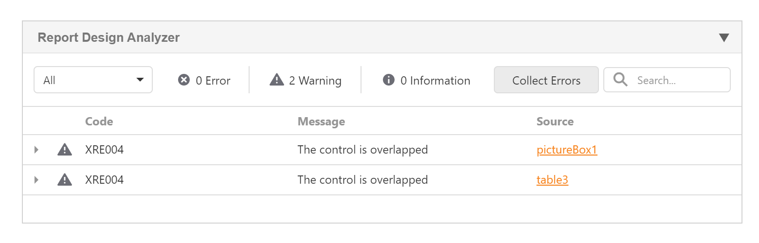
Report Design Analyzer
The Report Design Analyzer panel (designed to help you isolate, diagnose, and address common report design/layout-related issues) has been integrated into the DevExpress Web Report Designer (v21.2).
![Web Report Designer - Report Design Analyzer]()
Refer to the Reporting — Early Access Preview (v21.2) post to learn more about upcoming Reporting tool features.
Tabs Scroll
In this release, we introduce a new ScrollMode property that allows you to
specify how users navigate between tabs when they do not fit the
container’s width. The following modes are available:
- Auto
- the scroll mode is adapted to the device type. Mobile and tablet
devices use Swipe mode. Desktop devices use NavButtons mode.
- NavButtons
- the container displays a few tabs that fit the width. Users can
navigate to other tabs in the following ways: use the navigation
buttons, or hover the mouse pointer over a tab, hold the Shift key, and
scroll the mouse wheel.
- Swipe
- the container displays a few tabs that fit the width. To navigate to
other tabs, users can swipe tabs, or hover the mouse pointer over the
container, hold the Shift key, and scroll the mouse wheel.
- NoScroll
- users cannot scroll tabs. The tabs that do not fit the container’s
width are moved to a new line.
Coming Soon in v21.2
The features below are not included in our first EAP, but we expect to make them available in an upcoming beta (v21.2).
Grid
-
Editing within an Edit Form
-
Editing within a Popup Edit Form
-
Page Size Selector
-
Pager Customization Options
Scheduler
- Templates for various cell types (date headers, resource headers, headers that display days of a week, etc).
Rich Text Edit
Data Editors
Custom buttons
- Item templates for list editors
Charts
Context Menu
Your Feedback Counts
Should you have questions about this EAP, feel free to post your comments below. If you are testing our EAP and have usage related questions, please submit a support ticket via the DevExpress Support Center.
![]()
![]()