In this post, I'll discuss the most recent enhancements to the DevExpress UI for Blazor (v20.1.6).
.NET Core 3.1.7 and Blazor WebAssembly 3.2.1 Support
v20.1.6 supports the most recent versions of Blazor WebAssembly 3.2.1 and .NET Core 3.1.7. If you have yet to upgrade, please do so as Microsoft has addressed important vulnerabilities.
The update addresses the vulnerability by correcting how the ASP.NET Core web application handles web requests. -Rahul (Microsoft)
All .NET Core 3.1 applications running on .NET Core 3.1.6 or lower are affected by the CVE-2020-1597: ASP.NET Core Denial of Service Vulnerability. To learn more, please review the following: Microsoft Security Advisory CVE-2020-1597 | ASP.NET Core Denial of Service Vulnerability.
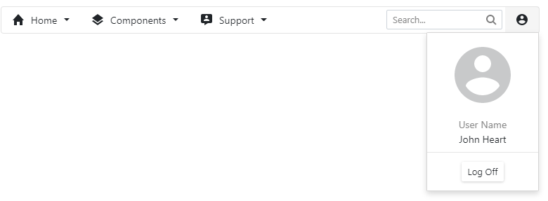
New Blazor Memo Editor
This release ships with a new multi-line memo editor component for Blazor:
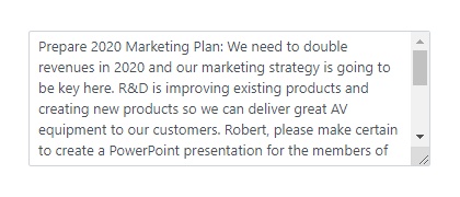
Our Blazor Memo component includes the following features:
rows– Use rows to control the number of visible text linescolumns– use columns to limit editor width by character count- resize – Our memo control supports multiple display modes including:
Vertical,Horizontal,VerticalHorizontal, &Disabled Clearbutton -Use the clear button to remove all content within the memo field.- read-only mode
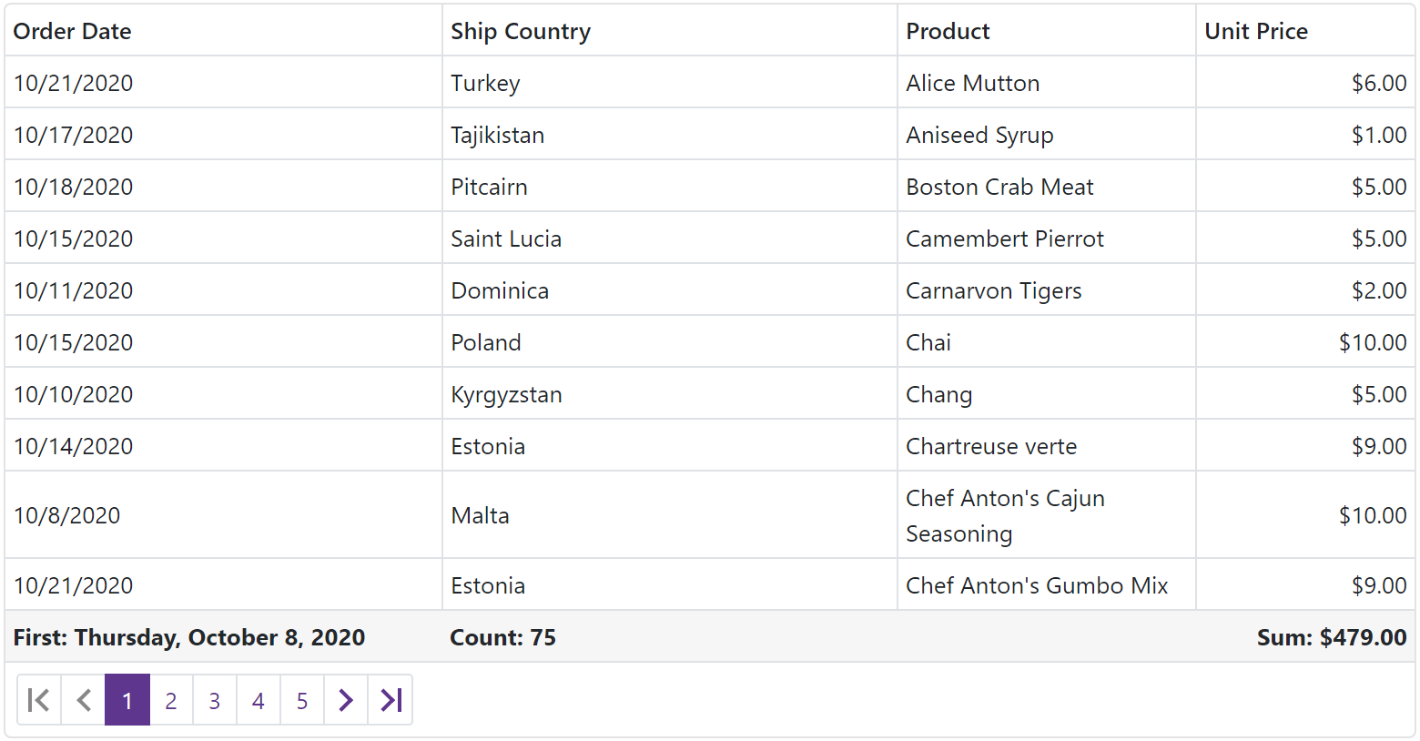
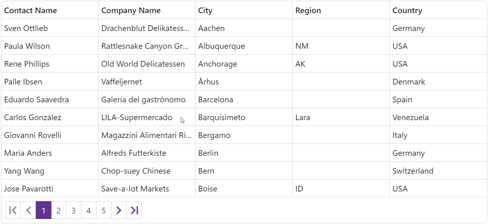
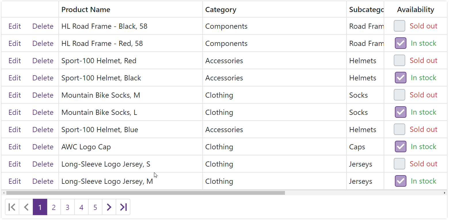
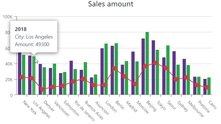
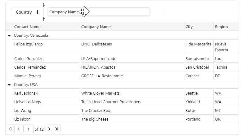
Blazor Data Grid
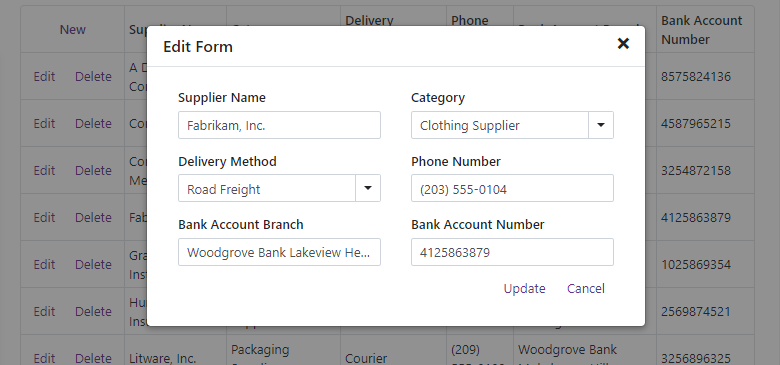
Popup Edit Form
You can now select between two edit modes when using our Blazor Data Grid: built-in or modal popup edit form. To enable the popup edit form, set the EditMode property to DataGridEditMode.PopupEditForm.
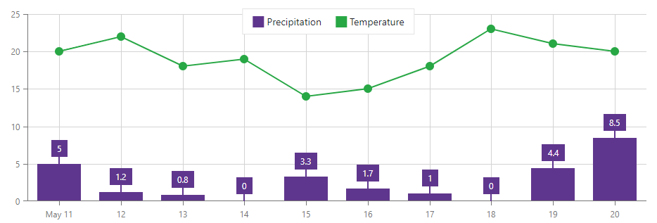
Blazor Scheduler
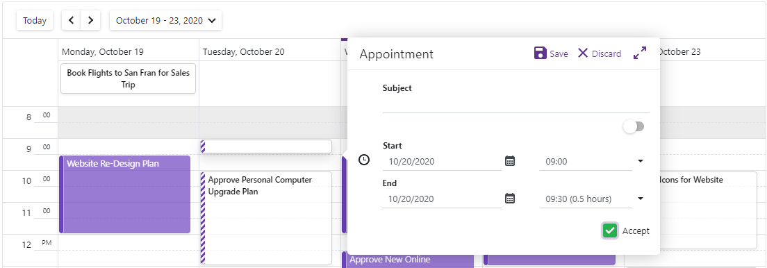
Appointment Templates
Our Blazor Scheduler now allows you to use templates to specify a custom appearance for individual events/appointments. To declare custom content for all-day appointments, use HorizontalAppointmentTemplate.
<HorizontalAppointmentTemplate><div
    class="card shadow-sm p-1 bg-white text-dark"
    style="width:100%; font-size: .925em; font-weight:600; box-shadow: .125rem .25rem rgba(34,34,34,0.15)">
    @context.Appointment.Subject</div></HorizontalAppointmentTemplate>
For appointments less than one day in duration, use the VerticalAppointmentTemplate:
<VerticalAppointmentTemplate><div
    class="card shadow-sm bg-white p-2"
    style="overflow: hidden; height: 100%;box-shadow: .125rem .25rem rgba(34,34,34,0.15)"><div><span class="badge badge-info mb-1 @context.Status.CssClass">@context.Status.Caption</span></div><span
      class="text-dark pl-0 mb-1"
      style="font-weight:600; font-size: .925em;">@context.Appointment.Subject</span><div
      style="height:100%; display:flex; flex-direction:column; justify-content:flex-end;"><div><span class="badge badge-light"><span class="oi oi-clock pr-1"> </span>@context.Appointment.End.ToString("MMM dd HH:mm")</span></div></div></div></VerticalAppointmentTemplate>
Custom Fields
Scheduler elements require a few standard data-bound properties (AppointmentID, Start, End, etc.). With this release, you can now add custom fields to appointments, labels, and status values.
For example, use the AppointmentMappings.CustomFieldMappings collection to add custom fields for appointments:
DxSchedulerDataStorage DataStorage = new DxSchedulerDataStorage()
{
  AppointmentsSource = AppointmentCollection.GetAppointments(),
  AppointmentMappings = new DxSchedulerAppointmentMappings()
  {…
    CustomFieldMappings = new List<DxSchedulerCustomFieldMapping> {
      new DxSchedulerCustomFieldMapping { Name = "IsApproved", Mapping = "Approved" },
      new DxSchedulerCustomFieldMapping { Name = "Progress", Mapping = "Progress" }
    }
  }
};
Custom field mapping properties are also available for Labels and Status values.
To access custom field values in templates, use the Context.Appointment.CustomFields property:
<VerticalAppointmentTemplate>
    ...
        @if (Convert.ToBoolean(context.Appointment.CustomFields["IsApproved"])) {<p class="text-dark"><span class="oi oi-check"></span> Approved</p>
        }<div class="progress border-primary" style="height: 5px;"><div class="progress-bar bg-success"
                 style="width:@context.Appointment.CustomFields["Progress"]"
                 role="progressbar"></div></div></div></VerticalAppointmentTemplate>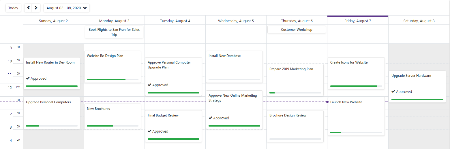
New Customization API
With this update, you can now assign CSS classes to customize appointments, labels, and status values:
AppointmentLabelMappings = new DxSchedulerAppointmentLabelMappings() {
    Id = "Id",
    Caption = "LabelName",
    Color = "LabelColor",
    TextCssClass = "TextCssClass",
    BackgroundCssClass = "BackgroundCssClass"
}Blazor Data Editors
Multiple Columns
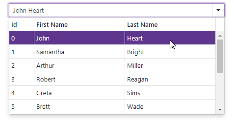
Our Blazor List Box, ComboBox, and TagBox components can now display data across multiple columns. To create the new column type, use the DxListEditorColumn object and specify the following properties to customize your column
FieldName- Binds the column to a specified data source fieldWidth- Specifies the column's widthVisible- Specifies the column's visibilityVisibleIndex- Specifies the column's display position
<DxComboBox Data=”@DataSource”
                  @bind-Value=”@SelectedValue”
                  EditFormat=”{1} {2}”><DxListEditorColumn FieldName=”Id” Width=”50px” /><DxListEditorColumn FieldName=”FirstName” VisibleIndex=”1”/><DxListEditorColumn FieldName=”LastName” /><DxListEditorColumn FieldName=”Country” Visible=”false” /></DxComboBox>
Our Blazor ComboBox and TagBox components now offer an EditFormat property. Use this property to format values displayed in both standard and multi-column modes. In multi-column mode, you can specify a visible column's index in curly braces. The code above adds three columns to the ComboBox and applies the {1} {2} format to the component's edit values. This format specifies that the editor value includes values for the following columns: FirstName (VisibleIndex = 1) and LastName (VisibleIndex = 2).
Bind to a Data Object Field
Our ComboBox, TagBox, and List Box components allow you to bind to any IEnumerable data source (database, custom objects, etc.). These components use the TextFieldName property to display item text.
With this release, we've added a new ValueFieldName property for the ComboBox, TagBox, and List Box. Use TextFieldName to display human-readable strings and ValueFieldName to read the connected "non-friendly" values. For example, use TextFieldName to display 'Employee Name' and ValueFieldName to read the corresponding 'Employee ID':
public class Employee
{
    public int Id { get; set; }
    public string FirstName { get; set; }
    public string LastName { get; set; }
    public Department Department { get; set; }

    public string Text => $"{FirstName} {LastName} ({Department} Dept.)";
}

...

<DxComboBox Data="@Employees.DataSource"
            TextFieldName="@nameof(Employee.Text)"
            ValueFieldName="@nameof(Employee.Id)"
            SelectedItemChanged="@((Employee employee) => SelectedItem = employee)"
@bind-Value="@Value"></DxComboBox>To bind the component to the entire object, do not specify the ValueFieldName property:
<DxComboBox Data="@Employees.DataSource"
            @bind-Value="@Value"></DxComboBox>
This feature implementation required the following API changes.
Input ID
We added a new InputID property to the following components: CheckBox, Date Edit, Spin Edit, Text Box, ComboBox, and TagBox.
Multiple editors can be added to our form layout item's template. You can now use the InputID property to control which editor receives focus when the user clicks on the form layout item's caption.
<DxFormLayout><DxFormLayoutItem Caption="Birth Date:" CaptionFor="date_edit"><Template><DxDateEdit @bind-Date="@BirthDate" InputId="date_edit"></DxDateEdit></Template></DxFormLayoutItem>
@*...*@</DxFormLayout>Calendar - Bind to a Single Object
Use the new SelectedDate property to bind Calendar to a single DateTime value instead of an IEnumerable collection of dates:
<DxCalendar @bind-SelectedDate="Date" />

@code {
    DateTime Date { get; set; } = new DateTime.Today;
}
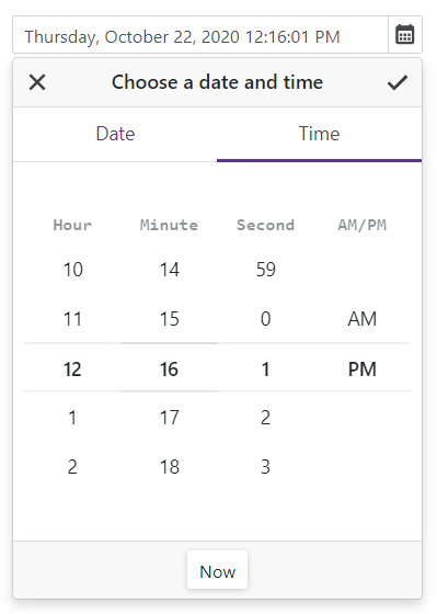
Calendar - Date Validation
We added support for Calendar validation. You can now validate the SelectedDate property by adding our Calendar component to Blazor's standard EditForm.
The Calendar is outlined in green if validation is successful and in red if validation fails:

Calendar - Nullable DateTime Support
You can now bind a Calendar to a nullable DateTime value:
<DxCalendar @bind-SelectedDates="Dates"  EnableMultiSelect="true" />

@code {
    IEnumerable<DateTime?> Dates { get; set; } = new List<DateTime?>() {
        null, new DateTime(2020, 08, 16), new DateTime(2020, 08, 17)
    };
}
Form Layout - CSS Classes
We added a new CssClass property for the Form Layout component. Use it to assign CSS classes to layout items and captions (including tab pages and groups).
Enhanced Event Processing
We've improved the delegate type from Action to EventCallback for multiple events. A call to StateHasChanged isn't required with these updated event handlers. StateHasChanged is called automatically to rerender the component after changes in the event.
Before:
<DxButton Click="@Click"../>
@code
{
    void Click(MouseEventArgs args)
    {
      // Use this event to process your code
      // during the click event then call StateHasChanged
      InvokeAsync(StateHasChanged);
    }
}
After:
<DxButton Click="@Click"../>
@code
{
    void Click()
    {
      // Use this event to process your code
      // during the click event without StateHasChanged
    }
}
For a complete list of changes to events and information about EventCallback advantages, please refer to the following Breaking Change: T920147
Upcoming Enhancements
To learn more about our upcoming plans for Blazor (v20.2), please review the following blog post: Blazor Roadmap.