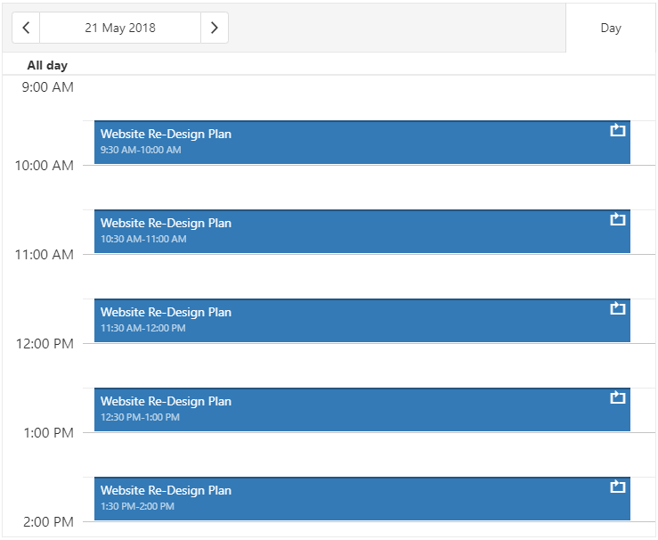
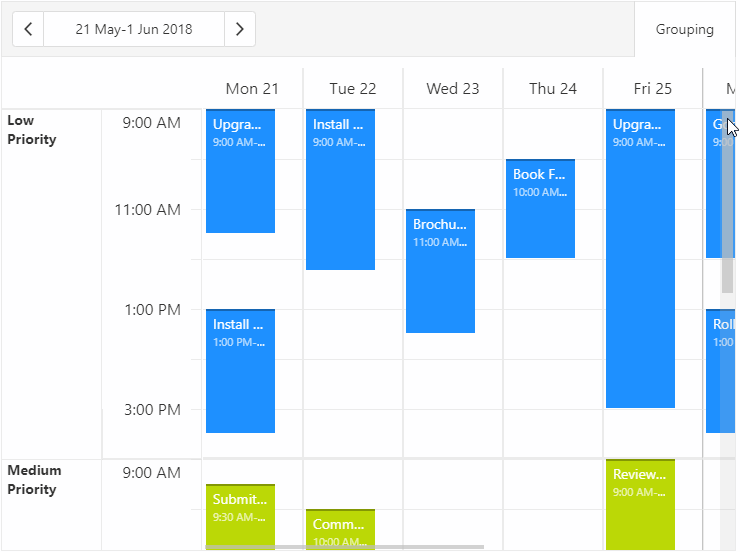
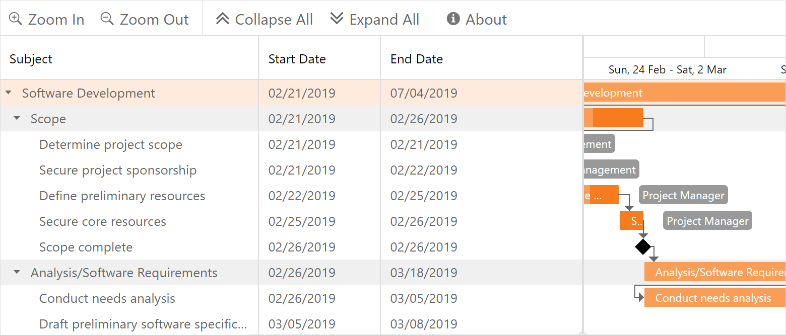
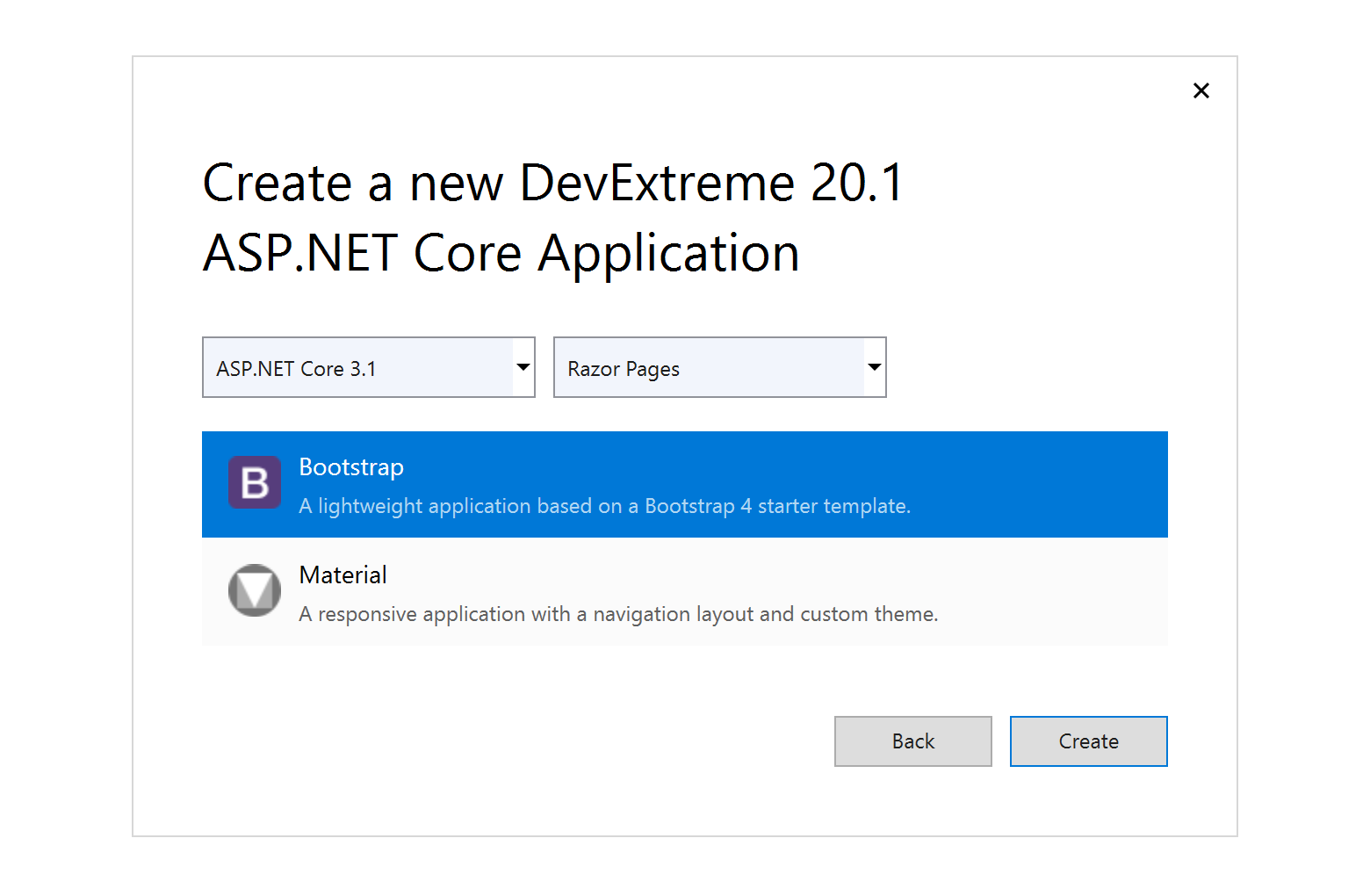
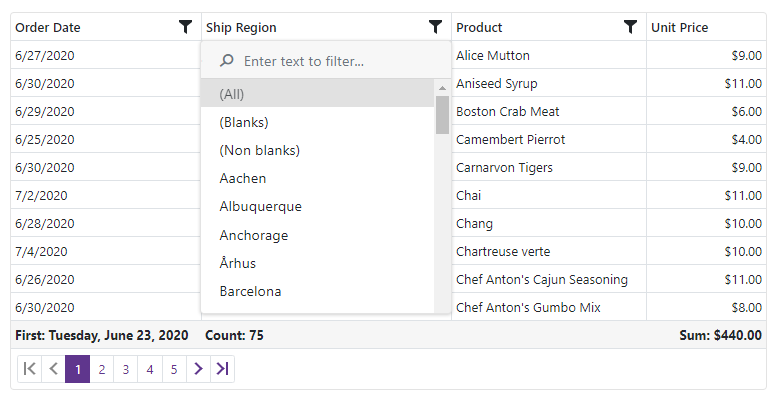
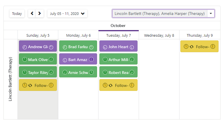
Quantcast
Channel: ASP.NET Team Blog
Viewing all 398 articles
Browse latest View live

ASP.NET WebForms and MVC – 2020 Roadmap

$
0
0

Gantt 

We will officially release DevExpress Gantt for WebForms and MVC in our first major release of 2020. 

Our official release (v20.1) will include the following new features: 

  • Localization support
  • New toolbar with commands to edit default items and add custom items
  • New Current Time Marker to indicate current date and time
  • Data validation support
  • Custom task color support 
  • Touch device support

In our second release of 2020 (v20.2), we’ll add the following capabilities to our Web Forms and MVC Gantt control:

  • Export Gantt content to PDF, PNG, etc.
  • Template support (Gantt chart tasks)
  • Context menu customization
  • Task Details dialogcustomization
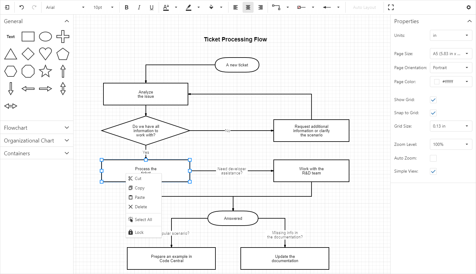
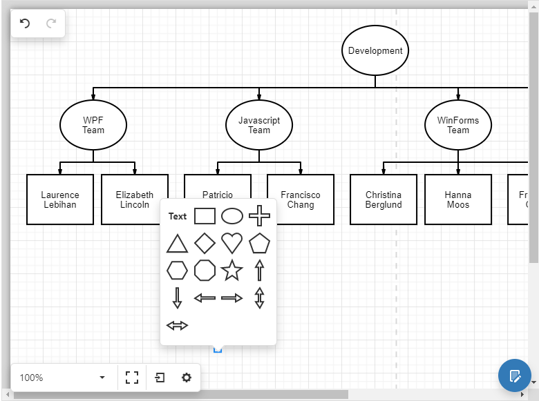
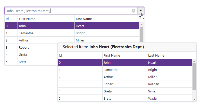
Diagram 

We will officially ship DevExpress Diagram for WebForms and MVC in 2020. 

Our v20.1 release will include the following features: 

  • Localization support
  • Performance enhancements
  • Custom shape templates 
  • New UI that offers additional workspace for a document. This should improve user experienceson mobile and tablet devices.
  • New shapes with images designed for use in OrgCharts.
  • Dash, dot, and other types of lines for shapes and connectors 
  • Context menu support
  • Touch device support

v20.2 will include the following new features:

  • Toolbar and context menucustomization
  • New API to refresh Diagram document when a data model is changed outside the component
  • Text validation in shapes and connectors
  • Automatically resize shapes based on text content
  • New API to restrict end-user operations such as shape resizing, dragging, adding orremoving shapes, dragging shapes outofcontainer, etc. 
  • Shape rotation support

RichEdit 

Client-side PDF export (in 20.1)

New client-side export mode generates a PDF document with the same layout as that displayed within the browser. 
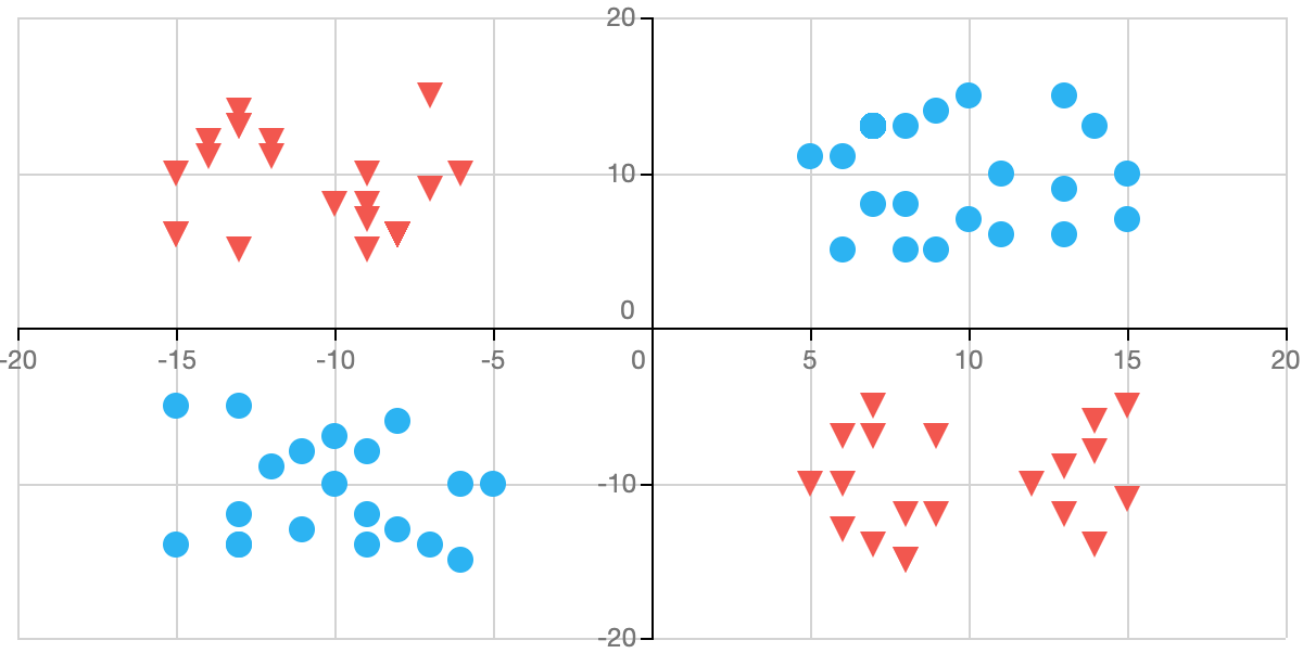
Charts

New Swift Point Series Type (v20.2)

Swift Point Series will be optimized for quick analysis of large input data via the use of point markers.

swift-series

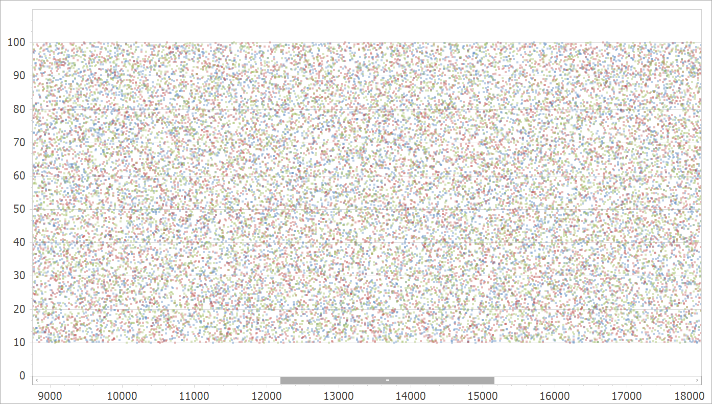
For more information on this feature, please review the following support tickets: T752918, S34103, Q455568.

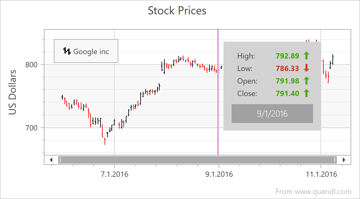
New DateTime Scale Mode (v20.1)

Our Chart Control includes a configurable DateTime scale (you can exclude non-working days and time as needed). We will extend DateTime scale processing by automatically excluding intervals without data. This will simplify the DateTime scale configuration for those using financial charts.

New Series Label Display Mode (v20.1)

All XY-Diagram compatible Series will support a new label type for easier Series identification when multiple Series are displayed simultaneously.

edge-labels

Support percent values for Side Margins (v20.1)

For more information on this feature, please review the following support tickets: T700625, T148976.

Advanced Text Formatter for Crosshair Panel (v20.2)

You will be able to specify Crosshair label width and alignment.
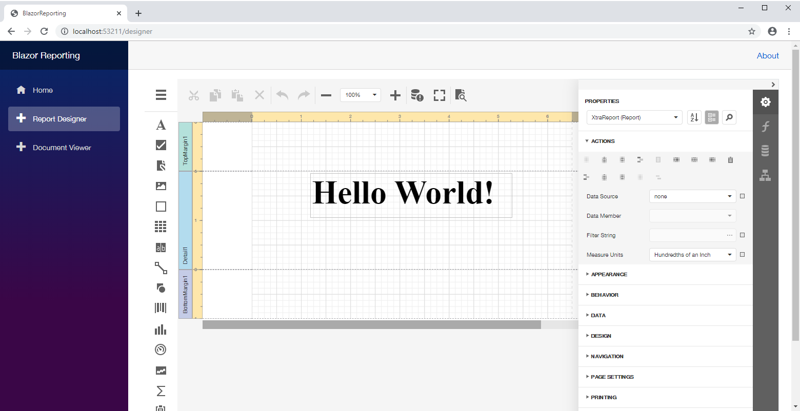
Reporting 

Translate Report Documents to Different Languages (v20.1)

You’ll be able to localize the text displayed in report controls and specify control location and size for a chosen language. This functionality will be available for End-User Report Designer components as well.

Report Designer - Localized Report

Performance Enhancements (v20.1 – v20.2)

By refactoring our document generation engine, we expect to improve performance in terms of both memory usage and document generation speed.

Embed PDF Documents into a Report Document (v20.1)

You’ll be able to insert a PDF file into a report.

Excel Export – Html-Inspired Content Support (v20.1)

You’ll be able to export reports that contain XRLabels (with the AllowMarkupText property enabled) to Excel and preserve the content formatting.

Excel Export – RTF Content Support (v20.1)

You’ll be able to export reports to Excel files and preserve XRRichText content.

Parameter Enhancements

Bind JsonDataSource Parameters to Report Parameters (v20.1)

You’ll be able to pass report parameter values directly to JsonDataSource.

JSON Data Source - Parameter Bindings

Select All Multi-Value Parameter Values By Default (v20.1)

You’ll be able to pre-select all values for a multi-value lookup parameter.

Numeric Range Parameter (v20.2)

You’ll be able to create integer and float range parameters and filter a report’s data using a single editor in the parameters panel.

Numeric Range Parameter Editor

Parameter Editor Grouping (v20.2)

You’ll be able to logically group multiple report parameters in the parameter panel. Editors that display parameter values are placed in a Group Box.

Visibility of Parameter Editors (v20.2)

You’ll be able to hide a parameter editor based on the value used for a different parameter.

PDF Export – Visual Signatures (v20.2)

You’ll be able to define visual signatures displayed in exported PDF files using a new report control.

PDF Export - Visual Signature

Excel Export – Memory Consumption Enhancements (v20.2)

We will overhaul our Excel Export engine so you can generate large documents while consuming less memory during the export process.

RDLC Conversion Tool (v20.2)

Our import tool will allow you to convert your RDL / RDLC reports to DevExpress Reports.

Document Viewer – Anchoring of Report Controls (v20.2)

You’ll be able to use the XRControl.AnchorHorizontal property to anchor report controls when changing a report’s page settings (like orientation, paper kind and margins in Print Preview). The controls will be anchored to the specified side of a parent container.

Anchoring in Print Preview

New Barcode – Pharmacode Symbology (v20.2)

This feature received 27% of the vote in our survey.

Our XRBarCode report control will support the Pharmacode symbology.

MongoDb Data Source (v20.2)

This feature received 36% of the vote in our survey.

You’ll be able to bind a report to the MongoDb database.

Other Enhancements

You can expect additional enhancements across our WebForms controls and MVC extensions. We will blog about these minor enhancements as we get closer to release. 


Blazor UI - 2020 Roadmap

$
0
0

In this post, I’ll summarize our Blazor UI release plans for the first half of 2020. Should you have any questions about the products/features listed herein, feel free to submit your comments/questions below.

As always, thank you for your continued support. Go Blazor!

Localization (available in 19.2 Beta)

You will be able to localize Blazor components (Blazor Server or Blazor WebAssembly) using predefined translations. You can create custom translations for your app via the DevExpress Localization Service.

DevExpress Blazor Localization

New Components

Reporting Components

Last December, we detailed how you can use our reporting tools within your blazor apps. By mid-year, we'll introduce new Blazor Reporting components which will provide better integration to help you create and manage reports.

File Manager

We're creating a new Blazor File Manager component to manage remote file system using standard file management operations.

Upload

Upload files to your server or a remote service. Our Blazor Upload component will ship with asynchronous multiple file upload, large file upload, and file extension validation support.

Toolbar

Our upcoming toolbar component will allow you to create useful tool buttons for popular end-user actions.

TagBox

The Tag Box control will allow your users to select values from a drop-down list or to enter them manually.

Button

Our Blazor Button component will support Contained, Outline, and Text render styles. It will ship with ten Bootstrap styles. You’ll also be able to assign icons or use a template to create a fully customized appearance.

Data Grid

Asynchronous Data-Aware Operations (available in 19.2 Beta)

This new API will allow you to execute database operations and await completion without blocking app code execution. Asynch data-aware operations will help you deliver more responsive solutions - even when connected to remote databases over slow networks.

Custom Data Binding (available in 19.2 Beta)

You'll be able to bind our Blazor Data Grid to a custom data source, including Web API services.

CheckBox Column (available in 19.2 Beta)

Our new Blazor CheckBox column will allow you to display Boolean values within the Blazor Data Grid.

Page Size Selector

Your end-users will be able to change data page size for the Data Grid using a drop-down UI element on the pager.

DevExpress Blazor Data Grid

Go To Page

End-users will be able to open a specific data page using the "Go To Page" edit box (displayed within the Data Grid's pager).

Keyboard Support

This feature will allow your end-users to navigate Data Grid rows via the keyboard.

New Header Filter menu

End users will be able to filter data by selecting a corresponding item in the Header Filter menu. You will be able to add custom items to the Header Filter menu as needed.

New Binary Image column

The Binary Column will allow you to display image data. You can bind this column to a property that contains images. To replace an image, the end-user should start row editing and upload a new image using the default Upload component available within the edit form.

New Unbound column

You will be able to use unbound columns to calculate column values based on custom algorithms (after retrieving data from the database).

Inline Edit Mode

Inline Edit mode will allow you to directly edit an individual row without displaying the Grid’s edit form.

Row Template

Row templates will allow you to create custom layouts for Data Grid rows.

Automatically Resize to 100% Height

When set to 100%, our Blazor Data Grid will automatically fill available height within the container element.

Built-In Edit Forms validation

If you use an edit form with default column editors, you no longer need to use the Blazor’s built-in validation. Our Blazor Data Grid will validate data automatically.

Custom Values in New Rows

At present, our Blazor Data Grid displays default values in new row cells. We will give you the ability to set custom values for new rows.

Search Panel

This UI element is useful when an end-user needs to search a specific value by several columns at the same time.Specific columns can be programmatically excluded from the user search.

Toolbar

This UI element will allow you to display toolbar buttons for custom operations and also popular operations used by your end-users.

Context Menu

The context menu displays popular user actions based on the user interaction, for example, a mouse click or finger tap on a UI element. You can hide default items or add custom ones to the popup menu.

ComboBox

Multiple Columns

The highly requested multi-column layout feature will be available for our Blazor ComboBox in the next major release.

Filtering Across Columns

This feature will allow you to find items by a specific value:

DevExpress Blazor ComboBox Filter

Templates

You'll be able to create custom appearances for ComboBox elements using item, header or footer templates.

Drop-Down Position Correction

When a ComboBox is located at the bottom of a web page, the component’s drop-down window might partially appear outside of the page. We plan to correct the window’s position automatically to always display within the available page space.

Calendar

Gestures

A new gesture will allow you to change months by swiping the current month in our Calendar.

Month and Year Navigation

Your end-user will be able to quickly navigate between months and/or years to find a specific date.

Common Editor Enhancements

Interactive Null Text (available in 19.2 Beta)

Many of you use null text to display an editor's placeholder. However, it disappears once the component has focus. We are going to keep null text visible until the user enters values.

Loading Image

If ComboBox or List Box is bound to a large data set, data loading operation may take some time. We plan to display a loading image for these editors to indicate the loading process.

ASP.NET Core - 2020 Roadmap

$
0
0
 
Our thanks to everyone who reviewed our preliminary ASP.NET Core 2020 Roadmap last year. Your feedback helped us refine our development plans and to finalize our 2020 Roadmap.

Should you have any questions about our 2020 Roadmap or if you’d like to discuss your development needs further, please post a comment below. We’ll be happy to follow up.

Visual Studio Integration (v20.1-v20.2)

Our new scaffolding wizard will help you generate API Controllers from eXpress Persistent Objects (XPO) models.

We will release existing DevExtreme-based project templates with a new unified wizard. This new wizard will allow you to select.NET Core version, View type (MVC or Razor Pages), project layout (Material or Bootstrap), and a few more options.

Official Product Release Schedule

In 2019, we introduced and released community tech previews (CTPs) of several major components. In 2020, we expect to officially ship the following products:

Gantt

We will officially release ASP.NET Core Gantt in our first major release of 2020 (v20.1) with the following new features: 
  • Localization support
  • New toolbar with commands to edit default items and add custom items
  • New Current Time Marker to indicate current date and time
  • Data validation support
  • Custom task color support
  • Touch device support
In our second major release of 2020 (v20.2), we plan to add the following enhancements to our ASP.NET Core Gantt control:
  • Export the Gantt content to PDF, PNG, etc.
  • Template support (Gantt chart tasks)
  • Context menu customization
  • Task Detail dialog customization.

Diagram

The Diagram for ASP.NET Core will be available in the v20.1 release and include the following features:
  • Performance enhancements
  • Custom shape templates
  • New UI that offers additional workspace for a document. This should improve user experiences on mobile and tablet devices.
  • Dash, dot, and other types of lines for shapes and connectors
  • Support for touch devices
v20.2 will introduce the following new features:
  • Toolbar and context menu customization
  • New API to refresh Diagram document when a data model is changed outside the component
  • Text validation in shapes and connectors
  • Automatically resize shapes based on text content
  • New API to restrict end-user operations such as shape resizing, dragging, adding or removing shapes, dragging shapes out of container, etc.
  • Shape rotation support

File Manager

Our first release of 2020 (v20.1), will include a production version of the ASP.NET Core File Manager. It will include the following new features:
  • Upload and download files via our ArrayFileProvider
  • Declarative column customization using component options
  • New API to manage file and directory selection and control end-user actions on UI elements
  • Intuitive file management error handling support
  • Notification and Progress panel UX enhancements
  • Item hover and selection within the thumbnail view
  • Touch device support enhancements

Improved Responsiveness/Adaptivity (v20.2 or later)

To help you leverage the responsive capabilities of many of our ASP.NET Core controls, we're working on creating a fully responsive real-world application. We're building it from scratch with modern approaches to responsive and adaptive design. Our goal is to have it look and work perfectly on any screen - from wide desktops and tablets to mobile phones. Adaptability enhancements are supported by many of our components from Toolbars and Menus to our Scheduler and DataGrid for ASP.NET Core. 

DataGrid/TreeList

New Export to Excel API (v20.1)

We plan to enhance the Export to Excel feature by leveraging the ExcelJS library which provides more flexibility and robustness.
The new export capabilities will give you granular control when exporting Excel files. To make the migration process smooth between versions, we'll offer both options (old and new) side-by-side for a limited time.

We expect to deliver the following features prior to official release:

  • Introduce transparent (WYSIWYG) export of our DataGrid’s column format.
  • Export the DataGrid’s filter configuration as Excel worksheet column filters.
  • Fully document our new export to Excel API.
  • Demonstrate popular usage scenarios via technical demos.

Remote Validation Support

We will extend the support for Asynchronous Validation Rule in DataGrid/TreeList cells for the row and batch editing modes.

API Enhancements

We plan to improve the design-time experience of both our DataGrid and TreeList when using MVVM-like reactive frameworks such as React, Vue, and Angular. You’ll be able to work with the component state via bindings/properties rather than via instance methods. For instance, you’ll be able to bind expanded detail row IDs in the markup instead of calling the ‘expandRow’ and ’collapseRow’ methods.
We will allow you to track and control the following DataGrid and TreeList states:
  • Expanded group rows
  • Expanded master-detail rows
  • Expanded adaptive rows
  • DataSource properties (items, totalCount, summary)
  • Load panel visibility
  • Validation state (invalid cells, error text and position)
In addition, we plan to introduce the following API enhancements:
  • Add new editing-related ‘saving’ and ‘cancel’ events
  • Allow you to manipulate DataGrid/TreeList data without using a CustomStore

PivotGrid

New Export to Excel API (v20.2)

We received a lot of positive feedback about the new Export to Excel API mentioned above in the DataGrid section and expect to extend it to PivotGrid in 2020.

UI Components

Editors & Form Layout

Label Animations (v20.1)

According to Material Design Guidelines, editor placeholder text can turn into a label once the editor obtains focus. We will add this feature to our editor controls.

HTML/Markdown Editor

Table Support (v20.2 or later)

ASP.NET Core HTML/Markdown Editor (CTP) core is based on the open-source implementation known as Quill. Quill 2.0 was expected to ship in 2019 with a new API and with table support. Unfortunately, Quill 2.0 has not been released.

Support for tables is an important feature and therefore, we cannot release a final version of our HTML/Markdown Editor until we find a way to implement tables. If Quill 2.0 is not released or we can’t deliver this capability with Quill 1.x, this feature may not be released in 2020.

Upload Images via a Form, Drag-and-Drop, and Copy/Paste (v20.2 or later)

Though we were unable to deliver this feature in 2019, we have prepared a custom solution you can use today. We expect to integrate this feature once we resolve the table support issue mentioned earlier.

Scheduler

Hour Values within the Recurrence Form (v20.1)

Your end-users will be able to specify the ‘hour’ portion of a recurring appointment:

Sticky Group/Resource Names (v20.1)

When scrolling a wide or high group, names can exceed visible boundaries. We'll enhance this with our new implementation where sticky names will remain visible during scroll operations.

Virtual Scrolling (v20.2)

To help improve overall performance and usability, we will add a new virtual scrolling mode to our Scheduler component. When enabled, only visible appointments will be rendered.

Data Visualization

Annotations in Maps, Pie and Polar Charts

We plan to introduce the recent chart annotations feature for Maps, Pie, and Polar Charts.

Custom Position of Chart Axes

Chart axes are always rendered on the edges of a chart which impairs its readability. To solve this, we are going to give the chart axes the capability to intersect at any value. Please, refer to our discussion page for more information.

Additional Customization Options

We're adding templates to help you render images (or other custom content) within chart axis labels.
The information contained within this blog post details our current/projected development plans. Please note that this information is being shared for INFORMATIONAL PURPOSES ONLY and does not represent a binding commitment on the part of Developer Express Inc. This roadmap and the features/products listed within it are subject to change. You should not rely on or use this information to help make a purchase decision about Developer Express Inc products.
 

ASP.NET Core - New Syntax To Fix Razor Issue

$
0
0

In this post, I'll explain a recent issue, our proposed fix, and what you need to know if you use our ASP.NET Core controls in .NET Core 3.x apps.

The Issue

We discovered an issue in ASP.NET Core's Razor engine which affects the client-side template syntax used by our DevExtreme-based ASP.NET Core Controls:

The Razor view engine can truncate parts of ERB-style constructs also known as 'percent tags' (<%= value %>) which will in turn affect your client-side templates. To see a code example of this issue and it's effects, please take a look at this GitHub issue.

To make matters worse, at runtime, the output is empty and there are no errors in the browser console.

While Microsoft does not have a quick fix scheduled for this issue, we've got a fix ready and I'd like to get your feedback.

Our Fix

We have limited options in how we can fix this issue because the problem lies in the ASP.NET framework's Razor engine. However, we've come up with a simple and useful workaround.

We now provide an alternate syntax for client-side templates. Instead of using angle brackets (<% %>), you can use square brackets [% %] as template delimiters:

[% if(value > 0) { %]<div>[%= value %]</div>
[% } else { %]<div>(none)</div>
[% } %]

The new syntax is already available in our recently released maintenance updates 19.1.8 and 19.2.4. We've updated our documentation as well.

If this issue is important to you, then let Microsoft know and please vote here.

Should you have any questions about our new syntax or if you’d like to discuss your development needs further, please post a comment below. We’ll be happy to follow up.

Blazor Components - New TagBox, Button, Theme, and more Enhancements (available in v19.2.3)

$
0
0

In this post, I'll discuss the most recent enhancements to the DevExpress UI for Blazor (v19.2.3). This update incorporates features and changes introduced in our most recent beta.

New "Blazing Berry" Theme

Our new "Blazing Berry" theme is now available. It was built with Bootstrap v4:

We love the new theme so much we made it our default for our online Blazor demos.

Download, or clone, the themes from our free open source GitHub repository here:

https://github.com/DevExpress/bootstrap-themes

New TagBox

A new TagBox component has been added in this release. As you know, a TagBox is an editor which allows your end users to select or type multiple items and display them in a text area.

Use the AllowCustomTags property to enable custom item input.

Filtering

Our Blazor TagBox ships with 'Contains' and 'StartsWith' filter modes. When filtering is enabled, the drop-down list is automatically filtered once an end user starts typing.

Virtual Scrolling

Our Blazor TagBox also supports Virtual Scrolling (to help you work with large data sources). In this mode, the TagBox loads a small item set and additional items are dynamically loaded from the server when an end user scrolls the drop-down list.

Template

You can customize default tag appearance using the TagBox's Tag Template.

Data Validation

Add our TagBox to the standard Blazor EditForm to leverage built-in Data Validation features:

New Button

We now offer a Blazor Button component with support for nine standard Bootstrap styles and three display modes. The Button component ships with the following states: default, hovered, focused, and disabled.

You can also create custom buttons.

Data Grid

Row Preview Template

You can now customize Blazor Data Grid rows via our preview row template. The layout of the preview section is located below each data row:

Note: Use the ItemInfo object to retrieve regarding the current row's data object.
<RowPreviewTemplate Context="ItemInfo"> @{ Employee employee = ItemInfo.DataItem;<table cellpadding="5" cellspacing="0"><tbody><tr><td rowspan="4" style="border: 0px;"><img src="images/Employees/@(employee.FileName).png" width="76" /></td><td style="border: 0px; white-space: normal;"> @employee.Notes </td></tr></tbody></table>
  }</RowPreviewTemplate>

New UI Elements in Pager

Our Blazor Data Grid offers improved UI navigation elements for paging. The new Page Size selector allows your end users to specify page size as needed. You can also add custom values to the Page Size drop-down list.

We added a Go To Page edit box so users can navigate to a specific data page:

We've also updated the Data Grid Pager's public API so you can manage our new UI elements.

New Row Initialization

This release includes a new InitNewRow event. The event allows you to set custom row values when an end user adds a new row to the grid.

Task OnInitNewRow (Dictionary<string, object> values) {
{
    values.Add("Field1Name", Field1Value);
    values.Add("Field2Name", Field2Value);
    ...
    return Task.CompletedTask;
}
Note: As the example above demonstrates, this new event handler should return the Task object so the new row will initialize asynchronously.

Charts

Axis Type Selections

Typically, the Chart component automatically creates an axis depending on your data. With this release, we've now added the following axis types which can be set in code: Continuous, Discrete, or Logarithmic.

Hide Spin Edit Buttons

Our Blazor Spin Edit now allows you to hide spin buttons using its new ShowSpinButtons property.

Popup

Header and Footer

With this release, we have improved the appearance of our Blazor Popup component. You can add custom content to the Popup's footer using the new FooterTemplate:

The Popup can now display internal scroll bars when the dialog contains lots of content. Unless hidden, the header and footer will also be displayed with scroll bars.

We've also added a new Visible property which can be easily bound to a Boolean field to control the popup's visibility.

Updated XAF's Blazor UI & Example with Security System APIs

For our XAF customers: We've updated our online XAF Blazor demo based on release versions of DevExpress Blazor components.

Even if you do not plan to use XAF's UI, you may find this new non-XAF Blazor Server demo and tutorial helpful. It demonstrates how to use DevExpress Blazor components with XAF's non-visual APIs for user authentication and group authorization. For more information on our business application framework for .NET developers, please follow the XAF Team blog.

ASP.NET WebForms, MVC and Core - Tips & Tricks (January 2020)

$
0
0

We’ve compiled a short list of new help topics, code examples and interesting support tickets that may be of interest to those of you using our ASP.NET Subscription. As always, feel free to share your favorite support tickets with the DevExpress developer community in the comments section below.

New Examples

We published several new examples onDevExpress GitHub. Please let us know if you have any questions or encounter any issues.

Rich Edit for Angular

Diagram for Web Forms

File Management for ASP.NET Core

Interesting Technical Support Tickets

Common (ASP.NET MVC and Web Forms)

ASP.NET Web Forms 

ASP.NET Core

ASP.NET MVC

Documentation Topics

The following article describes how you can add our ASP.NET Core RichEdit control to an Angular application.

Add RichEdit to an Angular Application

We also created a set of topics for the Gantt Control’s UI elements and its API members (how to manage appearance and functionality):

ASP.NET WebForms

TasksDependenciesResources

ASP.NET MVC

TasksDependenciesResources

We also added code examples to our documentation to illustrate how to use header and cell bands in MVC GridView.

Feedback

Feel free to share your thoughts on these items or anything else that may be on your mind. As always, we thank you for your continued business.

Blazor Components - New Upload, Chart Rotation, and Month-Year Navigation in Calendar (v19.2.4)

$
0
0

This post describes our new Upload component and enhancements made to the DevExpress UI for Blazor in our most recent release (v19.2.4). As you may know, we've released multiple updates over the last couple of months. You can read our last Blazor UI-related announcement here.

.NET Core 3.1.2 Support

Our Blazor components now support .NET Core 3.1.2 update.

New Blazor File Upload Component

This release includes a new Blazor Upload control. The Upload control allows your end users to upload files to your server via AJAX requests.

DevExpress Blazor Upload Component

Blazor File Upload Configuration

To configure the Upload control, the following client and server side properties must be set/specified:

Client-Side

  • Specify the Name property. This value is required to access uploaded files.
  • Set the UploadUrl property. Must be set to the server-side controller action that handles the upload requests.
<DxUpload Name="myFile"
        UploadUrl="https://[doamin name]/api/Upload/UploadFile/"></DxUpload>

Server-Side

Use the following code to create a controller and action used to check the accepted file before saving it to the target location:

    [Route("api/[controller]")]
    public class UploadController : ControllerBase {
        [Route("UploadFile")]
        // "myFile" is the value of the Upload's "Name" property.
        public ActionResult UploadFile(IFormFile myFile) {
           // Process the uploaded file here.
        }
    }
To learn more, please review the Blazor Upload control's documentation.

Chunk Upload for Large Files

To help you upload large files, our Upload component provides the new chunk mode. In this mode, the Upload component splits large files into small packets and sends them to the server in multiple requests.

To enable, set the ChunkSize property to the desired upload packet size. Therefore, the maximum size of each chunk will be split into before uploading. For example, the following code will upload files in one-megabyte increments:

<DxUpload ... ChunkSize="1000000"></DxUpload>
You'll need to configure your controller to accept file chunks, merge them to a single file, and save it. Please take a look at [this help topic](https://docs.devexpress.com/Blazor/DevExpress.Blazor.DxUpload#chunk-upload-for-large-files) for more information.

Drag and Drop

Our Blazor Upload control supports drag and drop operations. To activate drag and drop, set the external zones where end users can drop files.

Multiple File Upload

End users can upload multiple files. To activate multi-file upload, set the AllowMultiFileUpload property to true.

Instant Upload and Upload on a Button Click

The Upload component allows you to choose between two modes via the UploadMode property:

  • Instant (default) - to upload files immediately after a user selects or drops a file.
  • OnButtonClick - to only upload files once a user clicks the upload button.

DevExpress Blazor Upload On Button Click

File Validation

You can also validate files on the client before sending them to the server. Use the MaxFileSize property to limit the minimum and maximum file size and the AllowedFileExtensions property to restrict which file types can be uploaded:

<DxUpload MaxFileSize="4000000"
         AllowedFileExtensions="@(new List<string> { ".jpg", ".jpeg", ".gif", ".png" })" ... ></DxUpload>

DevExpress Blazor Upload Validation

API Changes

We've made some changes to the API since our last release (v19.2.4-Preview). To learn more, please review our API change log.

Charts Rotation

Our Blazor Chart component now ships with a Rotated property. Set the property to true to swap axes and display the argument (X) axis vertically and the value (Y) axis horizontally.

DevExpress Blazor Chart Rotation

Calendar Navigation Enhancements

With this release, end users can quickly find any date in our Blazor Calendar. The Calendar now supports navigation between months, years, decades, and centuries.

DevExpress Blazor Calendar Navigation

Updated XAF's Blazor UI & Example with Security System APIs

For our XAF customers: We've updated our online XAF Blazor demo based on release versions of DevExpress Blazor components.

Even if you do not plan to use XAF's UI, you may find this new non-XAF Blazor Server demo and tutorial helpful. It demonstrates how to use DevExpress Blazor components with XAF's non-visual APIs for user authentication and group authorization. For more information on our business application framework for .NET developers, please follow the XAF Team blog.

Blazor components - Tips & Tricks (February 2020) 

$
0
0

We thank you for your ongoing feedback and for choosing DevExpress Blazor UI controls. In this post, I’ll share links to a few interesting support tickets, examples, and documentation articles. Should you have any suggestions, please feel free to leave a comment below. 

Interesting Support Tickets 

 Online Examples  

Documentation Updates 

Getting Started

To help you get started with our Blazor components, we updated the following Blazor topics to include recent changes to the framework:

Please note that our documentation now refers to Blazor's hosting models using official names: Blazor WebAssembly and Blazor Server

New Common Topics

New Components

Data Grid

Scheduler Events  for CRUD Operations

More Updates 


ASP.NET WebForms and MVC - Early Access Preview (v20.1)

$
0
0

We thank you for your ongoing business and for choosing our ASP.NET WebForms and MVC controls. In this post, I’ll describe many of the enhancements we will include in our first major release of 2020. As always, we would love to hear your feedback in the comments below. 

A quick reminder: If you are an active  Universal or DXperience subscriber and want to test upcoming v20.1 features before our official release, you can download the Early Access Preview build via the DevExpress Download Manager. Please let us know how well the new functionality described herein addresses your business requirements. Your feedback will help us fine-tune our implementation prior to official release.

NOTE: Early Access and CTP builds are provided solely for early testing purposes and are not ready for production use. This build can be installed side by side with other major versions of DevExpress products. Please backup your project and other important data before installing Early Access and CTP builds.

ASP.NET & MVC Diagram  

Template-Enabled Custom Shapes 

With this release, you can introduce custom shape content using an SVG element. The SVG element can contain images, text, and hyperlinks  


Handle the CustomShapeCreateTemplate event to specify a template for your custom shape.  

See the documentation for more information. 

ASP.NET & MVC OrgChart Shapes

Our updated ASP.NET Diagram control includes new OrgCharts shapes. You can bind the control to a data source to display custom images in shapes. The ImageUrl property specifies the image data field's name. Users can select a shape image via UI elements.

See OrgChart documentation for more information. 

New Client-Side API 

The release version of our ASP.NET Diagram control includes new client-side API to handle user actions. You can use the ItemClick, ItemDlbClick, and SelectionChanged events to handle user interactions within the Diagram. 

New ASP.NET Diagram Shape and Connector Lines

We have added dash and dot line types that can be used for shapes and connectors.

Context Toolbox 

The DevExpress ASP.NET Diagram displays a context toolbox when you draw a connector from a shape and release it without connecting it to another shape. The toolbox allows you to create a shape at the end of the connector. This makes diagram generation faster and easier. Use the SettingsContextToolbox property to customize the context toolbox content. 

Themes Support 

The release version of our ASP.NET Diagram will support all ASP.NET DevExpress themes.  

Support for Mobile Devices 

Our Diagram’s layout and UI is adapted for use on mobile devices. The new interface helps users work with a diagram on devices with a small touch screen more effectively. 


Enhanced Drawing Performance

We optimized our Diagram’s inner shape drawing algorithms to improve performance when using a large number of shapes.

Changes in API

The release version of our Web Forms and MVC Diagram will include a new public API. If you evaluate our Diagram CTP, I highly recommend you check the upcoming API changes.

ASP.NET & MVC Gantt Control

New Gantt Column Types

Our WebForms and MVC Gantt control now supports different column types within the task list area. This functionality is useful if you need to display different data in the task list and give your users advanced editing capabilities.

To bind a column to your data source, assign a corresponding data field name to the FieldName property. See the Column Editor article for details. 

Gantt Strip Lines

This feature allows you to highlight specific dates or intervals in the chart area. Our Gantt supports an automatically updated current time marker, single strip lines, and intervals. You can enable them in any combination.  

Refer to Highlight Current Time, Create a Single Strip Line and Highlight a Time Interval sections in our online help file to learn more about time markers. .

You can assign custom CSS classes to any time marker using the SettingsStripLine.CurrentTimeCssClass and StripLine.CssClass properties.

Gantt Dependency Validation

We added Dependency Validation to our ASP.NET Gantt control. Once a user modifies data, the Gantt automatically updates tasks to maintain valid dependencies. If Gantt cannot resolve the conflict, the control displays a dialog with two options: cancel the action or delete the dependency between the tasks.

By default, our ASP.NET Gantt control does not validate relationships between tasks. To enable this functionality set the GanttValidationSettings.Enabled operty to True.  

Gantt Toolbar

The new built-in toolbar comes with a set of standard items. You can also create custom items to address desired functionality. To display the toolbar, enable the GanttToolbarSettings.Visible property. All toolbar items are available in the GanttToolbarSettings.Items collection.

The default items allow you to implement basic out-of-the-box operations: add/remove tasks, undo/redo changes, zoom in/out, expand/collapse all tasks.

To create a custom item, add a new GanttToolbarItemto the Itemscollection. Use the client-side CustomCommandExecuted event to process a custom item click. 

Items can have a hierarchical structure. All items allow you to customize icons and text used for Text and Image properties.

Changes in API

The release version of our Web Forms and MVC Gantt will include a new public API. If you evaluate our Gantt CTP, I highly recommend you check the upcoming API changes.

ASP.NET & MVC Rich Text Editor (Word Processing)

Client-Side WYSIWYG Export  

Document layout may look different in browsers and in an exported or printed document due to the unique nature of each browser. This difference is an issue for many applications. Our upcoming (v20.1) ASP.NET Rich Text Editor can export a document to PDF on the client side so that PDF layout mirrors the layout within a browser. 

Font Management API

We improved the Rich Text Edit’s font management API. You can now specify font information for the ribbon and all dialogs in a single location in code.

ASP.NET & MVC Charts

New DateTime Axis Mode

We enhanced the Date-Time scale by adding a SkipRangesWithoutPoints option. Enable it to automatically exclude all axis ranges without data points. This feature is especially useful for financial charting - you no longer need to manually define non-working date intervals.

New Series Label Display Mode

Prior to v20.1, our Chart Control used the Series.LabelsVisibility property value to display or hide all Series labels simultaneously. We’ve added a new SeriesBase.LabelVisibilityMode setting so you can choose between various Series label display modes:

  • First - Displays the first Series label based on the current X-Axis range.
  • Last - Displays the last Series label based on the current X-Axis range.
  • FirstAndLast - Both first and last Series labels are displayed based on the current X-Axis range.
  • All - All series labels are visible (similar to LabelsVisibility = True)
  • None - All series labels are hidden (similar to LabelsVisibility = False)

Note: LabelsVisibility property will continue to work (backward compatibility).

WebForms for Bootstrap

In our upcoming release, we will ship enhancements for our ASP.NET WebForms controls for Bootstrap.

Bootstrap GridView - Edit Form Layout

Our upcoming release will include an Edit Form Layout for the Bootstrap GridView. This layout allows you to arrange default edit form editors in an embedded Form Layout.

If you used Edit Form Layout in our 'classic' WebForms GridView, this feature will be familiar to you. The same API was used in our Bootstrap Grid.  

Bootstrap Accordion - Group Render Customization  

Our Bootstrap Accordion gives you the ability to customize a group’s appearance. We added new customization API to customize Accordion groups:

- SettingsBootstrap.RenderOption - specifies the name of a Bootstrap style to be applied to the entire Accordion group,
- TextCssClass - specifies CSS classes to be applied to a group’s text.

Your Feedback Matters

As always, we welcome your feedback. Please post your comments below or create a new support ticket if you’ve beta tested our Early Access Preview.

Q&A's from "Building your first Blazor App"

$
0
0
This week Carl Franklin, Julian and I hosted a packed out webinar "Building your first Blazor App". The response was overwhelming, so much so, some people could not get onto the live presentation. The entire thing was recorded and is available on ourDevExpress YouTube Channel.
During the event, there were a lot of great questions raised, I'm going to provide a list of all the key ones below along with the answers. Don't forget, if you have a question relating to our Blazor components, the team are always available via theDevExpress Support Centre.

General

Q: Will there be another delivery channel for Blazor components other than NuGet?
A: Hello! At the moment we don't plan to use other channel except NuGet.
Q: Can Blazor access the DOM natively or does it require JavaScript trickery?
A: Carl will probably touch that, but no, Blazor / WASM cannot (yet) directly access the dom. But all the calculations are being done by C# and the actual updates on the DOM by JavaScript
Q: I like Blazor, but so far I've felt it's difficult to continue best practices in terms of writing code. I'm focusing on Blazor server side, and I want my code and views to be seperate, and I've had to fumble my way through getting things to work. It's also a different way of thinking about designing code. I'm used to the MVC pattern, and now I'm having to think in terms of creating modules, and that's been somewhat difficult for me. I also feel like If I'm creating components they should be reuseable and not-one off. Am I on the right track here?
A: With Blazor you cannot use the MVC design pattern, but you can actually use the MVVM design pattern in a really nice way. You can use DI to inject ViewModels etc. and then use the binding mechanism to bind to properties and methods on the ViewModel
Q: Are there any initiatives for using Blazor for Desktop applications?
Q: When will you have dashboard viewer?
A: It is in our todo list but we don't have an estimate for it yet.
Q: We're relying on the server-mode grids in win32 due to number of rows (100k+). Does the data grid handle same data amounts without issue?
A: Even more! Please check it on our online demo https://demos.devexpress.com/Blazor/GridLargeDataBase
Q: Will Blazor have "design view" in VS2019 ? Where you can do drag-n-drop components visually?
A: Probably not
Q: Is it possible to encapsulate components in different assemblies and use them as a sort of library?
A: Absolutely, it's called a Razor component library. This works really nice but it's beyond the scope of this webinar
Q: Do you have plans to build HtmlEditor ?
A: I am afraid not in the near future. Should you have any other questions regarding our Blazor components, feel free to contact us at aspnetteam@devexpress.com
Q: Do the Nuget packages require authorization? I am asking because build/release pipelines will need to grab these.
A: If you're a registered customer, you will get a custom NuGet url which you can use for your build process
Q: When DevExpress does ship Blazor how similar will the controls be to the devExpress controls? (I.e. for migration)
A: We're working very hard on this. Please check our roadmap: https://community.devexpress.com/blogs/aspnet/archive/2020/01/29/devexpress-Blazor-2020-roadmap.aspx. We want to implement most required components and features first. Unfortunately, we cannot implement all at once and must prioritize. If you have any specific requirements, I would love if you share them with our team at aspnetteam@devexpress.com or support@devexpress.com
Q: Can Blazor be added to an existing .Net Core app.
A: Yes
Q: How does the webpage know which UI components to update? For example if i had an onclick event that needed to update the values of multiple UI components how does it know to update those components
A: Well, that is one of the cornerstones of the Blazor technology. It has a virtual DOM and a very smart algorithm to determine which elements need to be updated
Q: Does Blazor catch compile time errors or will I still need to debug in say, Chrome Debugger?
A: Yes, Blazor will catch compile-time errors (to a certain extent)
Q: What is a a polyfill... we have customers that still use IE 11.
A: A polyfill is in most cases some JavaScript which will make certain features available in older browsers which would not support those features otherwise
Q: Lots of customers, especially government, still use IE11. Server side works fine with a polyfill. I have a website doing that right now, and works with IE11.
A: Absolutely, polyfills do a good job in that area!

App State

Q: If the connetion is lost, user can't see page and maybe server can loose SignalR connection too. This may end users session?
A: Yes, but generally what happens is that a new environment on the server will be setup. But since it's 'normal JavaScript/HTML' on the client you can use LocalStorage or SessionStorage on the client to maintain some sort of state to re-initialize the environment on the server.
Q: What are the size limitions on appState? For example if I want to have a huge grid that has no jitter .. and handle this by downloading a 400 MB data .. Can I do this ? or are we limited by the browser memory management?
A: The app runs in the same sort of sandbox as any JavaScript app (Angular/Vue/React etc.) so yes, you're limited to the browser's memory management
Q: If app state is persisted on the client what happens about multiuser?
A: In Carl's demo, this state will only be maintained for this user. It is maintained on that client

Client vs Server

Q: Using Blazor (client side), which is the best practice to handle different configurations for DEV/PROD environment? (example: api url)
A: You would probably need to configure different builds for DEV/PROD clients since you want the API endpoints hardcoded in the client. Remember it runs on the client's browser :-)
Q: When will WASM debugging be available in VS?
A: This one of the last things they are working on right now.
Q: Instead of writing inline server code with the @code tag, is there any way the code can be put in a code behind?
A: Yes there is, you can create a partial class FetchData { ... } in Carl's example FetchData.razor.cs in the same folder
Q: In MVC, I can update html code and refresh the page while running. Does Blazor have a way of doing this?
A: Yes there is this InvokeAsync(StateChanged) but the idea is to NOT use this (or the least possible). Blazor does an excellent job in updating the DOM where needed
Q: Is there a benefit of using server side Blazor over client side?
A: That depends on the specifications of your app. They both have pro's and con's. Right now the biggest disadvantage is that there is no debugging support for WASM. For server side Blazor, you need your clients to have rather good internet connection.
Q: Can we use Server-side and Client-side Blazor components in the same project? I am asking because each one of them has some pros and cons.
A: This is possible but not advisable
Q: Is client side ready for production yet?
A: It is expected to be 'baked' in May 2020, this means Microsoft should stop making breaking changes. There are people already using it but there is no official support from Microsoft yet so it's "no guts no glory" :-o in case of problems

SignalR / Hosting

Q: What is the scope now when using Blazor Server side with SignalR requests instead of http requests?
A: The DI scopes work slightly different from server / wasm. Check:https://docs.microsoft.com/en-us/aspnet/core/Blazor/dependency-injection?view=aspnetcore-3.1and look at Service Lifetime
Q: In client site Blazor can i use another server like node, java etc?
A: Yes, you can even use gRPC services running on whatever backend but gRPC for Blazor is still in beta
Q: Doesn't SignalR have limitations on concurrent connections? How is scalability being addressed with Blazor?
A: The amount of connections your server can handle depends greatly on the amount of RAM in your server(s). You can also scale up by using Azure SignalR hub
Q: This application is running on IIS Express, but can we host it on IIS server? will it work?
A: Absolutely! No problem at all!
Q: What do I do if I only allowed to host on-premise? I cannot scale-out to Azure for using Signal-R when using Server-side Blazor...
A: The performance of Server Blazor is pretty good: On Azure: 1 vCPU / 3.5 GB of RAM can accomodate over 5000 users, Standard D3 v2 (4vCPU, 14 GB of ram) can host 20,000 connections
Q: Regarding Azure again: my customer is actually not allowed (and even not possible due to network-restrictions) to use Azure. So ist there an on-premise alternative?
A: Azure is NOT required, you can run Blazor from a local IIS server quite happily.
Q: Doesn't the number of users / connections a server can support depend on the application size?
A: It depends primarily on the amount of RAM available on the server

XAF, XPO & Databases

Q: Do you already have any version of XAF using Blazor?
Q: Hi! Is it planed to implement Razor DevExpress Xaf in future?
A: Yes, please check the XAF roadmap on our site
Q: If I need XPO i am not able to use it because our ERP has a IBM i Power9 Plattform and you only have DB2 Drivers, but not DB2 on IBM i :/ Is there a plan for IBM i Database SUpport?
A: That depends on the maintainer of the database driver. But please contact our support for more details
Q: Is there an easy connection to MS SQL databases?
A: Well, clientside cannot connect directly, you will need to connect to some WebAPI or something. Serverside Blazor can directly connect with either EntityFramework or DevExpress XPO or you can roll your own data layer

Authentication

Q: Can we do authorization in client-side Blazor?
A: Absolutely, but right now, you need to do a bit of manual code. This will be tokenbased authentication. Check: https://chrissainty.com/securing-your-Blazor-apps-authentication-with-clientside-Blazor-using-webapi-aspnet-core-identity/. Our new Blazor Server demo and tutorial should be of help as well – it is based on XAF's user authentication and group authorization APIs for .NET Core and .NET Framework apps
Q: Can we use the same security (roles etc) on serverside?
A: Yes, it works the same as MVC / WebAPI etc. with MS Identity

DevExtreme & Other Frameworks

Q: Hi, can we use DevExtreme in Blazor ?
A: You will need to use Blazor JavaScript interop to communicate
Q: Will we be able to port DevExpress controls to the Blazor version or will we need to develop from scratch?
A: You could use JavaScript Interop to use DevExtreme controls, but we're re-developing everything from scratch to be native Blazor controls.
Q: Can a Blazor application co-exist as a sub-module in AngularJS project?
A: Should be possible
Q: Can i use Vue-JS with Blazor
A: you can combine it in the same html page
Q: Is it possible to use third-party dlls in client-side Blazor apps (for sure they must be somehow running together with .NET Core)? What may I have to look for?
A: If those assemblies are .NET Standard 2.0 Dll's it will certainly work. But remember that your app runs in a similar sandbox as a 'normal' JavaScript app so you can't do anything more on the client as you could do with a JavaScript app
Q: How easy is it to use JavaScript frameworks like reactjs or vuejs with Blazor for say part of the application?
Q: How easy is it to use javascript frameworks like reactjs or vuejs with Blazor for say part of the application?
A: Javascript Interop is available with Blazor, but it might be quite tricky depending on your requirements
Q: Can we port Xamarin apps to this format?
A: There is a very early experiment from the Blazor team: https://devblogs.microsoft.com/aspnet/mobile-Blazor-bindings-experiment/ this runs with Xamarin
Q: If we have a WPF using Dev Express, how easy to convert to Blazer?
A: Well, you have to re-do the UI Part; XAML != Blazor
Q: Hi, can we add WinForm controls in Blazor/WebAssembly application?
A: No
Q: Can you use .Net Core along with .Net(WinForm) together?
A: Well, our WinForms controls are compatible with .NET Core, but that's beyond the scope of this webinar
Q: Are there demos that show how to use this with an MVVM or MVC pattern, or is that question nonsense in these contexts?
A: There are demo's around, but we don;t have enough time in this webinar to touch it. Check this github repo at: https://github.com/donwibier/DXBlazorSession
Q: I have legacy application (C++, MFC). Can I run my application using WebAssembly/Blazor with minimal changes? or do i need to re-write the whole code? I heard the beauty of webassembly is we can run existing windows application in brower using webassembly? If it is true, how can i run my existing legacy application in brower?
A: I guess this is question is not easy to answer, but be prepared for some serious development. Remember: Blazor runs on .NET Core, it's not compiled into WebAssembly. The only thing which is compiled into WebAssembly is the mono runtime which enables you to run .NET Standard dll's. Your code is compiled into intermediate .net code

Blazor Roadshow

Q: When is the Roadshow coming to Canada??? ...and bacon!!!!
A: Oh no! We don't have plans for Canada yet!!!
Q: When will Carl be in Germany?
A: We're looking at summer i think! visit http://www.Blazorroadshow.com in the next couple months to see updates!

ASP.NET Core - Early Access Preview (v20.1)

$
0
0

This post includes a list of new products/features we expect to include in our ASP.NET Core Early Access Preview build (v20.1). As always, should you have any questions about these new products/features, please post your comments below. We’ll be happy to follow up.

A quick reminder: If you are an active Universal or DXperience subscriber and want to test upcoming v20.1 features before our official release, you can download the Early Access Preview build via the DevExpress Download Manager. Please let us know how well the new functionality described herein addresses your business requirements. Your feedback will help us fine-tune our implementation prior to official release.

NOTE: Early Access and CTP builds are provided solely for early testing purposes and are not ready for production use. This build can be installed side by side with other major versions of DevExpress products. Please backup your project and other important data before installing Early Access and CTP builds.

New DevExtreme-based ASP.NET Core Project Wizard

20.1 will feature a fully reworked project creation wizard. 

Single entry

We combined multiple ASP.NET Core project templates into a single new item which is easier to find within the template list:

Any Combination 

Once you create a project, the wizard will ask you to choose between:
  • Two .NET Core LTS versions - 2.1 and 3.1. Note that 3.1 is only available in Visual Studio 2019.
  • Razor Pages or MVC Views
  • Bootstrap or Material application layout

Should you so wish, you can also use the DevExpress Template Gallery:  


ASP.NET Core DataGrid/TreeList

Remote Validation Support

We have extended Asynchronous Validation Rule support in DataGrid/TreeList cells when using row and batch edit modes.

New Export to Excel API (RTM)

v20.1 will be the official release of our new Export to Excel API based on the ExcelJS library. The EAP build includes the features listed below.

CustomizeCell Callback

The new 'exportDataGrid' API allows you to use the 'customizeCell' callback and fully control exported cell value and format. Within the callback, you can access the original DataGrid Cell object to implement WYSIWYG or custom Excel Cell appearance.

Column Bands Export Support

DataGrid can now export banded header cells.

Cell Text Alignment, Wrapping and Font Settings

The ‘alignment’ and ‘wrapText’ settings of DataGrid source cells are now applied to exported Excel cells. 'Group', 'header', 'groupFooter', and 'totalFooter' cells are exported using bold highlighting:

DataGrid’s Column Format Support

DataGrid cell format is now applied to exported Excel cells. You can specify a custom format when necessary.
DevExpress.excelExporter.exportDataGrid({
  customizeCell: function(options) {
    const { gridCell, excelCell } = options;
    if(gridCell.rowType === ‘data’) {
      if(gridCell.column.dataField === 'Phone') {
        excelCell.numFmt = '[<=9999999]###-####;(###) ###-####';
      }
    }

Cell Image Export Support

You can now export DataGrid cell images into your Excel worksheet.

Integrated Excel Filtering Support

You can now enable built-in Excel column filters using the new ‘autoFilterEnabled’ option:
DevExpress.excelExporter.exportDataGrid({
  autoFilterEnabled: true,
  ...
})

Integrated Export Status Panel

The new status panel is automatically displayed until DataGrid export operations are completed.

ASP.NET Core Scheduler

Hourly Repeating Events

Our Scheduler for ASP.NET Core can now use hours to specify repeat intervals for an event (such as an event that repeats every 4 hours).

Adaptivity Enhancements

We updated our Scheduler Appointment Form to better match screen size.


NOTE: If you run UI screenshot tests or if you customize the form via CSS, you might need to update your etalon screenshots and custom CSS rules.

API Enhancements

We have introduced a new ‘allowEditingTimeZones’ option. You no longer need to implement a custom onAppointmentFormOpening event handler.

ASP.NET Core Diagram  

Template-Enabled Custom Shapes 

With this release, you can introduce custom shape content using an SVG element. The SVG element can contain images, text, and hyperlinks  


The customShapeTemplate option defines a common template for all shapes in the control. The template option defines a template for an individual shape.

New Client-Side API 

The release version of our ASP.NET Core Diagram control includes new client-side API to handle user actions. You can use the ItemClick, ItemDlbClick, and SelectionChanged events to handle user interactions within the Diagram. 

New ASP.NET Core Diagram Shape and Connector Lines

We have added dash and dot line types that can be used for shapes and connectors.

Context Toolbox 

The DevExpress ASP.NET Core Diagram displays a context toolbox when you draw a connector from a shape and release it without connecting it to another shape. The toolbox allows you to create a shape at the end of the connector. This makes diagram generation faster and easier. Use the contextToolbox option to customize the context toolbox content. 

Support for Mobile Devices 

Our Diagram’s layout and UI is adapted for use on mobile devices. The new interface helps users work with a diagram on devices with a small touch screen more effectively. 


Enhanced Drawing Performance

We optimized our Diagram’s inner shape drawing algorithms to improve performance when using a large number of shapes.

Changes in API

The release version of our ASP.NET Core Diagram will include a new public API. If you evaluate our Diagram CTP, I highly recommend you check the upcoming API changes.

ASP.NET Core Rich Text Editor (Word Processing)

Client-Side WYSIWYG Export  

Document layout may look different in browsers and in an exported or printed document due to the unique nature of each browser. This difference is an issue for many applications. Our upcoming (v20.1) ASP.NET Core Rich Text Editor can export a document to PDF on the client side so that PDF layout mirrors the layout within a browser. 

Font Management API

We improved the Rich Text Edit’s font management API. You can now specify font information for the ribbon and all dialogs in a single location in code.

ASP.NET Core File Manager

Upload and Download for In-memory JSON data

ASP.NET Core FileManager gives you the ability to upload and download files into in-memory storage without requests to your server. To enable this feature:

1) Register the JSZip library in your project. 

2) Connect the FileManager to the ObjectFileSystemProvider.

3) Enable “upload” and “downloadpermissions within the FileManager.

File Manager API enhancements

We reworked the current FileManager API to make it clear and consistent.

File System Providers modularity 

We extracted our file system providers to separate modules. You do not need to have the entire FileManager code on a page if you want to use a stand-alone file system provider. Install the corresponding “devextreme/file_management/” module and use the provider without the FileManager. Note that extracted file system providers have new names.

Server-side API enhancements

We implemented a more flexible and transparent API to handle file operations on the server side. You can now enable specific file system functionality for your application using new interfaces:

  • IFileSystemItemLoader – to view files and folders;
  • IFileSystemItemEditor – to enable editing operations (create directory, copy, delete, move);
  • IFileUploader – to support file upload to your file system;
  • IFileContentProvider – to get file binary data.

Please refer to the list of server-side API changes and sample project with this new API for more information.

ASP.NET Core TreeView

Selection API Enhancements

We have extended our TreeView node selection API based on your feedback. The new getSelectedNodes and getSelectedNodeKeys methods allow you to obtain selected nodes easily.

HTML/Markdown Editor

Adaptivity Enhancements

The toolbar used for our HTML/Markdown Editor can now wrap to the second line if sufficient rendering space does not exist for individual items.

Data Visualization

Polar Chart Annotations

We have added chart annotation support to Polar Charts.

Custom Position of Chart Axes

You can now specify a custom position for your chart axes.

Your Feedback Matters

As always, we welcome your feedback. Please post your comments below or create a new support ticket if you’ve beta tested our Early Access Preview.
 

ASP.NET WebForms, MVC and Core - Tips & Tricks (February - March 2020)

$
0
0

In this post, we’ll summarize a few interesting ASP.NET examples, articles and support tickets we’ve compiled over the last two months. We hope this information is of value as you explore the capabilities of our ASP.NET product line.

Knowledge Base Articles

We published an article on our ASP.NET Scheduler’s XML helpers and a troubleshooting guide for ASP.NET controls that include file upload functionality:

New Examples

We recently published examples for our ASP.NET MVC Diagram control on GitHub.

Interesting Technical Support Tickets

Common

ASP.NET Web Forms

ASP.NET WebForms for Bootstrap

ASP.NET MVC

Documentation Updates

We published multiple help topics for those using our Rich Text Edit Control for ASP.NET Core:

Client-side API contains all Rich Text Edit members available on the client.

Document Managementdescribes available API to create, open, save, download, and print (it also includes other document management operations available to you when using our Rich Text Edit control). 

Feedback

As always, we welcome your comments and feedback. If you’ve come across a useful Support Center ticket, feel free to share it with the DevExpress developer community here.

ASP.NET Core & MVC - New Visual Studio Integration Features (v20.1)

$
0
0

v20.1 brings with it two new Visual Studio wizards for the DevExtreme-based ASP.NET Controls:

  • ASP.NET Core Project Wizard - Redesigned
  • New Wizard to Scaffold API Controllers using XPO

In this blog post, I'll explain how these wizards work and why we created them.

ASP.NET Core Project Wizard - Redesigned

As you may know, we offer several project templates for DevExtreme ASP.NET Core. We combined these templates and grouped several options into one new unified wizard:

The new wizard is now easier to locate in the Visual Studio File-New dialog. You can select your project options in the following ways:

  • Bootstrap or Material application layout
  • Razor Pages or MVC Views
  • Two .NET Core LTS versions - 2.1 and 3.1. Note that 3.1 is only available in Visual Studio 2019. Rest assured, once '.NET 5' is released, we'll add this option to the drop down as well.
Note: The project templates for MVC 5 have not been modified and are available through the File-New dialog.

New Wizard to Scaffold API Controllers using XPO

Thanks to your feedback, we've created a new wizard to help developers using eXpress Persistent Objects (XPO).

You can now scaffold API Controllers based on XPO data models. You'll find a new 'DevExtreme API Controller with actions, using XPO' item in the 'Add New Scaffolded Item' dialog:

DevExtreme ASP.NET MVC/Core - API Wizard

The new wizard to scaffold XPO API controller is available for ASP.NET Core and MVC 5 projects.

To learn more, please explore the following help topic: Scaffolding - XPO Data Model

Note: If you expect to create an XPO data model for an existing database, please review the Nullable behavior hint in this help topic.

Feedback

We hope this blog post was helpful. As always, we welcome your thoughts/feedback. Please post a comment below and let us know what you think about the new Visual Studio wizards for the DevExtreme-based ASP.NET controls.

ASP.NET Core, WebForms and MVC RichEdit - Insert RTF Content, Client PDF Printing, and Font Management (available in v20.1)

$
0
0

Insert RTF from clipboard

As you know, word processors like Microsoft Word can automatically send RTF content to the clipboard. In previous versions, our ASP.NET RichEdit control inserted content as HTML. This caused the loss of structural elements, such as fields, lists, and table formatting.

With our most recent release, we've introduced the ability to insert RTF from the clipboard while retaining structural elements.

Note: This new feature does not work in Internet Explorer since the browser itself does not allow you to obtain RTF content from the clipboard.

Export to PDF on the client

With v20.1, our ASP.NET RichEdit for both WebForms and MVC can export a document to PDF on the client. Exported documents will look identical to the one displayed within the browser. Our client-side PDF export feature offers the following options:

  • Export the current document to PDF and download the file (use the DownloadPdf method).
  • Obtain the exported document and modify it in code (the ExportToPdf method).
  • Print the PDF document. Our ASP.NET RichEdit exports the current document to PDF and invokes the Print dialog for the PDF file.

Our RichEdit for ASP.NET Core also includes an API to download, export, and print PDF documents.

Client-side PDF export requires you to specify a list of fonts available on the client. In this release we implemented font management functionality that helps you address this issue.

Font Management

Our RichEdit allows you to specify a custom font set and limit the number of fonts available to a user in the the control's ribbon or within its dialogs on the client side. You can supply fonts in TTF, TTC, or WOFF format. The RichEdit control can also download source files from Google Fonts on the fly.

Please refer to our documentation to learn more about font management across all supported platforms (ASP.NET Core, ASP.NET WebForms, or ASP.NET MVC)

Blazor UI Components - An Update with New Controls & Features, and Blazor Reports! (available in v20.1)

$
0
0

We just updated our UI controls for Blazor with official support for the latest version of Blazor WebAssembly. This release also includes two new UI components, a number of new features, and DevExpress Reports for Blazor.

Blazor WebAssembly 3.2.0 support

I'm thrilled to announce that Blazor WebAssembly is now officially released. This is a fully-featured and supported release of Blazor WebAssembly that is ready for production use. Full stack web development with .NET is now here! - Dan Roth, Blazor PM

As you know, Microsoft has officially released both server and client hosting models for the Blazor framework. Our most recent release (v20.1) supports Microsoft’s latest releases: .NET Core 3.1.4 and the Blazor Web Assembly 3.2.0.

Download

To get started with v20.1 today, use the DevExpress NuGet server.

New Reports for Blazor

If you currently own a DevExpress Reports Subscription, you’ll have access to our new Blazor Reporting platform. This Suite includes a Visual Studio Report Designer, a Blazor Report Viewer and a rich set of integrated report elements (tables, shapes, fields, etc).

Blog post | Demo | Documentation

New Adaptive Toolbar

v20.1 ships with a new Command Toolbar component for Blazor. This component allows you to add a lightweight adaptive toolbar to your Blazor apps:

DevExpress Blazor Toolbar

You can create and incorporate the following commands types within your Blazor apps:

  • Button
  • Drop-down list
  • Radio button
  • Check button
  • Link button

Each button can include an icon, text, or both. Use the DxToolbarItem.Template property to create a custom toolbar item as needs dictate. You can also divide toolbar items into groups.

Our Blazor Toolbar component automatically adapts size for desktop and mobile browsers. When the toolbar cannot fit into its container, the control hides text for items with an icon or moves root items one by one to a root submenu (until the toolbar contains the appropriate number of root items).

Demo | Documentation

New Context Menu

Our new Context or popup menu can display both a single or multi-level context menu.

DevExpress Blazor Context Menu

The Context Menu can organize and display items from a hierarchical structure or from a standard list. You can bind the menu to a data source and populate the item collection at runtime. You can also create custom context menu items directly within your Razor markup.

We've added a menu items API to set properties such as Text and Icon, start a new group, and more.

Use the Show(x, y) method to specify the location wherein the context menu is to be displayed. Call the Show method from the either the onClick or onContextMenu Blazor mouse events.

Demo | Documentation

Data Grid

Command Toolbar

Include custom tool buttons in your Blazor Grid by integrating our new Toolbar component. Use the Grid's HeaderTemplate to add toolbars:

Blazor data grid command toolbar

Demo | Documentation

Column Chooser

Our Blazor Data Grid allows you to customize visible columns via its runtime Column Chooser (Column Selector).

Users can reorder columns by dragging icons next to column headers. They can also hide or display columns using checkboxes:

Blazor-data-grid-change-column-visibility-using-column-chooser

To enable, add the DxDataGridColumnChooserToolbarItem to the grid toolbar's markup.

The Column Chooser is mobile-friendly. On mobile devices it adapts automatically and displays a panel:

Blazor-data-grid-adaptive-column-chooser-for-mobile

Demo | Documentation

Control Display Size

The majority of DevExpress Blazor Editor components now support three size options: Small , Medium , and Large.

Blazor-editors-small-medium-large-size-mode

Some components, like our Data Grid, are more complex than others (i.e. Button). To accommodate these differences, we introduced the following three SizeMode properties:

  • SizeMode - used for simple components, such as our Data Editors, Buttons, and Pager.
  • InnerComponentSizeMode - used for the Data Grid and Scheduler. Changes the size of internal UI elements.
  • ItemSizeMode - used for our Form Layout and Toolbar. Resizes items.

You can also use the DevExpress global option to modify size mode for the entire Blazor app.

Important note : In v20.1, we changed the default size of all editors to small. If you prefer a different size, simply use the properties listed above.

Documentation

Data Editors

Display Format Support

Our Text Box, Spin Edit, ComboBox and Date Edit components now support the DisplayFormat property. This allows you to display formatted values (based on conditional formatting rules) that differ from underlying field values. For example, you can display currency values for a field with float values. This property only changes how the value is displayed at runtime and does not affect the underlying value.

Use the new DisplayFormat property to specify a format pattern with standard format strings.

Blazor-data-editors-custom-display-format

Demo | Documentation

Specify when Values Update

When the Text Box and Spin Edit components are bound to a property or field, associated values are only updated when the editor loses focus. With this release, we added a new BindValueMode property to our Text Box and Spin Edit components.

Set the BindValueMode property to either:

  • OnLostFocus - Editor value is updated after the editor loses focus.
  • OnInput - Editor value is updated when input values change.

To update editor values immediately after user input changes, set this property to OnInput.

Note: each Blazor editor supports a default onInput event. Override this event to execute custom code when a user enters a new value within an editor.

Demo | Documentation

Input HTML attributes

Many of our Blazor editor components are built with the standard HTML input element. With this release, we've added the ability to assign HTML attributes. Our Text Box, ComboBox, Spin Edit, Date Edit, and TagBox now support the following attributes:

The Text Box, Spin Edit, and Date Edit also support the following attributes:

To apply these attributes, specify them directly in Razor markup:

<DxTextBox name="abc" tabindex="1" autocomplete="on" />

Documentation

Drop-down Window Direction

Our Blazor ComboBox, TagBox, and Date Edit components display a drop-down window below a standard text field. However, if one of these editors was located at the bottom of a page, then the drop-down window portion can be cut off.

With this release, our Blazor ComboBox, TagBox, and Date Edit will automatically open a window above or below their text field (based on available space).

Blazor-dropdown-window-above-text-box

Use the DropDownDirection property to manually define direction as Up or Down.

Documentation

CheckBox

Content Alignment

Use the new CheckBox Alignment property to align a check mark and text relative to one another.

Blazor-checkbox-left-right-center-alignment

Demo | Documentation

Spin Edit

Custom Increment Value

Use our Blazor Spin Edit's new Increment property to set custom increment values, including decimals:

Blazor-spin-edit-custom-increment-decrement-value

Demo | Documentation

Charts

Resolve Label Overlap

If chart series contain multiple points, point labels can overlap. With this release, we introduced a LabelOverlap property. Use it to specify how the chart should process overlapping labels.

Blazor-chart-labels-hide-stackled-overlap

Demo | Documentation

Series API Enhancement

We added a VisibleChanged event to the chart series object. The event fires when a user changes series visibility (for example, by toggling checkboxes near the series title in the legend). You can also implement two-way binding for the DxChartSeries.Visible property.

Documentation

XAF's Blazor UI & Example with Security System APIs

For our XAF customers, the team will soon update the online XAF Blazor demo based on the release version of our Blazor components. It will include bug fixes and improved data validation support.

Even if you do not plan to use XAF's UI, you may find this new non-XAF Blazor Server demo and tutorial helpful. It demonstrates how to use DevExpress Blazor components with XAF's non-visual APIs for user authentication and group authorization.

For more information on our business application framework for .NET developers, please follow the XAF Team blog.


ASP.NET AJAX Control Toolkit v20.1.0 - Now Available

$
0
0

A few years ago, we took over maintenance and guidance for the ASP.NET AJAX Control Toolkit project. Please refer to this blog post for more information on the project and why we stepped in to assist.

As part of our ongoing commitment to the project, we’ve released an update (ASP.NET AJAX Control Toolkit v20.1.0) to address the following issues.

Resolved Issues

  • CascadingDropDown continuously refreshes in Firefox 65 (#477)
  • MaskedEditExtender with ClearMaskOnLostFocus=False adds an extra character at the first position (#493)
  • ListSearchExtender does not work in Firefox 66+ (#494, contributed by @TheUlderico)
  • AjaxFileUpload fails with <sessionState cookieless="UseUri"> (#500)
  • ReorderList adds the opacity CSS property to the <LI> element (#503)
  • SCRIPT1028 error in legacy IE (#515, contributed by @SIkebe)
  • Tabs control doesn't preserve the active tab when it contains a LinkButton with a validator (#518)
  • DragPanelExtender - JavaScript errors in IE 11 with non-100% zoom (#522)
  • The onchange handler on a TextBox with AutoComplete is triggered twice in Google Chrome (#529)
  • HtmlEditorExtender.Decode - Remove insecure HTML (#532)

Ready to Upgrade?

To update the ASP.NET AJAX Control Toolkit, please download our most recent installer using the link below.

Download

Or, if you prefer, use Nuget:

ASP.NET AJAX Control Toolkit Nuget package

As always, we welcome your feedback. Please share your thoughts on this update via GitHub.

Want More? Try the DevExpress ASP.NET Subscription Free for 30-days

We’d like to thank you for installing the DevExpress Edition of the AJAX Control Toolkit and look forward to your feedback as you begin leveraging its capabilities.

If you require additional UI controls for your ASP.NET WebForms application, we invite you to download and try a free 30-day evaluation of our ASP.NET Subscription. With over 100 UI controls, the DevExpress ASP.NET Subscription helps you build your best, and deliver elegant line-of-business applications in the shortest possible time. For a complete list of products and features in our ASP.NET Subscription, please refer to the following webpage.

Upgrade to jQuery v3.5.1+ - DevExpress Controls

$
0
0

In May 2020, the jQuery team released v3.5.1 to fix a regression and address two security issues.

In this post, I'll discuss why you should update both your jQuery and DevExpress installations.

Security Fixes

The security issues are related to jQuery's DOM manipulation methods (.html(), .append(), etc.):

The second issue was very similar to the first. It was an XSS vulnerability that had to do with passing <option> elements to jQuery’s DOM manipulation methods. Essentially, we’re using a regex to wrap <option> elements with <select> elements to ensure those elements get parsed correctly in old IE (IE <= 9 replaces any <option> tags with their contents when inserted outside of a <select> element). - Timmy Wilson, jQuery Blog

This vulnerability is specific for jQuery versions older than v3.5.0. We encourage you to upgrade to jQuery v3.5.1+.

Upgrade DevExpress

While many DevExpress web components use jQuery, this vulnerability does not affect our web controls directly. However, if you're using the vulnerable jQuery methods mentioned above (for user input), compromising code can be injected from the client browser.

The good news: this vulnerability has been fixed in jQuery v3.5.1+. As such, we've updated the following versions of our product suite:

  • v19.1.11
  • v19.2.8
  • v20.1.4

I recommend that you install our update - this will be the easiest way to move to jQuery v3.5.1.

Learn more here: DevExpress Security Advisory

Upgrade npm packages

Please run the following command - it'll update your jQuery to the latest version:

npm i jquery

If you encounter any issues, please contact our support team for immediate assistance.

Blazor - Roadmap 2020 (Mid-Year Update)

$
0
0

In January 2020, we published our Blazor UI - 2020 Roadmap for the first half of 2020. Based on survey results and Support Center feedback, we’ve finalized our 2020.2 Roadmap. We want to thank you for your continued support and for your insightful comments.

New Components

Memo control

We're creating a new editor component that allows you to display and edit multi-line text. Our Blazor Memo component will ship with both data binding and validation support.

Drop Down Button

Our new Drop Down Button will allow your end-users to select from a list of items.

Drop Down Edit

The Drop Down Edit component will be able to display custom content within its list.

Page Layout

Our Blazor Page Layout component will help you create custom page layouts with ease.

Menu

The DevExpress Blazor Menu component will include support for hierarchical items, items group, left and right item alignment, and templates.

Navigation Bar

Our new Blazor Navigation Bar component will include built-in templates so you can create custom navigation items as needed.

Data Grid

Total Summaries

We're adding a set of predefined total summaries (Min, Max, Sum, Average, etc.) These aggregate function values are calculated against all rows in the Grid and displayed within the Blazor Grid’s footer.

We're also adding custom summary support so you can calculate summaries against records that meet specific criteria. You will also be able to use multiple data fields in your calculations.

Group Summaries

We expect to add a set of predefined summaries and a custom summary for the Blazor Grid’s group row or its group footer.

Column Customization

A new property will allow you to improve column appearance by assigning custom CSS classes to column markup.

Popup Edit

A new edit mode will allow your end users to edit cell values inside a popup edit form.

Inline Edit

Our Blazor Grid’s Inline Edit mode will allow your end user to edit cell values within the current edit row.

Filter Enhancements

We'll introduce the following new filter options to our Blazor Grid:

  • Popup Header Filter
  • Search Panel
  • Advanced Filter API

DevExpress Blazor Grid - Filter

Frozen Columns

Our Grid will ship with support for Frozen columns. This will allow end-users to lock columns in one area and keep this area visible during horizontal scroll operations.

Column Resize

With our new column resize feature, your end-users can easily modify column width via the mouse.

Automatic Data Updates (Observable)

Our Blazor Grid will allow you to bind to ObservableCollection and implement the INotifyPropertyChanged interface. The Grid will automatically update when changes are made to the observable collection.

Scheduler

Custom Fields

Our Blazor Scheduler control will support custom (data bound) fields so you can display and save custom information within an appointment form.

Custom Appointment Form

The Scheduler will allow you to customize the layout of the appointment edit form.

Filter and Group by Resources

The Scheduler will include an option to filter and group appointments by resources (for example employees, hotel rooms, etc.).

Timeline View

The Scheduler will ship with a new Timeline View. The timeline will display appointments/events as horizontal bars along its timescale. This new UI paradigm will give end-users a clearer picture of upcoming/past events.

DevExpress Blazor Scheduler - Timeline View

Data Editors Enhancement

Multiple Columns

The ComboBox, List Box, and TagBox components will include support for multiple columns (display list data across multiple columns).

Two-Way Binding

With two-way binding, you will have the option to bind a value from the ComboBox and TagBox with either a stand-alone variable or your Model's property.

Masked Input

Our Blazor Text Box, ComboBox and data editors that include a text field will support custom Masks (to help you manage user input).

Focus an Editor in Code

We're enhancing our editor's API so you can set focus on the data editor within code.

Item Template

Our List Box and ComboBox will include a new template region. You will be able to display custom information within this region as needed (will include support for an image within the input box).

Time Section in Data Edit

The Date Edit component will incorporate a time edit section and allow end-users to set time values alongside dates.

ComboBox Drop Down Width

We're adding an option to control the width of the ComboBox's drop down. The drop down's width will be calculated from either the:

  • drop down content width
  • entire width of the editor

Alternatively, you can use the expandable option. This option will allow width to increase or decrease as necessary.

Adaptivity Enhancements

For mobile devices, we're adding a popup and modal mode for the drop down window. These modes mimic the behavior of a standard drop down control on mobile browsers.

Visual Studio Integration

To help you get started with our Blazor UI components, we're creating new Project templates for both Blazor Server and Blazor WebAssembly applications.

Before we let you go

Your feedback matters a great deal. Please help us further improve DevExpress UI Components for Blazor by answering the following survey questions:

Blazor Components - Data Grid Column Enhancements, Modal Toolbar Items, & New Data Editor features (v20.1.5)

$
0
0

This post summarizes recent enhancements made to DevExpress UI for Blazor (v20.1.5).

.NET Core 3.1.5 Support

v20.1.5 supports the most recent version of .NET Core 3.1.5 update that contains security and reliability fixes.

Data Grid Enhancements

Filter Row

This release introduces a new property for our Blazor Grid columns: AllowFilter. Use this property to display/hide a corresponding column's filter editor:

<DxDataGridColumn ... AllowFilter="false">

The DevExpress Blazor Grid now hides its Filter Row by default. Enable the ShowFilterRow option to make it visible:

<DxDataGrid ... ShowFilterRow="true" >
To learn more, please review this ShowFilterRow document.

Documentation

ComboBox Column

Our Blazor Grid's ComboBox column now includes 'StartsWith' and 'Contains' filter modes. When filtering is enabled, the drop-down list is automatically filtered when an end user enters values within it.

<DxDataGrid DataAsync='@ForecastService.GetForecastAsync' ShowFilterRow='true'><DxDataGridComboBoxColumn
    Field='@nameof(WeatherForecast.CloudCover)'
    Caption='Cloud Cover'
    FilteringMode='DataGridFilteringMode.Contains'
  /></DxDataGrid>

The ComboBox column can load visible items within its drop down list (loads data virtually and on demand). This improves performance when binding to a large dataset.

Set the ListRenderMode property to one of the following options:

  • Entire - The editor renders the entire list simultaneously. Use this mode for short lists - when rendering the entire list does not slow performance.
  • Virtual - The editor renders list items when they appear in the viewport. Use this mode to optimize rendering speed for large lists.

Documentation

Navigation

Toolbar - Adaptivity Enhancement

For those targeting mobile devices, we've added a popup and modal mode for the Toolbar's drop down window. These modes mimic the behavior of a standard drop down control on mobile browsers.

Blazor-toolbar-modal-mobile-mode

Use the DropDownDisplayMode property to specify display mode for all menus within the toolbar. When the property is set to Auto, the menus adapts itself for a given device.

Demo | Documentation

Editors

Drop-Down Width Mode

You can control how our Blazor ComboBox and TagBox components display associated drop-down windows. Use the DropDownWidthMode property to specify the width of the drop-down list. The following values are available:

  • ContentOrEditorWidth (default) - minimum drop-down width matches the editor. Drop-down width is increased to fully display list item text (as needed).
  • ContentWidth - drop-down width equals the width of the longest list item.
  • EditorWidth - drop-down width matches editor width. List items are truncated if they do not fit.

ComboBox Demo | TagBox Demo

Min/Max Dates

Our date picker/data selection editors, Calendar and Date Edit, now allow you to set the date range available for selection. Assign the required dates to the component’s MinDate and MaxDate properties.

DevExpress Blazor-dateedit-calendar-min-max-date-range-limition

Calendar Demo | Date Edit Demo

ASP.Net Core, Web Forms and MVC RichEdit - Table Layout Enhancements

$
0
0

With our most recent minor update, we’ve improved table support within our Rich Text Editor for ASP.NET Core, Web Forms and MVC. We’ve incorporated the following enhancements across multiple versions (v19.1.11, v19.2.8, and v20.1.5). As always, we welcome your thoughts and feedback.

AutoFit Enhancements

With this update, the DevExpress ASP.NET Rich Edit control correctly displays large tables when the AutoFit option is set to AutoFit Contents:


Inner table width is calculated correctly when the AutoFit option for both outer and inner tables equals AutoFit Contents:

Fixed Table Style support

As you might expect, fixed table width has priority. A column's fixed width can be modified to fit the table.

Column Fixed Width

If a column’s width is fixed, content does not increase column width. Content increases row height instead.

Dash Sign is a Separator

The dash sign is considered a word separator.


Viewing all 398 articles
Browse latest View live


<script src="https://jsc.adskeeper.com/r/s/rssing.com.1596347.js" async> </script>