Quantcast
Channel: ASP.NET Team Blog
Viewing all 398 articles
Browse latest View live

Blazor Grid — Search Box (v22.2)

$
0
0

Our Blazor Data Grid component ships with a new case-insensitive search option (Search Box). When users enter text within the Search Box, our Blazor Data Grid filters data rows, displays matching records, and highlights search results. Additional features include:

  • Support for special characters.
  • Configurable input delay.
  • Search box placeholder (null text) support.
  • Ability to exclude specific columns from search operations.
  • Built-in search text parse modes.
  • Ability to specify search text in code (Search API).
  • Customizable Search Box appearance settings.

Search Box UI

Set the ShowSearchBox property to true to incorporate the Search Box within your DevExpress-powered Blazor app. Once enabled, users can enter text within the editor to filter data and highlight search results in the grid.

<DxGrid Data="Data" ShowSearchBox="true">
    <Columns>
        <DxGridDataColumn FieldName="ContactName"/>
        <DxGridDataColumn FieldName="City"/>
        <DxGridDataColumn FieldName="Country"/>
    </Columns>
</DxGrid>


If the group panel is visible, the Search Box and group panel are displayed in the same top panel.

The DevExpress Blazor Grid allows you to customize its built-in search-specific UI. You can:

  • Handle the CustomizeElement event to change Search Box settings and associated appearance.
  • Specify the SearchBoxTemplate property to replace the content of the Search Box container.

To explore Search Box-related capabilities in greater detail, feel free to review the following online demo: Search Box.


Search Syntax

The DevExpress Blazor Grid uses the same search syntax as DevExpress Data Grids on other platforms.

Search is case insensitive. Our Blazor Grid control looks for search text in every visible column cells. Set a column’s SearchEnabled property to false to exclude a specific column from search operations.

If search text contains multiple words separated by space characters, the words can be treated as a single condition or individual conditions grouped by the OR/AND logical operator (based on the the SearchTextParseMode property value).

Search text can include special characters. These special characters allow users to create composite criteria: add required and optional conditions, search against a specific column, specify comparison operators, or use wildcard masks. For more information in this regard, please review the following help section: Search Syntax.


Search in Code

To help search text in code, our Blazor Grid exposes the following API:

This API allows you to apply search criteria even if the Search Box is not visible. You can also use these members to implement a standalone search-related interface.

<div class="d-flex py-2">
    <DxTextBox @bind-Text="SearchText" />
    <DxButton Text="Apply" Click="() => GridSearchText = SearchText" CssClass="mx-2" />
</div>
<DxGrid Data="Data" SearchText="@GridSearchText">
    <Columns>
        <DxGridDataColumn FieldName="CompanyName" />
        <DxGridDataColumn FieldName="ContactName" />
        <DxGridDataColumn FieldName="City" />
        <DxGridDataColumn FieldName="Country" />
    </Columns>
</DxGrid>
@code {
    object Data { get; set; }
    string SearchText { get; set; }
    string GridSearchText { get; set; }
    // ...
}

Your Feedback Counts

As always, we appreciate your feedback.


Blazor Grid - Integrated Editor Appearance (v22.2)

$
0
0

In our most recent major release (v22.2), we introduced a new editor-related rendering mode within our Blazor Grid control.

Previously, the DevExpress Blazor Grid rendered editors (within the filter row/edit row cells) as standalone controls with associated borders and paddings.

If you wish to change this behavior and force our Blazor Data Editors to share the same border with the Grid cell itself, set the EditorRenderMode property to Integrated. This new rendering mode is applied to DevExpress Blazor editors placed directly in the following templates:

<DxGrid Data="forecasts" 
        ShowFilterRow="true" 
        EditorRenderMode="GridEditorRenderMode.Integrated">
  <Columns>
    <DxGridDataColumn FieldName="Date" >
      <FilterRowCellTemplate>
        <DxDateEdit Date="(DateTime?)context.FilterRowValue" 
                    DateChanged="(DateTime? v) => context.FilterRowValue = v" />
      </FilterRowCellTemplate>
    </DxGridDataColumn>
    <DxGridDataColumn FieldName="Temperature" >
      <FilterRowCellTemplate>
        <DxSpinEdit Value="(int?)context.FilterRowValue"
                    ValueChanged="(int? v) => context.FilterRowValue = v" />
      </FilterRowCellTemplate>
    </DxGridDataColumn>
    <DxGridDataColumn FieldName="Summary" />
  </Columns>
</DxGrid>

When used in this manner, borders for our Blazor Editor components are not displayed on-screen. As such, our Blazor Grid takes up less space, and row height does not change once data editing begins.

In the future, we expect to activate this feature by default and implement a global option to enable the previous rendering option.

To explore our new rendering mode in greater detail, feel free to review the following online demos: Edit Row | Filter Row

Your Feedback Counts

As always, we highly appreciate your feedback.

Blazor — New Window Component (v22.2)

$
0
0

Our most recent major update (v22.2) ships with a new Blazor Window component. You can use this new component to display a non-modal window with custom content in your Blazor application. The DevExpress Window Component allows you:

  • to display additional/relevant information on screen
  • to implement custom search dialogs
  • to gather information from users or ask for confirmation

The DevExpress Blazor Window component includes the following built-in features:

Header, Body, and Footer Customization

The DevExpress Blazor Window component consists of header, body, and footer elements. As you might expect, our Window component offers multiple customization options for these individual elements.

  • ShowHeader | ShowFooter: Controls header/footer visibility. The default Window displays header and body content.
  • HeaderText | BodyText | FooterText: Allows you to display plain text within an element and apply all predefined appearance settings.
<DxWindow ... 
    HeaderText="Header" 
    BodyText="Lorem ipsum dolor sit amet, consectetur adipiscing elit. Mauris sit amet metus vel 
             nisi blandit tincidunt vel efficitur purus. Nunc nec turpis tempus, accumsan orci auctor, 
             imperdiet mauris. Fusce id purus magna." showfooter="true"> 
    <FooterTextTemplate>  
        <DxButton Text="OK" Click="@context.CloseCallback"/>
    </FooterTextTemplate>  
</DxWindow>

Documentation

Window Position, Drag Operations

The Blazor Window is centered both horizontally and vertically on screen by default. To modify Window position, use the following properties:

You can also enable the AllowDrag property to allow users to drag the Window to a new position.

<DxWindow ... 
    PositionX=250 
    PositionY=250  
    AllowDrag=true>
</DxWindow>

Documentation | Demo

Window Size, Resize Capabilities

Our Blazor Window's Width and Height properties allow you to specify the Window’s size in absolute or relative units. You can also force the Window to adapt width/height to its content (auto). Use the MinHeight, MaxHeight, MinWidth, and MaxWidth properties to explicitly define a Window’s size constraints.

<DxWindow ... 
    Width="auto" 
    MinWidth="300px" 
    MaxWidth="600px" > 
</DxWindow>

You can also activate the AllowResize property to allow users to modify Window size.

Documentation | Demo

Show and Close Actions

To display and close the Window, you can implement two-way binding for the Visible property.

<DxButton RenderStyle="ButtonRenderStyle.Secondary" 
    Click="() => WindowVisible = !WindowVisible">SHOW A WINDOW</DxButton> 
<DxWindow @bind-visible="WindowVisible" ... > 
	... 
</DxWindow> 
@code { 
    bool WindowVisible { get; set; } = false; 
}

You can also call the ShowAsync and CloseAsync methods to display and close the Window asynchronously.

Display Window at a Custom Position

You can also use ShowAtAsync method overloads to display the window at a custom position:

<DxButton RenderStyle="ButtonRenderStyle.Secondary" 
    Id="windowTarget" 
    Text="SHOW A WINDOW AT ELEMENT (BY SELECTOR)" 
    Click="OnShowAtElementSelectorClick"> 
<DxWindow @ref="@windowRef" ... > 
	... 
</DxWindow>
@code { 
    DxWindow windowRef; 
    async Task OnShowAtElementSelectorClick(MouseEventArgs args) { 
        await windowRef.ShowAtAsync("#windowTarget"); 
    } 
} 
</DxButton> 

Documentation | Demo

Other Components You Can Use to Display a Custom Window

The following components can also be used to display custom windows in a Blazor application: DropDown, Flyout, Popup, and our new Window.

While base functionality for these components is similar, they are often used to address different usage scenarios:

  • DropDown - Displays a drop-down window.
  • Flyout - Displays a pop-up window with an arrow displayed next to its element. Typically used to display tooltips or hints.
  • Popup - Displays a modal adaptive window that overlays the current view.
  • Window - Displays a non-modal window. The window captures input focus when it appears, but users can still interact with the page itself.

Your Feedback Matters

Please take a moment to answer the following survey questions. Your feedback will help us fine-tune our long-term Blazor development plans.

Blazor Grid — Export Data to Excel (v22.2)

$
0
0

In this short post, I’ll briefly describe our new Excel data export option (v22.2). As you’ll see below, exported (XLS and XLSX) documents retain data shaping options applied within our Blazor Grid prior to the export operation (data grouping, sorting, totals and group summaries).

Data Groups

When using our Blazor Grid’s new export option, your exported document will retain information about applied data groups. And yes, users can expand and collapse groups within the exported worksheet.

You can specify whether to export each group row in an expanded/collapsed state, or prevent group row export (GroupExportMode).

Data Sorting

Our new Excel export option will maintain applied sort order within the exported document.

Totals and Group Summaries

Totals and group summaries within our Blazor Grid will be exported as calculated formulas.

You can prevent the DevExpress Blazor Grid from exporting group summaries (ExportGroupSummaries) or total summaries (ExportTotalSummaries) as needs dictate.

Export Methods

Our Blazor Grid exposes the following Excel-related data export methods:

You can choose to write the generated document to a stream or to a file (downloaded to the client machine).

<DxGrid @ref="Grid" Data="Data" >
    @* ... *@
</DxGrid>
<DxButton Text="Export Grid Data to XLSX" Click="ExportXlsx_Click" />
 
@code {
    IEnumerable<object> Data { get; set; }
    IGrid Grid { get; set; }
    protected override async Task OnInitializedAsync() {
        Data = await NwindDataService.GetCustomersAsync();
    }
    async Task ExportXlsx_Click() {
        await Grid.ExportToXlsxAsync("ExportResult", new GridXlExportOptions() { });
    }
}

Export methods accept the options parameter. This parameter allows you to customize a variety of settings in the generated document. For instance, you can write handlers for the following actions:

  • RowExporting action: allows you to filter exported grid data.
  • CustomizeSheet action: allows you to customize settings for the generated document.
  • CustomizeCell action: allows you to substitute a cell value, insert a hyperlink in the cell, or customize the cell’s format.

To explore the capabilities of our export option in greater detail, feel free to review the following online demo: Export Data.

Your Feedback Counts

As always, we appreciate your feedback.

Blazor Accordion — Single Selection (v22.2)

$
0
0

As you may already know, the DevExpress Accordion component for Blazor now supports single item selection. To enable this feature, set the component’s SelectionMode property to `Single`.


Accordion items can be selected in the following manner:

  • By clicking item headers.
  • By calling the SelectItem method (to select an item in code).
  • The component can automatically select an item based on the item’s NavigateUrl and the current browser URL. Use the UrlMatchMode property to enable this capability.

You can prevent users from selecting specific items using the AllowSelection property. To remove selection, call the ClearSelection method. Handle the SelectionChanged event to react to selection-related changes.

Our Blazor Accordion component allows URL synchronization (to organize navigation items within your application). 


Refer to the following GitHub example for implementation details and source code: https://github.com/DevExpress-Examples/blazor-accordion-navigation-with-selection

NOTE: If you’d prefer to incorporate a tree-like navigation metaphor in your Blazor apps, use our Blazor TreeView control instead. Our Blazor TreeView now supports URL matching modes (v22.2).

Your Feedback Matters

As always, we appreciate your thoughts and comments. Please take a moment to answer the following survey question: 

Blazor Toolbar — Data Binding (v22.2)

$
0
0

As you know, toolbars are often used to implement button-based interfaces.To help address a variety of use-case scenarios, our Blazor Toolbar component now offers data binding support.In this post, I’ll summarize two different ways to build your toolbar. 

The Simple Approach

If your Toolbar layout is relatively simple, you can declare buttons directly in your markup: 

<DxToolbar> 
    <Items> 
        <DxToolbarItem Text="Drop-down button"> 
            <Items> 
                <DxToolbarItem Text="Nested button" /> 
            </Items> 
        </DxToolbarItem> 
        <DxToolbarItem Text="Regular button" /> 
    </Items> 
</DxToolbar> 

A More Advanced Approach

If your toolbar layout requires additional processing logic (for example, to display toolbar items based on user role/profile), you can bind your DevExpress Blazor Toolbar to data.This data can use eithera flat or hierarchical structure.

@using Microsoft.AspNetCore.Components.Authorization 

<DxToolbar Data="@ToolbarItems"> 
    <DataMappings> 
        <DxToolbarDataMapping Key="Id" ParentKey="ParentId" Visible="isAdmin" Text="ValueName" /> 
    </DataMappings> 
</DxToolbar> 

@code { 
    [CascadingParameter] Task<AuthenticationState> authenticationStateTask { get; set; } 

    public IEnumerable<FormatItem> ToolbarItems { get; set; } 
    static bool IsAdmin { get; set; } 

    protected override async Task OnParametersSetAsync() { 
        var AuthenticationState = await authenticationStateTask; 
        IsAdmin = authenticationState.User.IsInRole("Admin"); 
    } 

    public class FormatItem { 
        public string ValueName { get; set; } 
        public int Id { get; set; } 
        public int ParentId { get; set; } 
        public bool IsAdmin = IsAdmin; 
    } 
} 

Data binding can be applied in the same manner across all DevExpress Blazor navigation components (Accordion, Context Menu, Menu, Toolbar, TreeView). If you wish to learn more about implementation details, please review the following YouTube video:https://www.youtube.com/watch?v=B_UQOO07kkw 

Your Feedback Matters

We appreciate your feedback as usual.

Blazor Editors — Command Buttons (v22.2)

$
0
0

As you may already know, our Blazor Editors allow you to customize built-in command buttons and add your own buttons with custom behaviors. In this blog post, I'll take a closer look at this new capability.

Create Custom Command Buttons

You can integrate custom command buttons for the following Blazor Editors: DxComboBox, DxDateEdit, DxMaskedInput, DxSpinEdit, DxTextBox, and DxTimeEdit. As you might expect, buttons can display text and icons. You can change button appearance, set position (to the right or left edge of an editor), specify navigation URLs, and handle button clicks as needs dictate.

To create a button, simply define the Buttons collection in the editor and add a DxEditorButton object to it.

Command buttons will be most useful when users need to execute an action tied to a specific text field. The following examples should help describe the possibilities available to you:

“Add Item” Button

You can extend ComboBox functionality with a custom button that allows users to insert new items to a list. The code below inserts an Add Employee button to the ComboBox.

<DxComboBox Data="@Data" 
            TextFieldName="@nameof(Employee.Text)" 
            @bind-Value="@SelectedEmployee"> 
    <Buttons> 
        <DxEditorButton IconCssClass="editor-icon editor-icon-add" 
                        Tooltip="Add an employee" 
                        Click="@(_ => OnButtonClick())" /> 
    </Buttons> 
</DxComboBox> 

@code{ 
    ...     
    void OnButtonClick() { 
        AddEmployeePopupVisible = true; 
    } 

    void OnEmployeeAdded(Employee newEmployee) { 
        AddEmployeePopupVisible = false; 
        if (newEmployee != null) { 
            Data = Data.Append(newEmployee); 
        } 
    } 
}

“Change Currency” Button

The code below adds a Change Currency button to the Spin Editor. The button allows users to change currency type when specifying a value.

<DxSpinEdit @bind-Value="@Price" 
            Mask="@NumericMask.Currency"> 
    <Buttons> 
        <DxEditorButton IconCssClass="@($"editor-icon {CurrencyButtonIconClass}")" 
                           Tooltip="Change currency" 
                           Click="@OnChangeCultureInfoButtonClick"/> 
    </Buttons> 
    <ChildContent> 
        <DxNumericMaskProperties Culture="MaskCultureInfo" /> 
    </ChildContent> 
</DxSpinEdit> 

“Send Email” Button

In the following example, I’ll add a Send Email button to an editor.

<DxMaskedInput Value="@Email" 
               ValueChanged="@((string value) => OnEmailChanged(value))" 
               Mask="@EmailMask"> 
    <Buttons> 
        <DxEditorButton IconCssClass="editor-icon editor-icon-mail" 
                        Tooltip="Send Email" 
                        NavigateUrl="@EmailLink" /> 
    </Buttons> 
</DxMaskedInput> 

@code{ 
    string Email { get; set; } = "test@example.com"; 
    string EmailMask { get; set; } = @"(\w|[.-])+@(\w|-)+\.(\w|-){2,4}"; 
    string EmailLink { get; set; } = "mailto:test@example.com"; 

    void OnEmailChanged(string email) { 
        Email = email; 
        EmailLink = $"mailto:{email}"; 
    } 
} 

Hide Built-In Buttons

You can now use new Show***Button properties to hide built-in command buttons that open a drop-down window (in DxDateEdit, DxTimeEdit,DxComboBox) or increase/decrease values (in DxSpinEdit).

The following code hides the built-in drop-down button within our Blazor Date Editor.

<DxDateEdit Date="DateTime.Today" ShowDropDownButton="false"/>

Customize Built-In Buttons

We’ve introduced several classes that allow you to customize built-in command buttons as follows:

Use associated properties to change built-in button icon, CSS class, position, etc. The following code changes the drop-down button’s icon in the Date Editor. The code hides the built-in button, adds a DxDateEditDropDownButton object to the `Buttons` collection, and specifies its IconCssClass property.

<DxDateEdit Date="DateTime.Today" ShowDropDownButton="false">   
    <Buttons>   
        <DxDateEditDropDownButton IconCssClass="oi oi-calendar"/>   
    </Buttons>   
</DxDateEdit> 

Your Feedback Counts

As always, we appreciate your feedback.

Blazor v23.1 — June 2023 Roadmap

$
0
0

This blog post summarizes major Blazor-related features we expect to ship in June 2023 (v23.1). Should you have questions about the features outlined below, feel free to create a Support Center ticket. We’ll be happy to follow-up.

The information contained within this blog post details our current/projected development plans. Please note that this information is being shared for INFORMATIONAL PURPOSES ONLY and does not represent a binding commitment on the part of Developer Express Inc. This blog post and the features/products listed within it are subject to change. You should not rely or use this information to help make a purchase decision about Developer Express Inc products.

Grid

Column Header Filter

We expect to incorporate Excel-style column filter dropdowns within our Blazor Grid. Like their ASP.NET counterparts, these dropdowns will display unique column values as a checklist with a built-in search box.

blazor-filter-dropdown

Excel-style column filters will include the necessary APIs to help you define your custom filter content.

Virtual Scrolling

In our next major release (June 2023), the DevExpress Blazor Grid will ship with support for a virtual scrolling option. This new mode will allow users to scroll through records with no paging. To maximize performance, our Blazor Grid will render only rows in the current scroll viewport.

Auto-Generated Editors

Our Blazor Grid will automatically generate and configure cell editors for individual columns based on associated data type. Automatically generated editors will be used in the Filter Row and within activated grid cells during edit operations (unless a custom cell or Filter Row template has been defined).

blazor-filter-row-editors

Cell Editor API

DevExpress Blazor Grid columns will ship with a new API to control cell editor settings. These settings will manage the type of editor used, and many of the options available for individual DevExpress Blazor Editor controls.

<DxGridDataColumn FieldName="Price">
  <EditorSettings>
     <DxMaskedInputSettings Mask="@NumericMask.Currency" />
  </EditorSettings>
</DxGridDataColumn>

Once defined, editor settings will apply to activated grid cells and the Filter Row.

Fixed Columns

The DevExpress Blazor Grid will include fixed column support. You will be able to fix any number of columns to either left or right by setting a parameter.

<DxGrid Data=”Orders”>
    <Columns>
        <DxGridCommandColumn FixedPosition=”GridColumnFixedPosition.Left” />
        <DxGridDataColumn FieldName=”OrderDate” />
        <DxGridDataColumn FieldName=”ShipCountry” />
    </Columns>
</DxGrid>

Fixed columns will always remain visible. In addition, end-users will not be able to drop columns from a non-fixed region to a fixed region (and vice versa).

New Column Chooser Window

At present, the Column Chooser is a dropdown that can be connected to a button or toolbar item. We expect to enhance column customization capabilities in our next major update. You will be able to display the Column Chooser as a draggable/resizable window within your Blazor app (this change will improve column customization flexibility and overall usability).

blazor-grid-column-chooser

Data Editors

New RadioButton

A new RadioButton control.

blazor-radio-button

ComboBox — Selected Item Template

Our new API will allow developers to customize the appearance of selected ComboBox items (to display images or custom content).

blazor-combo-box-item-template

TreeView

Node Checking

The DevExpress Blazor TreeView will be able to display checkboxes for individual nodes. This new capability will include a recursive node checking option. In this mode, once a user checks a parent node, all its children will be checked. Changes in child node check state will affect the check state of the parent node.

blazor-tree-view-node-checking

New Render and Size Mode Support

Our Blazor TreeView control will support our new rendering engine (introduced earlier for other DevExpress Blazor controls). Once implemented, our Blazor TreeView will support size modes and its appearance will be consistent with the rest of our Blazor product line.

blazor-tree-view-render

Vertical ScrollBar

Our TreeView will ship with a built-in scroll bar (for usage scenarios wherein the component itself needs to be displayed with a fixed height).

blazor-tree-view-scrollbar

Scheduler

Custom Edit Form API

The DevExpress Blazor Scheduler will include an API to display custom appointment edit forms.

Tabs

Tab Header Position

At present, our Blazor Tabs component can only display tab headers at the top. We expect to add the ability to display headers at the bottom, left, or right of the content area.

tab-position-bottom

IconUrl API

The new API will allow you to specify tab header images as URLs instead of defining them in CSS classes.

tab-images

Accordion

New Render and Size Mode Support

The DevExpress Blazor Accordion control will support our new rendering engine (introduced earlier for other DevExpress Blazor controls). Once implemented, our Accordion will support size modes and its appearance will be consistent with the rest of the DevExpress Blazor product line.

Window

Multi-Window Support

The DevExpress Blazor Window will support usage scenarios wherein multiple windows are opened simultaneously. End-users will be able to switch between open windows.

blazor-multi-window

Resizing by Edges

Our Blazor Window component will allow users to initiate resize operations by dragging any window edge, and not just the size grip.

blazor-window-resizing

Dialog

Dragging and Resizing Support

Modal dialogs created with the DevExpress Blazor Popup will support end-user drag and resize operations.

Utility Controls

New Wait Indicator

Our new Blazor Wait Indicator control will display a loading spinner should you need to indicate progress during lengthy/time consuming operations.

blazor-wait-indicator

New Loading Panel

Our new Blazor Loading Panel will extend the capabilities of the Wait Indicator and display a panel with progress indication atop a specified area. This panel will help indicate operational state and can optionally block user interaction against the underlying UI.

blazor-loading-panel

New Render and Size Mode Support

The DevExpress Blazor Menu control will support our new rendering engine (introduced earlier for other DevExpress Blazor controls). Once implemented, our Blazor Menu will support size modes and its appearance will be consistent with the rest of the DevExpress Blazor product line.


Blazor WebAssembly — AOT Compilation and Link Trimming (v22.2)

$
0
0

As you may already know, we recently introduced (v22.2) ahead-of-time (AOT) compilation support for .NET 7-based applications. AOT compilation allows you to improve Blazor WebAssembly application performance at the expense of larger app size.

In this blog post, we’ll describe AOT compilation and link trimming support for DevExpress Blazor UI components.

Ahead-of-Time Compilation

To begin, let’s first examine AOT compilation itself. By default, a browser runs Blazor WebAssembly apps using an IL interpreter. Interpreted code is generally slower when compared to Blazor Server-based apps. When ahead-of-time compilation is enabled, application code is compiled directly into native WebAssembly code on a developer machine or a build server. This enables native WebAssembly execution by the browser on client machines. Refer to the following Microsoft document for more information on AOT: Ahead-of-time (AOT) compilation.

To enable AOT compilation, set the RunAOTCompilation property to true in your Blazor WebAssembly app's project file. You can open this file by clicking Edit Project File in the project's context menu:

Edit the Application's Project File
<PropertyGroup>
    <RunAOTCompilation>true</RunAOTCompilation>
</PropertyGroup>

Because of the time involved (for AOT compilation), Visual Studio will not initiate compilation until you publish a project. To start the publishing process, right-click your project in Solution Explorer and choose Publish:

Publish a Project

Alternatively, execute the following command in the .NET CLI:

dotnet publish -c Release

To see how AOT affects performance, we measured various Blazor Grid (DXGrid) operations in a WebAssembly app (DxGrid was rendered with 5000 cells). Test results were as follows:

OperationAOT DisabledAOT Enabled
DxGrid - Filtering 100k rows220 ms117 ms
DxGrid - Paging900 ms570 ms
DxGrid - Selecting a row320 ms85 ms
DxGrid - Sorting 100k rows1000 ms950 ms
Switching to another web page735 ms420 ms

As you can see, AOT optimization results vary from one operation to another. However, the benefits of AOT far outweigh its drawbacks. We’ve already received positive feedback from customers. Some have even reported a 10x increase in app performance after enabling AOT.

Link Trimming

Speaking of drawbacks, AOT-compiled apps are larger, so they usually take longer to download to the client (first request). To address this, hosting servers compress Blazor WebAssembly app files before transfer. In addition, you can enable link trimming - which removes unused portions of a given library from your app.

Link trimming is enabled in .NET 7 Blazor WebAssembly projects by default. However, not all .NET libraries support trimming or enable it by default.

For our v22.2 release cycle, we added link trimming support for our largest library - DevExpress.Data (Blazor WebAssembly apps). This option is disabled by default, because the DevExpress.Data library is used on other platforms, where trimming can produce unexpected results.

To enable trimming for DevExpress.Data, configure trimming settings in the application's project file as follows:

<ItemGroup>
    <TrimmableAssembly Include="DevExpress.Data.v22.2" />
    <TrimmerRootDescriptor Include="MyRoots.xml" />
</ItemGroup>

Once configured, create the MyRoots.xml file in the project’s root folder. Add the following content to the newly created file:

<linker> 
    <assembly fullname="System.Runtime">
        <type fullname="System.DateOnly" />
        <type fullname="System.TimeOnly" /> 
    </assembly> 
    <assembly fullname="DevExpress.Data.v22.2">
        <type fullname="DevExpress.Data.Helpers.crtp_*" />
        <type fullname="DevExpress.Data.Helpers.ExpressiveGroupHelpers/crtp_*" />
        <type fullname="DevExpress.Data.Helpers.ExpressiveSortHelpers/crtp_*" />
        <type fullname="DevExpress.Data.Helpers.GenericDelegateHelper/crtp_*" />
        <type fullname="DevExpress.Data.Helpers.GenericEnumerableHelper/crtp_*" />
        <type fullname="DevExpress.Data.Helpers.SummaryValueExpressiveCalculator/crtp_*" />
        <type fullname="DevExpress.Data.Helpers.TreeListNodeComparerBase/crtp_*" />
        <type fullname="DevExpress.Data.Helpers.UnboundSourceCore/UnboundSourcePropertyDescriptor/crtp_*" />
        <type fullname="DevExpress.Data.ListSourceDataController" />
        <type fullname="DevExpress.Data.VisibleListSourceRowCollection/crtp_*" />
        <type fullname="DevExpress.Internal.WeakEventHandler`3">
            <method name="CreateDelegate" />
        </type> 
    </assembly>
</linker>

The impact of link trimming will vary from one app to another (based on libraries referenced and controls/features used within the app). The more controls/features used, the less removed through link trimming.

To demonstrate the effect of AOT and link trimming, we measured the size of a Blazor WebAssembly test app with DevExpress Grid, Editors, and Navigation components:

Trimming DisabledTrimming Does Not Include DevExpress.DataTrimming Includes DevExpress.Data
AOT Disabled55 MB43.9 MB39.9 MB
AOT Enabled188 MB152 MB137 MB

As I mentioned a moment ago, Blazor WebAssembly files are transferred to the client in a compressed form. The table below lists transfer sizes for the same test app:

Trimming DisabledTrimming Does Not Include DevExpress.DataTrimming Includes DevExpress.Data
AOT Disabled21.4 MB17.3 MB16.2 MB
AOT Enabled45.3 MB37.1 MB34 MB

Your Feedback Counts

As always, we welcome your thoughts/comments. Please take a moment to answer the following Blazor-related survey questions:

Blazor Grid — Cell/Data Editor API (v23.1)

$
0
0

Our most recent major update (v23.1) ships with a number of new Blazor Grid-related features/capabilities. In this blog post, I'll describe cell editing enhancements you can leverage in your current/upcoming Blazor project.

Auto-Generated Cell Editors

In previous versions, the DevExpress Blazor Grid did not auto-generate editors for its data rows (templates were used to manually add editors). For the Grid's filter row, the DevExpress Blazor Grid displayed standard text box editors for all columns (you could manually replace standard text boxes with more suitable editors as needed).

Before I describe auto-generated cell editor enhancements introduced in our v23.1 release cycle, let's look at the code snippet used to configure edit/filter operations for 3 columns in previous versions of our Blazor Grid (v22.2 and earlier).

<DxGrid Data="GridData" ShowFilterRow="true" EditMode="GridEditMode.EditRow" ... >
    <Columns>
        <DxGridCommandColumn MinWidth="120" />
        <DxGridDataColumn FieldName="OrderDate">
            <CellEditTemplate>
                @{
                    var invoice = (Invoice)context.EditModel;
                }
                <DxDateEdit @bind-Date="invoice.OrderDate" />
            </CellEditTemplate>
            <FilterRowCellTemplate>
                <DxDateEdit Date="(DateTime?)context.FilterRowValue" 
                            DateChanged="(DateTime? v) => context.FilterRowValue = v"/>
            </FilterRowCellTemplate>
        </DxGridDataColumn>
        <DxGridDataColumn FieldName="ProductName">
            <CellEditTemplate>
                @{
                    var invoice = (Invoice)context.EditModel;
                }
                <DxTextBox @bind-Text="invoice.ProductName" />
            </CellEditTemplate>
        </DxGridDataColumn>
        <DxGridDataColumn FieldName="UnitPrice">
            <CellEditTemplate>
                @{
                    var invoice = (Invoice)context.EditModel;
                }
                <DxSpinEdit @bind-Value="invoice.UnitPrice" />
            </CellEditTemplate>
            <FilterRowCellTemplate>
                <DxSpinEdit Value="(decimal?)context.FilterRowValue"
                            ValueChanged="(decimal? v) => context.FilterRowValue = v"/>
            </FilterRowCellTemplate>
        </DxGridDataColumn>
    </Columns>
</DxGrid>

To maximize productivity, v23.1 ships with our new auto-generated cell editor option. As its name implies, our Blazor Grid can now generate/configure its cell editors automatically. The following code snippet illustrates the code you'll need to write for the same 3 columns when using v23.1:

<DxGrid Data="GridData" ShowFilterRow="true" EditMode="GridEditMode.EditRow" ... >
    <Columns>
        <DxGridCommandColumn MinWidth="120" />
        <DxGridDataColumn FieldName="OrderDate" />
        <DxGridDataColumn FieldName="ProductName" />
        <DxGridDataColumn FieldName="UnitPrice" />
    </Columns>
</DxGrid>

Our data editing-related algorithms were designed for maximum flexibility. For columns containing Enum values, the algorithm generates combo box editors and populates them with appropriate items. For editors used within the Grid's Filter Row, the algorithm displays a Clear button (but hides the clear button for editors used within data rows).

Cell Editor API

While auto-generated cell editors save time, you may still need to customize editors to address specific business requirements. For advanced usage scenarios, we've implemented editor-related settings designed to change editor appearance and behavior. For example, the code snippet below customizes an auto-generated spin editor:

<DxGridDataColumn FieldName="UnitPrice">
    <EditSettings>
        <DxSpinEditSettings Mask="n3" />
    </EditSettings>
</DxGridDataColumn>

The primary advantage of editor-based settings (when compared to templates) is that modifications affect not just the editor used for editing or filtering, but the entire column. You'll find more examples of this behavior later in this post.

To customize editor settings for your app, you can use the Grid's CustomizeDataRowEditor and CustomizeFilterRowEditor events. The Grid fires these events once an editor appears in the data or filter row. In the following example, we've customized all filter row editors:

Customize Filter Row Cell
<DxGrid Data="@products" CustomizeFilterRowEditor="Grid_CustomizeFilterRowEditor" ... >
    <Columns>
        <DxGridCommandColumn MinWidth="120" />
        <DxGridDataColumn FieldName="OrderDate" />
        <DxGridDataColumn FieldName="ProductName" />
        <DxGridDataColumn FieldName="UnitPrice" />
    </Columns>
</DxGrid>
@code {
    void Grid_CustomizeFilterRowEditor(GridCustomizeFilterRowEditorEventArgs e) {
        if(e.EditSettings is ITextEditSettings textEditSettings) 
            textEditSettings.NullText="Type to filter";
    }
}

Auto-Generated Editors within the Grid's Edit Form

In Edit Form mode, you may need to fully control form appearance - including setting form size, defining the number of editors per line, and setting editor order. Even for advanced usage scenarios such as this, you won't have to configure editors yourself. Simply call the GetEditor method to obtain the editor generated for an individual column and place it in your Grid's Edit Form.

<DxGrid Data ="GridData" ShowFilterRow="true" ... >
    <Columns>
        <DxGridCommandColumn MinWidth="120" />
        <DxGridDataColumn FieldName="OrderDate" />
        <DxGridDataColumn FieldName="ProductName" />
        <DxGridDataColumn FieldName="UnitPrice">
            <EditSettings>
                <DxSpinEditSettings Mask="n3" />
            </EditSettings>
        </DxGridDataColumn>
    </Columns>
    <EditFormTemplate Context="editFormContext">
        <DxFormLayout>
            <DxFormLayoutItem Caption="Order Date:">
                @editFormContext.GetEditor("OrderDate")
            </DxFormLayoutItem>
            <DxFormLayoutItem Caption="Product Name:">
                @editFormContext.GetEditor("ProductName")
            </DxFormLayoutItem>
            <DxFormLayoutItem Caption="Unit Price:">
                @editFormContext.GetEditor("UnitPrice")
            </DxFormLayoutItem>
        </DxFormLayout>
    </EditFormTemplate>
</DxGrid>

Foreign Key (Combo Box) Column

Combo box settings are a great example of how editor settings affect the entire column.

Foreign Key Column

Our Blazor Grid generates combo box editors for columns associated with Enum data types. You can also replace a column's default editor with a combo box and implement a foreign key column. The column displays values from an external collection in the following elements:

  • Column cells
  • Group rows
  • Editors in data rows and filter row
  • Column filter menu

You can search for these values in the built-in search box. By default, the Grid sorts combo box columns by display text, while other columns are sorted against actual values.

The following code snippet configures a foreign key column:

<DxGridDataColumn FieldName="CategoryId" Caption="Category Name">
    <EditSettings>
       <DxComboBoxSettings Data="Categories" ValueFieldName="Id" TextFieldName="Name"/>
    </EditSettings>
</DxGridDataColumn>

Click the following link to learn more and download our foreign key column sample: GitHub example.

Checkbox Column

A Checkbox editor is yet another example of an editor whose settings affect the entire column.

In display mode, the Grid displays read-only checkboxes for Checkbox columns. In the filter row, the Grid replaces checkboxes with combo box editors. This allows users to easily clear a filter using the Clear button built into the combo box.

Checkbox Column

The DevExpress Blazor Grid automatically displays strings that correspond to checkbox states within the filter row, column filter menu, and group rows. You can use the ShowCheckBoxInDisplayMode property to display text strings within column cells. To customize these strings across all elements simultaneously, simply specify the following properties:

Your Feedback Counts

As always, we highly appreciate your feedback.

Blazor — New Radio Button and Radio Group (v23.1)

$
0
0

As you may already know, we recently added a Radio Button and Radio Group to our Blazor UI component suite.

Radio Button

Our Blazor Radio Button component allows you to create radio buttons and combine them into groups (since we use a standard approach, you can easily switch from <input type="radio"> elements to our Radio Button).

We’ve done our best to maximize flexibility and give you full control when using our Blazor Radio Button. You can customize radio buttons individually and position them as business needs dictate. To create a radio button, add the control markup (<DxRadio/>) to a page, specify a button value, and associate the button with a radio group/group value:


@foreach(var priorityLevel in PriorityLevels) { 
        <DxRadio GroupName="priorities-radio-group" 
                 @bind-GroupValue="@SelectedPriorityLevel" 
                 Value="@priorityLevel">
            @priorityLevel 
        </DxRadio>
    } 
    
@code { 
    string SelectedPriorityLevel { get; set; } = "normal"; 
    IEnumerable<string> PriorityLevels = new[] { "low", "normal", "urgent", "high" }; 
} 

Radio Group

The DevExpress Blazor Radio Group allows you to create a set of radio buttons based on a collection. If you already have a collection of options, you should use this component instead of Radio Button.

Our Radio Group component automatically arranges radio buttons on-screen. As such, you simply need to specify the desired layout: vertical or horizontal.

<DxRadioGroup Items="@Languages" 
              @bind-Value="@PreferredLanguage" 
			  Layout="@RadioGroupLayout.Horizontal"/> 

@code { 
    string PreferredLanguage { get; set; } = "English"; 
    IEnumerable<string> Languages = new[] { "English", "简体中文", "Español", "Français", "Deutsch" }; 
} 

Disable Radio Buttons

To prevent users from focusing/selecting a specific radio button/item, disable the radio button using the DxRadio.Enabled or RadioGroup.EnabledFieldName property.

<legend>Select your drink:</legend> 
<DxRadioGroup Items="@Drinks" 
              @bind-Value="@SelectedDrinkId" 
              ValueFieldName="@nameof(Product.ProductId)" 
              EnabledFieldName="@nameof(Product.InStock)">
    <ItemTemplate>@context.ProductName @GetDrinkState(context)</ItemTemplate>
</DxRadioGroup>

Input Validaton

To apply input validation, place the Radio Button/Radio Group in a standard Blazor EditForm and validate user input (based on data annotation attributes defined in a model) as necessary.

<EditForm Model="@starship" 
           OnValidSubmit="@HandleValidSubmit" 
           OnInvalidSubmit="@HandleInvalidSubmit">
    <DataAnnotationsValidator />
    <label>
        Engine Type: 
    </label>
    <DxRadioGroup @bind-Value="@starship.Engine" 
                     Items="@(Enum.GetValues(typeof(Engine)).Cast<Engine>())" 
                     Layout="@RadioGroupLayout.Horizontal"/>
    <ValidationMessage For="@(() => starship.Engine)" />
</EditForm>
 
...

public class Starship { 
    [Required(ErrorMessage = "You need an engine to fly."), EnumDataType(typeof(Engine))] 
    public Engine? Engine { get; set; } 
    // ... 
} 

Your Feedback Counts

Please take a moment to respond to the following survey question. Your answers will help us understand your needs and refine future Radio-related development plans.

Blazor Grid — Keyboard Support CTP (v23.1)

$
0
0

In this blog post, I'll describe keyboard-related enhancements we incorporated into the DevExpress Blazor Grid in our last major release. The features outlined below are available as a Community Tech Preview.

As its name implies, "keyboard navigation" allows users to access Grid UI elements and navigate between these elements using a keyboard. To enable this feature, set the KeyboardNavigationEnabled property to true.

<DxGrid Data="Products" KeyboardNavigationEnabled="true">
    @* ... *@
</DxGrid>

Unlike competitors, our Blazor Grid component processes keyboard navigation on the client side. The Grid sends a request to the server only when the user performs a specific operation (such as sorting, grouping, or paging). As such, keyboard navigation works as expected even in Blazor Server apps with a slow connection.

Client-Side Keyboard Navigation

Because of our client-side implementation, the server is unaware of element focus state. Should you need to manage focus state, you can enable the Grid's focused row. The focused row will follow client focus and do so asynchronously (to avoid possible delays).

The following example displays additional information about the currently focused item:

<DxGrid Data="Data" KeyboardNavigationEnabled="true"
    FocusedRowEnabled="true" FocusedRowChanged="Grid_FocusedRowChanged">
    @* ... *@
</DxGrid>
<DxFormLayout>
    <DxFormLayoutItem Caption="@MemoCaption" Visible="@ShowMemo">
        <DxMemo Text=@Notes />
    </DxFormLayoutItem>
</DxFormLayout>
@code {
    IEnumerable<object> Data { get; set; }
    string MemoCaption { get; set; }
    string Notes { get; set; }
    bool ShowMemo { get; set; }
    void Grid_FocusedRowChanged(GridFocusedRowChangedEventArgs e) {
        if (e.DataItem != null) {
            ShowMemo = true;
            var employee = (Employee)e.DataItem;
            MemoCaption = employee.FirstName + " " + employee.LastName + " details:";
            Notes = employee.Notes;
        }
        else
            ShowMemo = false;
    }
    // ...
}
Keyboard Navigation and Focused Row

Navigation Rules

Our Blazor Grid includes three root navigation areas: group panel, data table, and pager. These areas are highlighted in separate colors in the image below.

Root Navigation Areas

To navigate to the next/previous area, use Tab/Shift+Tab. Arrow keys navigate between elements in a given area (for example, between data cells).

If an element contains nested objects, users can press Enter to focus the first object, then press Tab/Shift+Tab to navigate between objects. When leaving the last nested object, navigation automatically returns to the previous level. To move back one level, users can also press Esc. In the following image, we navigate between buttons in the pager via the Tab key.

Navigate through Pager Buttons

Shortcuts

The DevExpress Blazor Grid supports the following shortcuts (to help users interact with various Grid elements):

ShortcutFocused ElementDescription
EnterCommand ColumnIf the focused cell contains a single button, presses the button.
EnterSelection ColumnSelects/deselects the checkbox.
SpaceGroup PanelInitiates sort operations or changes sort order for the focused column.
SpaceData RowSelects/deselects the focused row if the corresponding feature is enabled.
SpaceHeader RowClears sort order applied to other columns, and initiates sort operations or changes sort order for the focused column.
Shift+SpaceHeader RowMaintains sort order applied to other columns, and initiates sort operations or changes sort order for the focused column.
Ctrl+SpaceHeader RowClears sort order for the focused column.
Ctrl+FAnyFocuses the search box.

Limitations

At present, keyboard navigation is available as a Community Tech Preview (CTP). The following limitations apply:

  • Keyboard navigation does not work with our Grid's virtual vertical scrolling mode.
  • Users cannot focus dialogs and windows, including column filter menu and column chooser.

In our next release cycle, we have plans to address these limitations.

If keyboard navigation is important to you, you can test our current implementation online: DevExpress Blazor Grid Demos. Nearly all demos include a "Keyboard Navigation (Tech Preview)" switch. Use this switch to enable keyboard navigation.

Enable Switch

Alternatively, you can download v23.1 and explore the capabilities of the DevExpress Blazor Grid on your machine:
DevExpress Blazor v23.1 – Licensed | DevExpress Blazor v23.1 – Trial

Your Feedback Matters

As always, we welcome your feedback. Please take a moment to answer the following survey questions:

Blazor — New Wait Indicator and Loading Panel (v23.1)

$
0
0

Our most recent update (v23.1) includes two new Blazor UI components (Wait Indicator & Loading Panel). These new components allow you to visually communicate the state of load operations within your Blazor-powered app. In this blog post, I’ll show you how to incorporate these components into your next Blazor project.

Loading Panel

A key aspect of responsive web design is to communicate progress/loading state with users. You can display loading indicators when loading complex UI forms, retrieving data for an existing form, etc. Depending on the use case, you may want to hide content or disable user interaction with the content. You can use our new Loading Panel for Blazor to address these specific requirements.

A Loading Panel component displays a loading indicator overlay atop components and containers. You can prevent users from interacting with content under the panel, apply shading to content, or completely hide content during load operations. And of course, you can apply customizations to the panel’s indicator as needs dictate.


The Loading Panel can serve both as a standalone component and a container

You may specify Loading Panel without additional parameters and manage the Visible property value to display/hide the Loading Panel when an operation begins/finishes. In such instances, the panel occupies the entire parent container. This approach will be useful if you want to display Loading Panel instead of content area during page load operations when a user navigates between pages.

@if (SomeCondition == null) { 
    <DxLoadingPanel /> 
} 
else { 
    ... 
} 

You can also specify the panel’s PositionTarget property to attach it to target content. This may come in handy in the following situations:

  • You want to cover the entire web page. 
  • You are going to reuse the same Loading Panel across your application. 
  • It is important to keep your content at a specific position in the DOM.
<DxFormLayout>  
    <DxFormLayoutGroup Caption="Target Group" Id="show-panel">  
        @* ... *@  
    </DxFormLayoutGroup>  
</DxFormLayout>  

<DxLoadingPanel Visible="true" ApplyBackgroundShading="true" PositionTarget="#show-panel" /> 

In other instances(for example, when you declare Loading Panel in the same place as its target content), you can use the component as a container. When implemented in this manner, Loading Panel behaves as a <div> with fixed position. Specify target content as the panel’s Child Content to proceed:

<DxLoadingPanel @bind-Visible="PanelVisible"> 
    <DxGrid Data="DataSource">@* … *@</DxGrid> 
</DxLoadingPanel> 

Refer to the following demo page for full code and additional examples: Loading Panel – Overview.

Wait Indicator

If you need to indicate progress in a more subtle manner - without hiding content or overlaying target content - you may find our new Wait Indicator for Blazor of value. Wait Indicator allows you to indicate loading on button click or indicate progress of an asynchronous operation related to a data editor. This component is designed so that it can be easily embedded into other components, such as DxButton and Data Editors. Indicator size is adjusted to inner elements of other components and does not require additional customizations.

Specify Wait Indicator as a component’s child content and use the Visible property to display the indicator as your requirements dictate:

<DxButton Enabled="!isSending" RenderStyle="ButtonRenderStyle.Secondary">  
    <DxWaitIndicator Visible="isSending" />  
    <span class="mx-2">@Message</span>   
</DxButton> 


You can also change the indicator’s animation or add a custom icon.

Refer to the following sources for more additional guidance: Demos | Documentation

Your Feedback Matters

Please take a moment and review the following survey questions. Your feedback will help us refine our Blazor UI product line to meet and exceed your expectations.

Blazor — Year-End Roadmap (v23.2)

$
0
0

This post details upcoming features/capabilities we expect to introduce in our next major update (v23.2 - December 2023). As always, your feedback will help us shape future development directions. If you have questions or suggestions, feel free to submit your thoughts in the survey at the end of this post or submit a ticket via the DevExpress Support Center. 

The information contained within this blog post details our current/projected development plans. Please note that this information is being shared for INFORMATIONAL PURPOSES ONLY and does not represent a binding commitment on the part of Developer Express Inc. This blog post and the features/products listed within it are subject to change. You should not rely or use this information to help make a purchase decision about Developer Express Inc products.

.NET 8 Support

DevExpress Blazor UI components already support the latest preview of .NET 8. Once .NET 8 is released to manufacturing, we'll update our Blazor libraries and officially release .NET 8 support.

Accessibility and WCAG Support

We understand the importance of accessibility, and that's why we're allocating significant resources to improve Grid, Data Editors, Layout & Navigation component accessibility features. Expect a wide range of fixes and enhancements to improve accessibility for your next DevExpress powered Blazor app. 

Bootstrap v5.3 and Dark Mode Support

While the majority of DevExpress Blazor controls don't rely on Bootstrap any longer, they can still use colors and other variables from Bootstrap-based themes. In v23.2, we expect to integrate DevExpress Blazor components with Bootstrap v5.3 - while also embracing the newly introduced Dark Mode.

bootstrap-dark-mode

Adaptivity Enhancements

Our adaptivity engine is getting a major overhaul. Instead of checking for touch devices, we will now assess various device and browser settings, leading to a more stable adaptive mechanism. This means that DevExpress Blazor mobile-based interfaces will no longer appear on systems with touch monitors and a mouse. We are rolling out these enhancements for the following components:

  • Grid (Column Chooser window);
  • Date Edit (the calendar);
  • Popup;
  • Menu (the hamburger menu);
  • Toolbar (submenus).
adaptivity

Grid

Hierarchical Filter Menu

We're adding a hierarchical filter menu for DateTime columns in our Blazor Grid. This feature will simplify record filter operations within specific date ranges (and of course, streamline the user experience of your Blazor app).

grid-filter-menu

Column Best Fit

To help improve data presentation and information clarity, DevExpress Blazor Grid columns will automatically modify width to fit actual content. You can trigger this functionality via the Grid's API (using BestFitColumn/BestFitColumns methods) or with a simple double-click on the column delimiter/seperator. You will also be able to automatically calculate column width when the Grid is displayed for the first time.

Toolbar / Header Template

With our next major update you will be able to add a toolbar with your own commands (or any custom content) to our Blazor Grid's header region.

grid-toolbar

DevExtremeDataSource and CustomDataSource - Caching Support

When bound to remote data with DevExtremeDataSource or CustomDataSource, our Blazor Grid will cache records retrieved from the server. This will improve usability and fewer requests sent to the server, especially in Virtual Scrolling mode.

Virtual Scrolling Enhancements

Virtual Scrolling mode, initially released as CTP in v23.1, will go RTM in v23.2. We've listened to your feedback and are implementing additional fixes and optimizations, especially for scenarios where the Grid displays large amounts of data (100,000+ records).

Shortcuts and Keyboard Support Enhancements

We've read your feedback  and are working on fixes and enhancements for our keyboard support in the Blazor Grid. Our goal is to expand keyboard interactions across various usage scenarios and introduce a wider range of keyboard shortcuts for common Grid-related actions.

API Enhancements

We expect to implement new APIs for key customization scenarios:

  • Header alignment customization;
  • Group and total summary prefix customization;
  • The ability to disable column movement (for all/specific columns).

Data Editors

Calendar — Keyboard Support

The DevExpress Blazor Calendar will support keyboard navigation and selection via the keyboard within its cells.

Toolbar, Menu & Context Menu — Focus & Keyboard Support

Our Blazor Toolbar, Menu, and Context Menu components will be fully accessible with the keyboard. They will support keyboard navigation within items, menus, and sub-menus, and will highlight the current (focused) item.

menu-focus

Toolbar — Adaptivity Enhancements

We are rewriting the adaptivity engine for our Blazor Toolbar to ensure items hide or minimize consistently, eliminating any inconsistencies or unexpected behavior.

toolbar-adaptivity

Rich Text Editor

Non-Windows OS Support

Our Rich Text Editor will use the DevExpress Drawing graphics library instead of System.Drawing.Common internally. This will enable Blazor Server, WebAssembly, and Hybrid apps to run on non-Windows machines (Linux, Mac, Android, iOS, and other Unix-based systems) where the System.Drawing.Common library is not supported. If you’re unfamiliar with this topic/issue, please refer to the following post: DevExpress Cross-Platform Products — Getting Ready for .NET 7.

Reporting

Report Designer — Print Preview Support for Blazor WebAssembly

To finalize the Blazor WebAssembly support for DevExpress Reports, we will re-organize the internal implementation of our JS-based Blazor Web Report Designer to enable end-users to display a report’s print preview and immediately view change results applied to a report in the designer.

Report Designer — Property Descriptions

In v23.2, properties selected in the Report Designer will display a brief description of associated functionality. As a result of this user experience enhancement, end-users will gain a better understanding of property behavior and understand how property values impact report creation.

Report Designer — Report Control Smart Tags and Context Menus

We will reimagine the properties panel user interface of the Web Report Designer:

  • Move contextual actions displayed at the top of the properties panel (i.e., insertion of bands, table modifications, layout rearrangements, etc.) to context menus.
  • Move the Tasks section to "smart tags/popup toolbars" like the one displayed for a report’s Rich Text control.

EPC QR Code (SEPA Credit Transfer Scheme)

We plan to extend barcode generation support in reports and allow you to create EPC QR Codes. The EPC QR Code (SEPA Credit Transfer) is a secure and efficient payment method that simplifies electronic fund transfers within the Single Euro Payments Area (SEPA). It utilizes a Quick Response (QR) code format to encode payment information, such as the beneficiary account details, payment amount, and the purpose of the transaction. This enables users to easily initiate and process SEPA credit transfers by scanning the QR code with a compatible mobile banking app or device.

Enhanced Tagged (Accessible) PDF Export

We have listened to your valuable feedback and planned improvements to our PDF/A export feature. Based on feedback, we understand that it is essential not just to validate PDF files for compliance with accessibility standards but also to ensure the creation of PDF files with the most accurate logical structure (helpful for screen readers). In our next update, we will research ways to tag the following elements in generated  PDF files:

  • Tables and column headers;
  • Text headings (h1, h2, etc);
  • Alt-text for pictures.

Enhanced Watermark Capabilities

Extended watermark capabilities will allow you to assign different text/image watermarks to different report pages while creating reports in Report Designer.

Drill-Through Reports

This interactivity enhancement for our Report Viewer will allow end-users to navigate to reports (with detailed information) by clicking report items.

Additional Features: A Sneak Peek into the Future

While our roadmap showcases the key features we expect to deliver in v23.2, we're also researching other possibilities. Some of these capabilities may or may not make it to the final release. Some of these features include: 

  • Grid — Cell (Batch) Editing mode;
  • Grid — Grouping support for DevExtremeDataSource and CustomDataSource;
  • Grid — Additional built-in UI to select DateTime and numeric ranges in the Filter Menu;
  • Grid — Additional API enhancements;
  • ListBox — New UI and data engine
  • Charts — Performance & API enhancements;
  • Pivot Grid — Visual enhancements and new features;
  • Reduced deployment size for Blazor WebAssembly apps.

Please remember that these items are still in early development stages, and some may be delayed or subject to change before v23.2 is released. Nevertheless, we've listed them here to keep you in the loop and gather your valuable feedback.

Share Your Thoughts with Us

We can't wait to bring these exciting enhancements to life, and we look forward to creating an even better experience for our user community. Your feedback is crucial so please take a moment to share your thoughts on upcoming Blazor features using the form below. We look forward to hearing from you!


What's New in v23.1

If you have yet to review the features/capabilities introduced in our most recent major update, please visit the following webpage and let us know what you think of this release by responding to our online survey: Explore Our Newest Features (v23.1).

Blazor Chart Control — Runtime/Dynamic Filtering Solutions with Pros and Cons

$
0
0

Use-Case Scenario

Quite often while building a simple report a filter will be applied in markup with a hard-coded value, but what happens when that same filter needs to be dynamic? For example when representing a range of years where the requirement is the report should always show the current year at runtime. This post details ways to implement filters dynamically, including Lambda-based Expression trees in place of the hard-coded string value (an advanced, but very useful approach for complex real-world requirements).

The following example chart displays revenue across a range of years, the goal is to have the series automatically display the current year and the previous 3. This is a modified sample from one of our clients, so this is 100% from the real world.

Basic Blazor Chart Setup

The creation of the chart is straight forward (if you follow our online demos or online documentation): 

  • create the chart
  • set up the series
  • bind to the data class
  • set the filter values
<DxChart Data="@ChartData" Width="100%" Height="250px">  
	<DxChartTooltip Enabled="true" Position="RelativePosition.Outside" Context="x">  
	<div style="margin: 0.75rem">  
	<div class="font-weight-bold">FY: @x.Point.SeriesName</div>  
	<div>Month: @x.Point.Argument</div>  
	<div>Amount: @($"{(double)x.Point.Value:$0,.#K}")</div>  
	</div>  
	</DxChartTooltip>  
	<DxChartBarSeries Name=@Helpers.PrevFY3.ToString()  
		T="Data.BIData.AnnualSales"  
		TArgument="string"  
		TValue="double"  
		ArgumentField="si => si.Month"  
		ValueField="si => si.Amount"  
		SummaryMethod="Enumerable.Sum"  
		Filter="si = 2021" />  
		<DxChartBarSeries Name=@Helpers.PrevFY2.ToString()  
		T="Data.BIData.AnnualSales"  
		TArgument="string"  
		TValue="double"  
		ArgumentField="si => si.Month"  
		ValueField="si => si.Amount"  
		SummaryMethod="Enumerable.Sum"  
		Filter="si = 2022" />  
	<DxChartBarSeries Name=@Helpers.PrevFY1.ToString()  
		T="Data.BIData.AnnualSales"  
		TArgument="string"  
		TValue="double"  
		ArgumentField="si => si.Month"  
		ValueField="si => si.Amount"  
		SummaryMethod="Enumerable.Sum"  
		Filter="si = 2023" />  
	<DxChartBarSeries Name=@Helpers.CurrentFY.ToString()  
		T="Data.BIData.AnnualSales"  
		TArgument="string"  
		TValue="double"  
		ArgumentField="si => si.Month"  
		ValueField="si => si.Amount"  
		SummaryMethod="Enumerable.Sum"  
		Filter="si = 2024" />  
	<DxChartArgumentAxis SideMarginsEnabled="true" />  
	<DxChartLegend Position="RelativePosition.Outside"  
	HorizontalAlignment="HorizontalAlignment.Right" />  
</DxChart>

Challenges / Problems creating Dynamic Filters at Runtime

Catch #1

Notice that in the basic setup the Filter, ArgumentField, ValueField values are set as "strings" and the financial year (2024) is hard-coded in Razor:

ArgumentField="si => si.Month" 
Filter="si = 2024"

This simple approach raises multiple general-programming questions in the real world, though:

  • What should we do as developers to make our solution more mainteinable in the future? 
  • How to make future code extensions easier and not redo things in multiple places, like supporting a new financial year?
  • How to separate concerns/responsibilities (especially presentation/Razor from business logic in code?

Catch #2

While the Filter option looks like a string in a markup, it actually expects an expression enclosed in double quotes. For instance, аttempting to update to a static string in the code will not work:

Filter = Helpers.FinYear4
public static string FinYear4 => "FinYear = 2018";

While syntactically correct, a compile of the project will result in the following error:

Indexed.razor(78, 51): [CS1503] Argument 1: cannot convert from 'string' to 'System.Linq.Expressions.Expression<System.Func<Data.BIData.AnnualSales, bool>>' Cannot convert lambda expression to intended delegate type because some of the return types in the block are not implicitly convertible to the delegate return type

Strictly speaking, the property needs to be a 'System.Linq.Expressions.Expression' which is obviously more complex than the humble string.

Solution #1 (Simplest) - Prefilter a Data Set Instead of a Chart Control 

We can avoid at least some of the catches if we filter data before binding it to the chart control. In this case, the Filter property (and associated challenges) will not be needed at all - bypass the problem instead of solving it (that is why I called it "the simplest"). Similar advice is given in the famous book "The Visual Display of Quantitative Information" by Edward Tufte or even the application of the 'law of parsimony' aka Occam's razor.

Solution Pros and Cons

Filtering data at the data source level, certainly, has its own pros and cons. For instance, by removing filtering from the Razor and component levels, we have changed the whole architecture and will now need to think about how to make dynamic filters at the data source level, how to pass a dynamic value to our data source filtering method, etc, etc. That's beyond the scope of this post, but hopefully you understand that such engineering decisions come at a cost also.

Interestingly, this approach will not be sufficient for this example, the data is already filtered to just include the required 4 years of records, and the series are being applied as years, so the Filter is being used to separate the records into appropriate years.

Solution #2 (Simple) - Variables Inside the Filter Expression

We can update our Filter value in Razor to something like below, where CurrentFY is a variable declared in the code block of our Razor markup (it may hold the value 2024 or any other dynamic expression we need for our task):

Filter="@(si => si.CreatedOn.Year == CurrentFY)"

Solution Pros and Cons

The biggest con is that despite the CurrentFY variable, the filter logic is heavily tied to the markup (the `si.CreatedOn.Year` part remains). The obvious pro is that this is a relatively short solution that may meet the needs of simple project requirements (for instance, this approach is used regularly in the DevExpress Blazor Chart demos).

Solution #3 (Advanced) - Expression Trees

What exactly is a 'System.Linq.Expressions.Expression<System.Func<Data.BIData.AnnualSales,bool>>' ?

  • System.Linq.Expressions.Expression - is a Lambda expression to be returned as the parameter.
  • System.Func<Data.BIData.AnnualSales, bool> - is a function created using the built in .NET delegate type, where the first parameter is an input and the second parameter is the return type.

The finished method will be something like this:

private static System.Linq.Expressions.Expression<Func<Data.BIData.AnnualSales, bool>> AnnualSalesExpression(int year)
{
 var parameterExpression = Expression.Parameter(typeof(Data.BIData.AnnualSales), "si");
 var constant = Expression.Constant(year);
 var property = Expression.Property(parameterExpression, "FinYear");
 var expression = Expression.Equal(property, constant);
 return Expression.Lambda<Func<Data.BIData.AnnualSales, bool>>(expression, parameterExpression);
} 

Method Purpose and Its Building Blocks 

The method generates an expression that represents a filtering function for `AnnualSales` based on a given year. When invoked, it returns something that is conceptually similar to

(si) => si.FinYear == year

ParameterExpression

var parameterExpression = Expression.Parameter(typeof(Data.BIData.AnnualSales), "si");

Here, is the definition of the parameter for the expression. Think of this as the `si` in the lambda

(si) => ...

Constant

var constant = Expression.Constant(year);

Encapsulate the year provided to the function into a constant expression. This will be the value to be compared against.

Property 

var property = Expression.Property(parameterExpression, "FinYear");

This extracts the `FinYear` property from `AnnualSales`. Think of it as accessing `si.FinYear`.

Expression

var expression = Expression.Equal(property, constant);

Creates an equality check. It's basically saying "Is `si.FinYear` equal to the provided year?".

Bringing It Together

Finally, the method wraps it all into a complete lambda expression:

Expression.Lambda<Func<Data.BIData.AnnualSales, bool>>(expression, parameterExpression);

This line effectively crafts an expression that represents our desired filter function

(si) => si.FinYear == year

A set of static properties allow the current financial year and previous years to be easily assigned in the markup. In this example, the values of CurrentFY and PrevFYx are calculated based on the server date and position within the financial year calendar. 

The end result is a Sales Revenue by Financial Year that automatically rolls forward at the start of each new financial period.

public static Expression<Func<Data.BIData.AnnualSales, bool>> CurrentFYFilter => AnnualSalesExpression(CurrentFY);
public static Expression<Func<Data.BIData.AnnualSales, bool>> PrevFY1Filter => AnnualSalesExpression(PrevFY1);
public static Expression<Func<Data.BIData.AnnualSales, bool>> PrevFY2Filter => AnnualSalesExpression(PrevFY2);
public static Expression<Func<Data.BIData.AnnualSales, bool>> PrevFY3Filter => AnnualSalesExpression(PrevFY3);
public static Expression<Func<Data.BIData.AnnualSales, bool>> PrevFY4Filter => AnnualSalesExpression(PrevFY4);

Now the chart will continue to update year on year.

Solution Pros and Cons

The main con is difficulty, because you must understand Expression Trees in the first place. This C# language feature is not rocket science as demonstrated above, but some developers may feel uncomfortable with it.

The biggest pro is that this approach is unlimited in terms of runtime/dynamic queries you may support, regardless of any source where filter value is coming from. It is also good for code organization, responsibility separation and general refactoring, keeping the filters out of Razor. For easier future extension and maintenance, developers of enterprise-scale business apps can isolate this filtering logic into a separate layer or a set of helper classes, which are then reused in other parts of the application, not only in charts. That is why this solution was perfect for the project, and the client was happy with the results.

Solution #4 (Advanced) - A Filter Control with a Combination of Previous Solutions

In certain scenarios, where developers delegate a lot of data shaping work to their end-users, if may be beneficial to introduce the Filter Editor control as a great option for any runtime filtering scenario. For instance, this is what the XAF Blazor Team did recently for their customers (see the picture from the Team's v23.1 What's New). Technically, the idea is to take our existing DevExtreme / JavaScript component and then convert its output filter expression to the format needed by the Blazor Chart Control.

Filter Editor - XAF Blazor, DevExpress

Solution Pros and Cons

It may be advanced to implement for some developers, but it is still a very powerful solution that in our experience many end-users loved. Thanks to the rich set of DevExpress runtime UI customization options (for developers and end-users alike), business requirement changes can be implemented without the need for redeployment.

If you would like more information or have similar client requirements, please drop a comment below detailing your needs and we will be happy to consider a more detailed explanation for future blog posts.

Your Feedback Matters


Blazor Grid — Virtual Scrolling CTP (v23.1)

$
0
0

In this blog post, I'll describe the capabilities of our Blazor Grid component's virtual scrolling mode. As the title of this post states, Virtual Scrolling is currently available as a Community Tech Preview. We expect to officially release virtual scrolling support in our next major update (v23.2, due in December). Should you have any questions about the contents of this post, feel free to submit a support ticket via the DevExpress Support Center.

Virtual Scrolling is a new data display mode in our Blazor Grid control. When Virtual Scrolling is enabled, our Blazor Grid will look as if its ShowAllRows property is enabled. In both instances (Virtual Scrolling and ShowAllRows), the Grid control displays all rows on a single page and replaces its built-in pager with a vertical scroll bar. End-users can navigate between grid rows as follows:

  • Move the vertical scroll bar
  • Press Up/Down or Page Up/Page Down keys
  • Spin the mouse wheel
  • On touch devices, slide Grid data vertically

The main difference between these modes is the rendering engine used. In ShowAllRows mode, our Blazor Grid renders all data rows simultaneously, while in virtual scrolling mode it only renders what's necessary (rows in the viewport plus a few rows above and below). When the Grid is bound to a remote data source, the Grid requests data in small chunks as the user scrolls content.

The image below illustrates how rendering size differs in these modes:

Grid Render Size

To demonstrate the effect of row virtualization, we measured rendering time of the Grid in Blazor WebAssembly and Blazor Server test apps. Test results were as follows:

Server App Render SpeedWASM App Render Speed

Note that we measured rendering time on desktop devices. On mobile devices with much less computing power, the difference between virtual scrolling and ShowAllRows modes is much more significant (especially in WebAssembly-powered applications).

As our test results demonstrate, Virtual Scrolling mode can improve app performance by reducing Grid rendering size. To switch the Grid to Virtual Scrolling mode, set the Grid's VirtualScrollingEnabled property to true. It's important to also limit Grid height; otherwise, the Grid automatically stretches to encompass the total height of all data rows.

The example below activates Virtual Scrolling mode and limits the height of the Grid to its container's height:

<style>
    .my-grid {
        height: 100%;
    }
</style>
<DxGrid Data="@Data" CssClass="my-grid" VirtualScrollingEnabled="true">
    <Columns>
        // ...
    </Columns>
</DxGrid>

Unlimited Row Height

Most virtual scrolling implementations (including the standard Virtualize component) require that all rows maintain the same height. Unlike competing technologies, our Blazor Virtual Scrolling mode does not apply such a limitation. As such, you can virtualize Grid rows that display custom content or nested Grids (also known as master-detail views).

This capability not withstanding, Virtual Scrolling mode works best when all grid rows retain the same height. You can use our new TextWrapEnabled option to truncate long text blocks within cells, column headers, and summaries. Cells, columns, and summaries with truncated text automatically display a tooltip.

Text Wrap Disabled

New Scrolling API

When using Virtual Scrolling mode, you cannot switch between pages (because the Grid contains only one page) and corresponding API members will not work. We've implemented the following methods to scroll grid data to a specific row:

Alternatively, you can use focused row instead. Once you set focused row in code, our Blazor Grid highlights the row and navigates (scrolls) to it.

Your Feedback Matters

As always, we welcome your feedback. Please take a moment to answer the following survey questions:

Blazor — Early Access Preview & Cell Editing Survey (v23.2)

$
0
0

This post gives you a sneak peek into some of the upcoming features slated for our next major update (v23.2). We invite you to explore these features and share your valuable feedback via the survey below or in the Support Center.

Before I begin — a quick reminder: If you are an active Universal or DXperience subscriber and want to review/test upcoming v23.2-related features before official release, please download our Early Access Preview build via the DevExpress Download Manager.

Early Access and CTP builds are provided solely for early testing purposes and are not ready for production use. This build can be installed side by side with other major versions of DevExpress products. Please backup your project and other important data before installing Early Access and CTP builds. This EAP does not include all features/products we expect to ship in our v23.2 release cycle. As its name implies, the EAP offers an early preview of what we expect to ship in two months.

Accessibility Enhancements

Our Early Access Preview introduces a series of accessibility-focused enhancements across various Data Editor components and the TreeView:

  • We've added alternative text descriptions to all elements.
  • Corrected element structures for better compatibility with screen readers.
  • Introduced WAI-ARIA attributes and roles where needed.

Bootstrap v5.3 and Dark Mode Support

Those who rely on Bootstrap colors in their Blazor applications can now upgrade their apps to Bootstrap version 5.3. Additionally, our DevExpress Blazor components used with Bootstrap themes now seamlessly integrate with the Dark Mode feature introduced in this Bootstrap release.

To try this feature, access the locally installed Blazor demos and select "Default Dark" in the theme picker.

bootstrap-theme-chooser

You can also enable Dark Mode in your apps using the data-bs-theme attribute:

<html lang="en" data-bs-theme="dark">

Adaptivity Enhancements

Our adaptivity engine has received substantial upgrades. It now assesses various device and browser settings to determine when to display mobile-friendly user interfaces. This ensures a smoother experience, preventing mobile UI from appearing on systems equipped with touch monitors and a mouse. These enhancements extend to the following DevExpress Blazor components:

  • Grid (Column Chooser window)
  • Date Edit (the calendar)
  • Popup
  • Menu (the hamburger menu)
  • Toolbar (submenus)
adaptivity

Grid

Hierarchical Filter Menu

We introduced hierarchical filter menu support for DateTime columns. This new menu can group all unique dates within a column by months and years to simplify filter operations and enhance the user experience of your Blazor app.

grid-filter-menu

To try this feature, access the locally installed Blazor demos and proceed to Grid → Filter Data → Column Filter Menu.

DevExtremeDataSource — Grouping Support

Our DevExpress Blazor Grid now offers grouping support when connected to remote data using DevExtremeDataSource. The Grid can request information about groups from the server without loading all records. Also, while this feature is not included in this Early Access Preview, we are actively developing the capability for server-side calculation of group summaries (totals) in the Grid.

To try this feature, download a sample project here.

Cell Editing Survey

Although Cell Editing is not a part of this Early Access Preview, we're actively developing this feature for release as a CTP in v23.2. With Cell Editing, you'll have the ability to edit cells seamlessly and post changes without explicitly pressing the Edit and Save buttons. You can also navigate between cells and rows and edit them using the keyboard. DxGrid will save changes on a per-row basis using the existing API (see EditModelSaving).

grid-cell-editing

This image demonstrates a work-in-progress prototype. The final implementation may differ.

Please participate in our survey below to share your preferences and help shape this feature, including its future enhancements after the initial release.

Charts

WASM Performance Enhancements

We optimized our Charting engine to significantly enhance loading speeds in WebAssembly applications. While beneficial for any WebAssembly app with Charts, these changes are especially impactful when dealing with larger datasets. In such scenarios, Charts will load up to 5 times faster.

chart-performance

Label Font Customization API

You can now customize font settings for labels within DevExpress Blazor Charts, including Axis titles, Axis labels, Series labels, and Constant line labels. The new DxChartFont object offers customizable settings such as color, font family, opacity, size, and weight.

<DxChartSeriesLabel>
    <DxChartFont Size="14" Weight="600"/>
</DxChartSeriesLabel>

To try this feature, access the locally installed Blazor demos and proceed to Charts → Customization → Series → Series Label Customization.

Rich Text Editor

Non-Windows OS Support

We successfully transitioned our Blazor Rich Text Editor's engine from System.Drawing.Common to the DevExpress Drawing graphics library. This upgrade enables Blazor Server, WebAssembly, and Hybrid apps to run on non-Windows platforms (Linux, Mac, Android, iOS, and other Unix-based systems) where the System.Drawing.Common library is not supported. If you’re unfamiliar with this topic/issue, please refer to the following post: DevExpress Cross-Platform Products — Getting Ready for .NET 7.

Reporting

DevExpress Reports v23.2 will include a number of important features, including EPC QR Code support and enhancements to the Report Viewer and Designer. For more information about these Reporting-related features, please review the following blog post: Reporting — Early Access Preview (v23.2).

Blazor — Twitch Episode 1 Recap

$
0
0

Tuesday, September 19th, Amanda and I streamed our first Twitch episode. For all of you who didn’t make it in time, head over to the DevExpress Official channel to replay it.

In this blogpost I will explain what I have created and where to find the code on GitHub so you can check it out or recreate the project yourself.

The File / New Experience

As with any other project template or scaffolding tool, it’s important to understand what has been created and how it works to take full advantage from the generated code.

From the start, there are a couple of things that are interesting to know. First is the ~/Program.cs file which holds the following code:

var builder = WebApplication.CreateBuilder(args);

// ... code omitted for clarity ...

builder.Services.AddDevExpressBlazor(options => {
    options.BootstrapVersion = DevExpress.Blazor.BootstrapVersion.v5;
    options.SizeMode = DevExpress.Blazor.SizeMode.Medium;
});

// ... code omitted for clarity ...

This makes sure the DevExpress Blazor controls will work and we can specify some global options like control size mode and Bootstrap version.

Another interesting file to look at is the ~/Shared/MainLayout.razor file.

It contains two DevExpress controls - DxLayoutBreakpoint and the DxGridLayout. With these two controls it is easy to get the hamburger menu functionality to work.

The DxLayoutBreakpoint control is a non-visible component which has a number of CSS breakpoint constraints and a bindable IsActive property. This allows us to show or hide certain elements depending on the current screen dimensions.

<DxLayoutBreakpoint MaxWidth="1200"
                    @bind-IsActive="@IsMobileLayout" />

@code {    
    private bool _isMobileLayout;
    public bool IsMobileLayout {
        get => _isMobileLayout;
        set {
            _isMobileLayout = value;
            IsSidebarExpanded = !_isMobileLayout;
        }
    }    
    
    // ... code omitted for clarity ...
}

More examples can be found on our Demo Site.

The DxGridLayout is a component that allows you to set up rows and columns in your display. Next, you’ll add controls into its Items collection, which can then be assigned to those rows and columns. Again, we can bind the visible properties to C# properties to make items appear or disappear or even move them from one grid-cell to another depending on current screen dimensions.

<DxGridLayout CssClass="page-layout">
    <Rows>
        @if(IsMobileLayout) {
            <DxGridLayoutRow Areas="header" Height="auto"></DxGridLayoutRow>
            <DxGridLayoutRow Areas="sidebar" Height="auto"></DxGridLayoutRow>
            <DxGridLayoutRow Areas="content" />
        }
        else {
            <DxGridLayoutRow Areas="header header" Height="auto" />
            <DxGridLayoutRow Areas="@(IsSidebarExpanded ? "sidebar content" : "content content")" />
        }
    </Rows>
    <Columns>
        @if(!IsMobileLayout) {
            <DxGridLayoutColumn Width="auto" />
            <DxGridLayoutColumn />
        }
    </Columns>
    <Items>
        <DxGridLayoutItem Area="header" CssClass="layout-item">
            <Template>
                <Header @bind-ToggleOn="@IsSidebarExpanded" />
            </Template>
        </DxGridLayoutItem>
        <DxGridLayoutItem Area="sidebar" CssClass="layout-item">
            <Template>
                <NavMenu StateCssClass="@NavMenuCssClass" />
            </Template>
        </DxGridLayoutItem>
        <DxGridLayoutItem Area="content" CssClass="content px-4 layout-item">
            <Template>
                @Body
            </Template>
        </DxGridLayoutItem>
    </Items>
</DxGridLayout>

More examples can be found on our Demo Site.

Theme Switching

Our controls ship with several professionally-designed themes to give your users the best UI experience. The two I have used are the Blazing Berry and Blazing Berry Dark themes.

If you take a look in the ~/Pages/_Layout.cshtml, on line 11 you will see a link tag with a reference to one of our themes:

<link href="_content/DevExpress.Blazor.Themes/blazing-berry.bs5.css" rel="stylesheet" asp-append-version="true" />

Changing this to

<link href="_content/DevExpress.Blazor.Themes/blazing-dark.bs5.css" rel="stylesheet" asp-append-version="true" />

will make our app use the dark theme.

Another interesting declaration in the head section is:

<component type="typeof(HeadOutlet)" render-mode="ServerPrerendered" />

This allows us to change markup in the head from other lower-level components which is what we want to do with the ThemeToggler which I’ve build.

The DxThemeToggler Control

Since Blazor is a component-based architecture and I might want to reuse this in other projects, I will create a Razor Class Library. The cool thing with this project is that it can also contain static web assets needed by your controls, such as CSS, images, and JavaScript.

Once the project has been added to the solution, we have to setup some references. The first is in the Blazor App. It should reference the Razor Class Library.

Because we want to use DevExpress Controls in the Library, we also need to add a reference to the DevExpress.Blazor assembly. This line can simply be copied from the App project file.

<ItemGroup>
    <PackageReference Include="DevExpress.Blazor" Version="23.1.4" />  
</ItemGroup>

After a quick build (to make sure the DevExpress package is loaded in the library), we can add the DevExpress namespace in the _Imports.razor file of the library.

Now we can create a new Razor component in the Library which I will call DxThemeToggler.razor.

It will contain the following markup:

<HeadContent>
    @foreach (var item in _activeTheme.StylesheetLinkUrl)
    {
        <link href="@item" rel="stylesheet" />
    }
</HeadContent>

<DxCheckBox CheckType="CheckType.Switch"
            LabelPosition="LabelPosition.Left" Alignment="CheckBoxContentAlignment.SpaceBetween"
            @bind-Checked="@DarkMode">
    Dark mode
</DxCheckBox>

@code {
    public record ThemeItem(string Name, string[] StylesheetLinkUrl)
    {
        public static ThemeItem Create(string name)
            => new ThemeItem(name, new[] { $"_content/DevExpress.Blazor.Themes/{name}.bs5.min.css" });
    };

    private readonly static ThemeItem lightTheme = ThemeItem.Create("blazing-berry");
    private readonly static ThemeItem darkTheme = ThemeItem.Create("blazing-dark");
    private ThemeItem _activeTheme = lightTheme;
    
    private bool _darkMode = false;
    public bool DarkMode
    {
        get => _darkMode;
        set
        {
            if (_darkMode != value)
            {
                _darkMode = value;
                _activeTheme = _darkMode ? darkTheme : lightTheme;
                InvokeAsync(StateHasChanged);
            }
        }
    }
}

The only thing to do to make this work is to add the newly created DxThemeToggler control somewhere in the App. The most ideal place would be the ~/Shared/Header.razor

<nav class="navbar header-navbar p-0">
    <button class="navbar-toggler bg-primary d-block" @onclick="OnToggleClick">
        <span class="navbar-toggler-icon"></span>
    </button>
    <div class="ms-3 fw-bold title pe-4 flex-grow-1">DxBlazorChinook</div>
    <DxBlazor.UI.DxThemeToggler></DxBlazor.UI.DxThemeToggler>
</nav>
Note: I have added the flex-grow-1 class on the element above so everything is aligned properly.

Automatic Theme Switching

One of the things I wanted to investigate is whether it is possible to check the theme of your OS and sync your App with it. After a bit of searching online, I arrived on this Stack Overflow page.

The first visible answer gave these tips:

if (window.matchMedia && window.matchMedia('(prefers-color-scheme: dark)').matches) {
    // dark mode
}

// To watch for changes:

window.matchMedia('(prefers-color-scheme: dark)').addEventListener('change', event => {
    const newColorScheme = event.matches ? "dark" : "light";
});

Cool! Exactly what I need (and a bit more). We’ll be needing a bit of JavaScript Interop for this to work.

With the creation of the Razor Class Library, the project template is generated with a sample JavaScript file and an Interop example. The example C# code uses a nice pattern to lazy-load a JavaScript file and it shows how to execute the JavaScript method in the sample JavaScript file. We can copy over a bunch of things.

First let’s create a JavaScript file dxblazor-ui.js in the ~/wwwroot folder which contains the following function:

export function isDarkMode() {
    // from StackOverflow
    return window.matchMedia && window.matchMedia('(prefers-color-scheme: dark)').matches; 
}
    

Now let’s copy (and change) some code from the ExampleJsInterop.cs into our DxThemeToggler.razor

private readonly Lazy<Task<IJSObjectReference>> moduleTask;

[Inject] IJSRuntime jsRuntime { get; set; } = default!;

public DxThemeToggler()
{
    moduleTask = new(() => jsRuntime.InvokeAsync<IJSObjectReference>(
        "import", "./_content/DxBlazor.UI/dxblazor-ui.js").AsTask());
}

public async ValueTask<bool> IsDarkMode()
{
    var module = await moduleTask.Value;
    return await module.InvokeAsync<bool>("isDarkMode");
}

public async ValueTask DisposeAsync()
{
    if (moduleTask.IsValueCreated)
    {
        var module = await moduleTask.Value;
        await module.DisposeAsync();
    }
}
    
Note: The ExampleJsInteropt.cs uses constructor injection to get the IJSRuntime reference but since a Razor component requires a parameterless constructor
I have created a member decorated with the [Inject] attribute.

Furthermore, the DxThemeToggler.razor component should implement IAsyncDisposable and we need to use the Microsoft.JSInterop namespace.

@implements IAsyncDisposable
@using Microsoft.JSInterop

<HeadContent>
    ... code omitted for clarity ...

The last thing to add to the DxThemeToggler is an override of the OnAfterRenderAsync.

protected override async Task OnAfterRenderAsync(bool firstRender)
{
    await base.OnAfterRenderAsync(firstRender);
    if (firstRender)
    {
        DarkMode = await IsDarkMode();
    }
}

Once we run the app, you’ll see that it starts with the same light or dark theme that your OS is currently using.

Triggering on OS Theme Changes

I mentioned earlier that we found more than we were originally looking for… the second snippet from Stack Overflow. It even states: “To watch for changes”. Let’s see how that works…

If we take a look at that code, an event listener is being registered, and in our case it should change the C# DarkMode property.

So in the JavaScript file we can add the following:

export function addThemeSwitchListener(dotNetReference) {
    window.matchMedia('(prefers-color-scheme: dark)').addEventListener('change', event => {
        dotNetReference.invokeMethodAsync("OsThemeSwitched", event.matches);
    });
}

In the DxThemeToggler we need to execute that function once. A good place would be the OnAfterRenderAsync.

protected override async Task OnAfterRenderAsync(bool firstRender)
{
    await base.OnAfterRenderAsync(firstRender);
    if (firstRender)
    {
        DarkMode = await IsDarkMode();
        var module = await moduleTask.Value;
        await module.InvokeVoidAsync("addThemeSwitchListener", DotNetObjectReference.Create(this));
    }

}

The second thing to add is the method OsThemeSwitched. Because it is called from JavaScript, it needs to be decorated with the [JSInvokable] attribute.

[JSInvokable]
public void OsThemeSwitched(bool isDark)
{
    DarkMode = isDark;
}

Well…Let’s bootup a bunch of different browsers navigating to your app, and try to switch the theme of your OS!

The entire project is available on GitHub. (I have also created a branch called EP01-Auto-Dark-Light-Theme-toggling that holds the code we’ve been discussing in this episode)

In the next episode, I will talk about data access and laydown a basic architecture which works for me. It might be something for you as well!

Blazor – Twitch Episode 2 Recap – Part 1

$
0
0

In our second live stream, Amanda and I talked about how to get data out of a database and visualize it by using our Blazor DxGrid control. We started with the application build during the previous stream including the automatic ThemeToggler control. You can read all about it in the Episode 1 Recap.

The database

For demo purposes I like to use the Chinook Database. You can download the SQL Script on GitHub. Make sure you pick the correct script. I used the one for MS-SQL Server with Auto incementing Keys.

The reason for using this database is because it’s simple and pre-populated with sample data.

Configuring EntityFramework

Once the database has been created on MS SQL-Server, we need to scaffold the DBContext and the EF Model classes. Since I like to think ahead, and keep things organized and maintainable, I have decided to add a new Class Library project to the solution which I have named: DxChinook.Data.EF.csproj.


Adding a new Class Library

After successful completion of the wizard, I add a reference in the DxBlazorChinook app:

<ItemGroup>
		<ProjectReference Include="..\DxBlazor.UI\DxBlazor.UI.csproj" />
		<ProjectReference Include="..\DxChinook.Data.EF\DxChinook.Data.EF.csproj" />

Because we want to use scaffolding for generating the DBContext and the Model classes, there are 2 packages we need to add to both the Blazor App and the Class Library:

<ItemGroup>		
		<PackageReference Include="Microsoft.EntityFrameworkCore.SqlServer" Version="6.0.0" />
		<PackageReference Include="Microsoft.EntityFrameworkCore.Tools" Version="6.0.0" />

After doing a build to make sure all packages are available and loaded, we can open the Package Manager Console in Visual Studio, select the DxChinook.Data.EF project, and enter the Scaffold-DbContext command:


Scaffold-DbContext "Server=(LocalDB)\MSSQLLocalDB;Database=Chinook;Trusted_Connection=True;" Microsoft.EntityFrameworkCore.SqlServer -OutputDir Models

The scaffolding command

With the Scaffold-DbContext command, I’m specifying the -OutputDir Models option. This option will put the scaffolded code in a Models sub-folder in the project.

There is also a warning about potentially sensitive information. This is because in ChinookContext the following code has been written:

Warning code

We can just safely remove the entire method from the code. Also the EntityFramework package references can be removed from the DxBlazorChinook app.

Since we need to register certain classes from this project to the DI container, I have renamed the DxChinook.Data.EF.Class1.cs file to RegisterServices.cs and changed the code to look like this:

public static class RegisterServices
{
    public static IServiceCollection RegisterDataServices(this IServiceCollection services, string connectionString)
    {
        services.AddDbContext<ChinookContext>(options => 
            options.UseSqlServer(connectionString), ServiceLifetime.Transient);

        return services;
    }
}

The static class contains an extension method for the IServiceCollection interface which – in this case – configures DbContext.

By using this approach, we can now go to DxBlazorChinook/Program.cs and call this method.

using DxBlazorChinook.Data;
using DxChinook.Data;
using DxChinook.Data.EF;
using Microsoft.AspNetCore.Components;
using Microsoft.AspNetCore.Components.Web;


var builder = WebApplication.CreateBuilder(args);

// ... code omitted for clarity ...

builder.Services.RegisterDataServices(
    builder.Configuration.GetConnectionString("ChinookConnection"));

builder.WebHost.UseWebRoot("wwwroot");

// ... code omitted for clarity ...

The last thing to do is add the connectionString in the appsettings.json:

{
  "connectionStrings": {
    "ChinookConnection": "data source=(localdb)\\mssqllocaldb;integrated security=SSPI;initial catalog=Chinook"
  },
  "Logging": {
    "LogLevel": {
      "Default": "Information",
      "Microsoft.AspNetCore": "Warning"
    }
  },
  "AllowedHosts": "*"
}

With this in place, we are ready to get data from the database into our DxGrid!

Have you noticed that our DxBlazorChinook App doesn’t need to have any references to EntityFramework packages?

Using the DevExpress Blazor DxGrid

Now that we have done the necessary preparations, we’re ready to create a new Blazor Component in DxBlazorChinookApp/Pages. Let’s call it Customers.razor. I’ll cut the @page “/grid” from the Grid.razor and paste it into the Customers.razor and remove the rest of the sample code. (Now we don’t need to modify our navigation component to access the page)

@page "/grid"

@code {

}

Under the @page directive, I’ll also add @using DxChinook.Data.EF.Models and I’ll inject the ChinookContext by adding @inject ChinookContext dbCtx.

Since the DxGrid component is very versatile in the way it works with data, I switch over to the DevExpress Blazor Demo site to check which mechanism I want to use:

Binding to Large Data (Queryable)

I end up on the “Binding to Large Data (Queryable)” example since this allows us to use server-side paging / filtering and sorting. It results in smaller packages of data being sent forward and back which improves the end-user experience – specifically on larger databases.

As I check the source code of the demo, I can copy some fragments out of the demo code and paste it in my Customers.razor page.

First, I copy the DxGrid code and remove all columns – since the model being used is different.

@page "/grid"
@using @DxChinook.Data.EF.Models
@inject ChinookContext ctx

<DxGrid Data="@Data">
    <Columns>
        
    </Columns>
</DxGrid>

Next, I copy the C# code from the @code block and paste it in my Customers page as well:

@code {
    object Data { get; set; }
    protected override void OnInitialized() {
        var dataSource = new GridDevExtremeDataSource<Customer>(ctx.Customers);
        dataSource.CustomizeLoadOptions = (loadOptions) => {
            // If underlying data is a large SQL table, specify 
            // PrimaryKey and PaginateViaPrimaryKey.
            // This can make SQL execution plans more efficient.
            loadOptions.PrimaryKey = new[] { nameof(Customer.CustomerId) };
            loadOptions.PaginateViaPrimaryKey = true;
        };
        Data = dataSource;
    }
}

I have already changed some types and removed redundant code from the copied code.

VisualStudio Search & Replace with RegularExpressions

Before we can see any data in the DxGrid, we need to add the columns to the grid.

The quickest way of doing that is by mastering the Search & Replace with Regular Expressions. I recommend spending some time on how this works, because it can save you a ton of time!

So first I copied the properties from the Customer model. (Place your cursor on any Customer reference and hit F12. You’ll end up in the Customer.cs class.

Select the properties we want to appear as columns in the DxGrid, and copy and paste them in the Columns section of the Dx declaration and remove the = null!; initializers on the properties who have them.

Next, press Ctrl+H to open the Search & Replace and make sure the Use Regular Expressions feature is turned on.

Search & Replace with RegEx

Now we can enter the following search expression:

public (.*) (.*) { get; set; }

And we’ll replace it with:

<DxGridDataColumn FieldName="@nameof(Customer.$2)" Caption="$2" />

Check that the Selection feature is selected and click Replace All. Within a second, the code has been transformed into DxGridDataColumn declarations!

If we run the application, you’ll see that the customers are being shown where the grid is fetching paged results from the database!

CRUD Operations with the DxGrid

So now let’s see how to implement CRUD operations with the DxGrid.

To make this work, let’s navigate to the DevExpress Blazor Demo site and check the examples on how this can be done.

Editting demo

If I quickly screen through the example code, I notice a couple of things:

  • There is an EditFormTemplate which determines how the edit form looks like.
  • There are some events bound to the DxGrid for Initializing, storing, and deleting.

Let’s first copy the EditFormTemplate from the demo code into our Customers grid and remove the DxFormLayoutItem elements (since they are based on another model).

I can now quickly pull the same trick as I did with the columns, by pasting in the properties from the Customer class, selecting the pasted code.

Creating the EditFormTemplate

Now I can enter the following in the Search & Replace dialog:

Search:

public (.*) (.*) { get; set; }

Replace:

<DxFormLayoutItem Caption="$2" ColSpanMd="6">@EditFormContext.GetEditor(nameof(Customer.$2))</DxFormLayoutItem>

We’ll have an editor form constructed in seconds!

DxGrid CRUD Eventhandlers

We now need to tell the grid what to do when we start editing, saving or deleting. For this we need to code the following event-handlers:

<DxGrid Data="@Data"
        CustomizeEditModel="Grid_CustomizeEditModel"
        EditModelSaving="Grid_EditModelSaving"
        DataItemDeleting="Grid_DataItemDeleting"
  
  ... code omitted for clarity ...

The first one allows us to initialize the model being edited with some default data. We can do something like:

void Grid_CustomizeEditModel(GridCustomizeEditModelEventArgs e)
{
    if (e.IsNew)
    {
        var item = (CustomerModel)e.EditModel;
        item.FirstName = "John";
        item.LastName = "Doe";
    }
}

The second handler will deal with the actual storage and in our case if will look like this:

string serverError = string.Empty;
async Task Grid_EditModelSaving(GridEditModelSavingEventArgs e)
  {
      serverError = string.Empty;
      var item = (Customer)e.EditModel;
      try
      {

          if (e.IsNew)
              await ctx.AddAsync<Customer>(item);
          else
          {
              // get item from db and replace properties edited
              var db = await ctx.FindAsync<Customer>(item.CustomerId);
              if (db != null)
              {
                  db.FirstName = item.FirstName;
                  db.LastName = item.LastName;
                  db.Company = item.Company;
                  db.Address = item.Address;
                  db.City = item.City;
                  db.State = item.State;
                  db.Country = item.Country;
                  db.PostalCode = item.PostalCode;
                  db.Phone = item.Phone;
                  db.Fax = item.Fax;
                  db.Email = item.Email;     
              }
          }
          await ctx.SaveChangesAsync();
      }
      catch (Exception err)
      {
          e.Cancel = true;
          serverError = err.InnerException == null 
                ? err.Message 
                : err.InnerException.Message;

      }
  }
I have implemented some error handling in case the database raises an exception (e.g. required fields are missing)

The last handler – for deleting – will look like this:

async Task Grid_DataItemDeleting(GridDataItemDeletingEventArgs e)
{
    var item = (Customer)e.DataItem;
    serverError = string.Empty;
    try
    {
        var db = await ctx.FindAsync<Customer>(item.CustomerId);
        if (db != null)
        {
            ctx.Customers.Remove(db);
            await ctx.SaveChangesAsync();
        }
    }
    catch (Exception err)
    {
        e.Cancel = true;
        serverError = err.InnerException == null ? err.Message : err.InnerException.Message;
    }
}

Again, with some error handling in place.

Before we’re able to use the CRUD features of the DxGrid, there are a couple of things we need to do in the DxGrid’s declaration – bind the events, specify the editing mode and keyfield and last, add a command column.

The event binding, editing mode and keyfield can be set like this:

<DxGrid Data="@Data" 
        CustomizeEditModel="Grid_CustomizeEditModel"
        EditModelSaving="Grid_EditModelSaving"
        DataItemDeleting="Grid_DataItemDeleting"
        EditMode="GridEditMode.PopupEditForm"
        KeyFieldName="@nameof(Customer.CustomerId)">
    <Columns>
      <DxGridCommandColumn Width="160px" />
      <DxGridDataColumn FieldName="@nameof(Customer.LastName)" 
                        Caption="LastName" />
  ... code omitted for clarity ...

The command column allows us to change the state of the grid from browsing to inserting, updating or deleting.

If we now run the application, we’ll have a screen which allows us to – more or less - manage customers.

Editing with DxGrid

More or Less?

Modifying an existing customer works as expected. Now try adding a new customer and click directly on Save (without entering any data). As you can see nothing happens.

This is because an exception occurs, but this is not displayed and therefore the operation is cancelled in the UI.

async Task Grid_EditModelSaving(GridEditModelSavingEventArgs e)
{
    // ... code omitted for clarity ...
        await ctx.SaveChangesAsync(); // <-- DB raises exception
    }
    catch (Exception err)
    {
        e.Cancel = true;             // <-- EditForm stays open
        serverError = err.InnerException == null 
              ? err.Message 
              : err.InnerException.Message;
    }
}

Do you remember that in the event code, I added the serverError?

Let’s visualize that by adding a dxFormLayoutItem in the EditForm template like this:

<DxFormLayoutItem Caption="" ColSpanSm="12" BeginRow="true" 
    CssClass="formlayout-validation-summary" 
    Visible="@(!string.IsNullOrEmpty(serverError))">
    <Template>
        <div class="validation-errors" style="color:red;">
            @serverError
        </div>
    </Template>
</DxFormLayoutItem>

If we now run again and perform the new / save action, we’ll see what’s happening:

Insert with Validation Error

An exception was raised by the database which is now projected back to the UI.

Note that this message is not desirable in a public production environment since it shows information about Database, Table and Fieldnames.
An average hacker would be extremely happy to get this information.

Another thing with the current setup is that the UI is working directly with EF models. This is something I wouldn’t recommend.

It is better to use models optimized for the UI where some (or all) properties will be copied from the EF Models into the UI Models and back. This is pattern is called DTO (Data Transformation Objects).

Though we have setup a functional app to manage data from the database, there are some things that can be done more efficiently.

Read in the Part 2 Post what I have changed to get a better architecture and how to reduce the amount of code in the Customers.razor.

The code for these changes can be downloaded from the Github repo. I have created a separate branch for this.

Blazor – Twitch Episode 2 Recap – Part 2

$
0
0

If we summarize what we’ve done in Part 1 to enable CRUD operations in the DxGrid, it is not complex at all though it is a descent amount of code. Especially, if you need to do this for 200 entities in your real-world database. It would mean a considerable amount of redundant code.

Also, error handling has been implemented, but not on a level that we want. There is sensitive information being projected in the UI.

Refactoring for better architecture (and less code)

In the second part of the video, I have done some refactoring to deal with the issues mentioned above.

DTO Mapping

One of the things I would NOT recommend is to use EF Models directly in the UI. This gives us an opportunity to fine tune the UI Model for its task … the UI.

When using DTO, we’ll need to be able to copy property values from one type of object to another based on certain conventions. An example is shown in the Grid_EditModelSaving event. In this case the convention is name based.

// get item from db and replace properties edited
var db = await ctx.FindAsync<Customer>(item.CustomerId);
if (db != null)
{
    db.FirstName = item.FirstName;
    db.LastName = item.LastName;
    db.Company = item.Company;
    db.Address = item.Address;
    db.City = item.City;
    db.State = item.State;
    db.Country = item.Country;
    db.PostalCode = item.PostalCode;
    db.Phone = item.Phone;
    db.Fax = item.Fax;
    db.Email = item.Email;     
}

In real-world scenario’s there might be other conventions to determine which property will be copied.

Fortunately, there are several NuGet packages available which will do exactly this without the need to write the objA.PropertyValue = objB.PropertyValue statements.

One of the most popular ones is AutoMapper from Jimmy Bogard. It is open-source, free to use and well documented. It uses a configuration profile which describes the conventions being used when DTO is applied. This makes it very flexible.

I will use this one to set up a generic DataStore which will allow us to Query and perform CRUD operations base on DTO Models which will be mapped into EF Models.

This gives us a nice separation of the UI and the actual DataAccess mechanism.

To initialize the mapping configuration we need to create a class which descends from AutoMapper’s Profile class. We can put this class in the RegisterServices.cs file, (or alternatively in a new file), in the DxChinook.Data.EF project.

public class ChinookMappingProfile : Profile
{
    public ChinookMappingProfile() { 
        CreateMap<Customer, CustomerModel>()
            .ReverseMap(); // don't forget the ReverseMap to map both ways
        // ... more mapping conventions here ...
    }
}

This allows us to map from the EF model Customer to CustomerModel and back.

Before this works, we need to initialize the DI container. An appropriate place would be in the RegisterDataServices class in DxChinook.Data.EF project.

public static IServiceCollection RegisterDataServices(
        this IServiceCollection services, string connectionString)
{
    //configure AutoMapper and EF Context
    services.AddAutoMapper(cfg => 
        cfg.AddProfile<ChinookMappingProfile>());

    services.AddDbContext<ChinookContext>(options => 
            options.UseSqlServer(connectionString), 
            ServiceLifetime.Transient);

    return services;
}

Validation

Another thing that I would recommend is to NOT leave validation up to the database, but to validate your input in earlier stages in the process. To improve the end-user experience, we can use DTO Model validation. This means that we don’t need to send the model to the server all the time. Simple things like: Required, Email address, Dates, Min/Max values etc. can be easily validated by the UI - without hitting the DB.

As I mentioned, the DTO Model validation is primarily to improve the end-user experience. Because this sort of validation is happening in the browser, an avid end-user could try to tamper with it, so it is not 100% guaranteed that the data is accurate.

For this – as with any web-technology- it is always necessary to perform server-side validation as well.

.NET comes out of the box with Model validation through attributes found in the System.ComponentModel.DataAnnotations namespace.

This approach works quite nice through all the layers of an application (incl. EF and Blazor) but when you require some more advanced validation – like properties depending on each other properties or objects - it can get tricky. You will need to create your own Validation attributes according to the specifications of your project.

One other popular open-source NuGet package is FluentValidation by Jeremy Skinner. It is – like AutoMapper - open-source and free to use and includes really good documentation for creating our own validation rules.

I will use this package as well and combine it together with AutoMapper in our Store.

The Generic DataStore

Let’s start with creating our generic data store. The main goals for this class are:

  • I want to deal with DTO Models
  • There should be DTO Model Validation
  • I do not care about Entity Framework (or some other data access technology) -> Loosely coupled.
  • There needs to be server-side validation as well.
  • I want to reduce the amount of code in my Blazor components.

Because of the loosely coupled architecture I want to build, let’s add a new Class library project to the solution: DxChinook.Data.csproj

This project will contain the DTO Model classes together with FluentValidators for the DTO Models and it will contain a C# file Interfaces.cs.

The Interfaces.cs file will contain one enum:

public enum DataMode
{
    Create,
    Update,
    Delete
}

We need this later on to determine if we’re Creating, Updating or Deleting, and - as the filename implies - it contains 2 interfaces:

public interface IDataResult
{
    bool Success { get; set; }
    DataMode Mode { get; set; }
    // include namespace FluentValidation for this!
    ValidationException Exception { get; set; }
}

public interface IDataStore<TKey, TModel>
    where TKey : IEquatable<TKey>
    where TModel : class, new()
{
    string[] KeyFields { get; }
    TModel GetByKey(TKey key);
    IQueryable<T> Query<T>() where T : class, new();
    IQueryable<TModel> Query();
    TKey ModelKey(TModel model);
    void SetModelKey(TModel model, TKey key);
    Task<IDataResult> CreateAsync(params TModel[] items);
    Task<IDataResult> UpdateAsync(params TModel[] items);
    Task<IDataResult> DeleteAsync(params TKey[] ids);
}

There are some interesting things to point out in the IDataStore interface. It does not have any knowledge of EF Models. Just DTO Models.

If you cross-check the properties and methods in this interface with the code we’ve build in the Customers.razor code, you might get an impression where this leads to.

Let’s add a new class file in the root of our DxChinook.Data.EF project and call it EFStore.cs.

If will have a class EFResult which will implement the IDataResult interface. This allows us to project success or failure back to the UI.

public class EFResult : IDataResult
{
    public EFResult() { }
    public EFResult(DataMode mode, string propertyName, Exception err)
    {
        Mode = mode;
        Success = (err == null);
        if (!Success)
        {
            Exception = (err as ValidationException)!;
            if (Exception == null)
                Exception = new ValidationException(new[] {
                    new ValidationFailure(propertyName, err!.InnerException == null ? err.Message : err.InnerException.Message)
                });
        }
    }
    public bool Success { get; set; }
    public DataMode Mode { get; set; }
    public ValidationException Exception { get; set; } = default!;        
}

The other class in this file is the EFDataStore. Notice that this is an abstract class.

Its declaration looks like this:

public abstract class EFDataStore<TEFContext, TKey, TModel, TDBModel> 
        : IDataStore<TKey, TModel>
    where TEFContext : DbContext, new()
    where TKey : IEquatable<TKey>
    where TModel : class, new()
    where TDBModel : class, new()
{
    public EFDataStore(TEFContext context, 
        IMapper mapper, 
        IValidator<TDBModel> validator)
    {
        Mapper = mapper;
        DbContext = context;
        Validator = validator;
    }

    protected IMapper Mapper { get; }
    public TEFContext DbContext { get; }
    public IValidator<TDBModel> Validator { get; }
    
    // ... more to come ...
}

A couple of interesting things are happening here. The first generic type is the EF Context class (so you can use this in other projects as well), the second one is the type of the key field. In most cases this will be an int or guid. (In our case an int)

The last 2 generic type are the DTO Model type (TModel) and the EF Entity class (TDBModel). Note that all types have restrictions on them. (where clauses)

As you can also see, the constructor needs 3 parameters - which at runtime - will be injected by the DI container. The IMapper is the AutoMapper instance for mapping fro DTO -> EF and back. The IValidator is a validator class which works with EF type. This covers our server-side validation.

Next we have a couple of abstract methods which need to be implemented for every store.

    // ... class EFDataStore ...
    public abstract string KeyField { get; }
    public abstract void SetModelKey(TModel model, TKey key);
    public abstract TKey ModelKey(TModel model);

    protected abstract TKey DBModelKey(TDBModel model);

You’ll see later when we implement a CustomerStore how this works!

Next there are some methods which deal with querying the datastore based on DTO Models.

    protected virtual TDBModel? EFGetByKey(TKey key) { 
        return DbContext.Find<TDBModel>(key);
    }

    protected virtual IQueryable<TDBModel> EFQuery() {
        return DbContext.Set<TDBModel>();
    }
    
    public TModel CreateModel() => new TModel();
    
    public virtual IQueryable<TModel> Query() {
        return EFQuery().ProjectTo<TModel>(Mapper.ConfigurationProvider);
    }
    
    public virtual IQueryable<T> Query<T>() where T : class, new() {
        return EFQuery().ProjectTo<T>(Mapper.ConfigurationProvider);
    }

    public virtual TModel GetByKey(TKey key)
    {
        TModel result = CreateModel();
        return Mapper.Map(EFGetByKey(key), result);
    }

If you look closely to these methods, you’ll see AutoMapper in action and it does an incredible cool job!

The Query() method runs a query which is constructed on DTO Models, but the ProjectTo method (which is from AutoMapper) transforms the Query into an EFQuery - which is based on EF models - so it can execute the SQL on the database, and transforms the results back into DTO Models - Wow!!

Then there is a helper method which uses the FluentValidation mechanism to perform the server-side validation:

public const string CtxMode = "datamode";
public const string CtxStore = "datastore";

protected async Task<ValidationResult> ValidateDBModelAsync(TDBModel item,
    DataMode mode, 
    EFDataStore<TEFContext, TKey, TModel, TDBModel> store)
{
    var validationContext = new ValidationContext<TDBModel>(item);
    validationContext.RootContextData[CtxMode] = mode;
    validationContext.RootContextData[CtxStore] = store;
    
    var result = await Validator.ValidateAsync(validationContext);
    return result;
}

Basically only the last line await Validator.ValidateAsync(..) is needed to perform the validation but I’m putting some extra info in the validation context so we can access the DataStore and determine the operation (Update, Insert, Delete) from the Validator class.

Next there are some helper methods which allow us to execute some code in a database transaction. There are 2 - the first is able to return a value, the other one justs executes something in that transaction:

protected async virtual Task<T> TransactionalExecAsync<T>(
    Func<EFDataStore<TEFContext, TKey, TModel, TDBModel>,
    IDbContextTransaction, Task<T>> work,
    bool autoCommit = true)
{
    T result = default!;
    using (var dbTrans = await DbContext.Database.BeginTransactionAsync())
    {
        result = await work(this, dbTrans);
        if (autoCommit && DbContext.ChangeTracker.HasChanges())
        {
            await DbContext.SaveChangesAsync();
            await dbTrans.CommitAsync();
        }
    }
    return result;
}
protected async virtual Task TransactionalExecAsync<T>(
    Func<EFDataStore<TEFContext, TKey, TModel, TDBModel>,
    IDbContextTransaction, Task> work, bool autoCommit = true)
{
    using (var dbTrans = await DbContext.Database.BeginTransactionAsync())
    {
        await work(this, dbTrans);
        if (autoCommit && DbContext.ChangeTracker.HasChanges())
        {
            await DbContext.SaveChangesAsync();
            await dbTrans.CommitAsync();
        }
    }
}

The last methods in this class are the CRUD methods. You can also see how the TransactionalExecAsync methods are being used here.

public async virtual Task<IDataResult> CreateAsync(params TModel[] items)
{
    if (items == null)
        throw new ArgumentNullException(nameof(items));

    var result = await TransactionalExecAsync(async (s, t) =>
        {
            try
            {
                foreach (var item in items)
                {
                    var newItem = new TDBModel();
                    Mapper.Map(item, newItem);
                    
                    var validationResult = await ValidateDBModelAsync(newItem, DataMode.Create, s);
                    if (!validationResult.IsValid)
                        throw new ValidationException(
                            validationResult.Errors);

                    var r = await DbContext.Set<TDBModel>()
                                    .AddAsync( newItem);
                    await DbContext.SaveChangesAsync();
                    //reload changes in DTO Model
                    Mapper.Map(r.Entity, item);                     
                }
                await s.DbContext.SaveChangesAsync();
                await t.CommitAsync();
                return new EFResult { 
                    Success = true,
                    Mode = DataMode.Create 
                };
            }
            catch (Exception err)
            {
                return new EFResult(DataMode.Create, nameof(TDBModel), err);
            }
        },
        false);
    return result;
}

public async virtual Task<IDataResult> UpdateAsync(params TModel[] items)
{
    if (items == null)
        throw new ArgumentNullException(nameof(items));

    var result = await TransactionalExecAsync(async (s, t) =>
    {
        try
        {
            foreach (var item in items)
            {
                var key = ModelKey(item);
                var dbModel = EFGetByKey(key);
                if (dbModel == null)
                    throw new Exception(
                        $"Unable to locate {typeof(TDBModel).Name}({key})");
                
                Mapper.Map(item, dbModel);

                var validationResult = await ValidateDBModelAsync( 
                    dbModel, DataMode.Update, s);
                if (!validationResult.IsValid)
                    throw new ValidationException(validationResult.Errors);
                
                DbContext.Entry(dbModel).State = EntityState.Modified;
                await DbContext.SaveChangesAsync();
            }
            await s.DbContext.SaveChangesAsync();
            await t.CommitAsync();
            return new EFResult { Success = true, Mode = DataMode.Update };
        }
        catch (Exception err)
        {
            return new EFResult(DataMode.Update, nameof(TDBModel), err);
        }
    }, false);
    return result;
}

public async virtual Task<IDataResult> DeleteAsync(params TKey[] ids)
{
    if (ids == null)
        throw new ArgumentNullException(nameof(ids));

    var result = await TransactionalExecAsync(async (s, t) =>
    {
        try
        {
            foreach (var id in ids)
            {
                var dbModel = EFGetByKey(id);
                if (dbModel != null)
                {
                    var validationResult = await ValidateDBModelAsync(dbModel, DataMode.Delete, s);
                    if (!validationResult.IsValid)
                        throw new ValidationException(validationResult.Errors);

                    DbContext.Entry(dbModel).State = EntityState.Deleted;
                    await DbContext.SaveChangesAsync();
                }
            }

            await s.DbContext.SaveChangesAsync();
            await t.CommitAsync();
            return new EFResult { Success = true, Mode = DataMode.Delete };
        }
        catch (ValidationException err)
        {
            return new EFResult(DataMode.Delete, nameof(TDBModel), err);
        }
    }, false);
    return result;
}

If you take another look at this class, you might notice that all code which deals with EF model classes are made protected, while all public methods only deals with DTO Models - as parameters or results.

Refactoring the project to use our Generic DataStore

We need to prepare a couple of things before we can start using out DataStore;

  • Create a DTO Model
  • Create a FluentValidator for our EF Model

In the DxChinook.Data project, we’ll add a folder Models and in that folder, we’ll add a class CustomerModel. It looks like this:

public class CustomerModel
{
    
    public int CustomerId { get; set; }
    public string FirstName { get; set; } = null!;
    public string LastName { get; set; } = null!;
    public string? Company { get; set; }
    public string? Address { get; set; }
    public string? City { get; set; }
    public string? State { get; set; }
    public string? PostalCode { get; set; }
    public string? Country { get; set; }
    public string? Phone { get; set; }
    public string? Fax { get; set; }
    public string Email { get; set; } = null!;
}

It looks similar as the EF Customer class but you will find, when working on the project it gives you the flexibility you want later on.

Next in the DxChinook.Data.EF projects root, let’s create a file CustomerStore.cs.

I will first add a FluentValidator class for the EF Customer class:

public class CustomerValidator : AbstractValidator<Customer>
{
    public CustomerValidator()
    {
        RuleFor(x=>x.LastName).NotEmpty();
        RuleFor(x=>x.Email)
            .NotEmpty()
            .EmailAddress()
            .CustomAsync(async (email,ctx, ct)=> {                    
                if (ctx.RootContextData.ContainsKey(CustomerStore.CtxMode) &&
                    ctx.RootContextData.ContainsKey(CustomerStore.CtxStore))
                {
                    var store = (CustomerStore)ctx.RootContextData[CustomerStore.CtxStore];
                    var mode = (DataMode)ctx.RootContextData[CustomerStore.CtxMode];
                    var cust = ctx.InstanceToValidate;

                    if (await store.Query().Where(c => c.Email == email && c.CustomerId != cust.CustomerId).AnyAsync(ct))
                    {
                        ctx.AddFailure("Email address is already in use");
                    }
                }                   
            });
    }
}

Now you get an impression why this is called FluentValidator - the validation logic is coded by using a fluent syntax of one or more validation rules.

Remember I put some extra code in the ValidateDBModelAsync(..) method in our generic datastore? Because of that, I’m now able to check the store if the e-mail address is unique in the DB.

In the same file I will now code our CustomerStore:

public class CustomerStore : EFDataStore<ChinookContext, int, CustomerModel, Customer>
{

}

You will see the red whobbly line appear under CustomerStore. If you place the cursor there and hit Alt+Enter (or Ctrl + ` when using CodeRush), you’ll be able to add the missing constructor and to implement the abstract class.

The generated constructor remains as it is, and the code in the abstract methods can be filled in really simple so the Store looks like this:

public class CustomerStore : EFDataStore<ChinookContext, int, CustomerModel, Customer>
{
    public CustomerStore(ChinookContext context, 
        IMapper mapper, IValidator<Customer> validator) 
        : base(context, mapper, validator)
    {

    }

    public override string KeyField => nameof(Customer.CustomerId);

    public override int ModelKey(CustomerModel model) {
        return model.CustomerId;
    }
    
    public override void SetModelKey(CustomerModel model, int key) {
        return model.CustomerId = key;
    }
    
    protected override int DBModelKey(Customer model) {
        return model.CustomerId;
    }
}

The cool things is that all methods created by VisualStudio are now using concrete types like Customer, CustomerModel and int.

This is why I like abstract generic classes !!

In the DxChinook.Data.EF.RegisterServices class, we need to register the validator and the store:

        public static IServiceCollection RegisterDataServices(this IServiceCollection services, string connectionString)
        {
            //configure AutoMapper and EF Context
            services.AddAutoMapper(cfg => cfg.AddProfile<ChinookMappingProfile>());
            services.AddDbContext<ChinookContext>(options => 
                options.UseSqlServer(connectionString), ServiceLifetime.Transient);
            //more services here...
            services.AddScoped<IDataStore<int, CustomerModel>, CustomerStore>();
            services.AddScoped<IValidator<Customer>, CustomerValidator>();
            return services;
        }

Ready to slice some code

Now we can go back to the Customers.razor file and make some modifications to it: First, let’s remove the @using DxChinook.Data.EF.Models from the page, and replace the @inject ChinookContext ctx with @inject IDataStore<int, CustomerModel> Store

Next we can do a search and replace Customer -> CustomerModel.

(make sure you untick the UseRegular Expressions box)

Also, we need to change the methods below need to use the Store:

 protected override void OnInitialized()
{
    var dataSource = new GridDevExtremeDataSource<CustomerModel>(Store.Query());
    dataSource.CustomizeLoadOptions = (loadOptions) =>
    {
        // If underlying data is a large SQL table, specify PrimaryKey and PaginateViaPrimaryKey.
        // This can make SQL execution plans more efficient.
        loadOptions.PrimaryKey = new[] { Store.KeyField };
        loadOptions.PaginateViaPrimaryKey = true;
    };
    Data = dataSource;
}

ValidationException? serverError = default!;
async Task Grid_EditModelSaving(GridEditModelSavingEventArgs e)
{
    serverError = default!;
    var item = (CustomerModel)e.EditModel;
    var result = (e.IsNew)
        ? await Store.CreateAsync(item)
        : await Store.UpdateAsync(item);
    if (!result.Success)
    {
        e.Cancel = true;
        serverError = result.Exception as ValidationException;
    }
}

async Task Grid_DataItemDeleting(GridDataItemDeletingEventArgs e)
{
    serverError = null;
    var item = (CustomerModel)e.DataItem;
    var result = await Store.DeleteAsync(Store.ModelKey(item));
    if (!result.Success)
    {
        e.Cancel = true;
        serverError = result.Exception as ValidationException;
    }
}

You might also notice that the type of serverError has changed from string to ValidationException. Make sure to include @using FluentValidation.

To display validation error correctly in the UI, we need to change the markup in the <DxFormLayoutItem> containing the serverError.

<DxFormLayoutItem Caption="" ColSpanSm="12" BeginRow="true"
                              CssClass="formlayout-validation-summary">
    <Template>
        @if (serverError != null)
        {
            <div class="validation-errors" style="color: red;">
                <ul class="validation-errors">
                    @foreach (var e in serverError.Errors)
                    {
                        <li>@e.ErrorMessage</li>
                    }
                </ul>
            </div>
        }
    </Template>
</DxFormLayoutItem>

To wrap things up, we can change the <DxGrid KeyFieldName> declaration:

<DxGrid Data="@Data"
        ...
        KeyFieldName="@Store.KeyField">
    ...
</dxGrid>

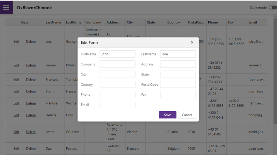
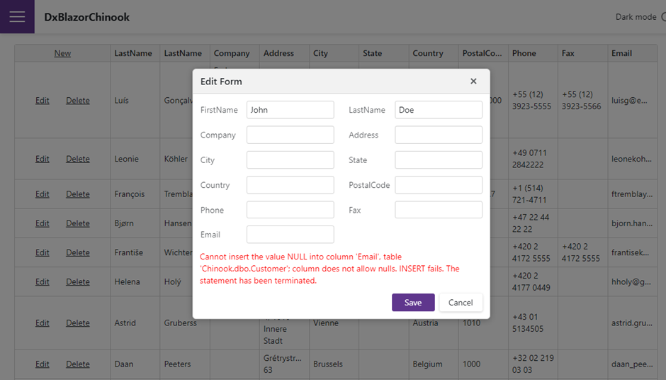
With this in place, we are ready to run the app! The only visual thing that has changed is the error message when one of the validation rules fails.

Under the hood of the app, we have done some serious changes:

  • We have completely decoupled the EF Models from the UI (The blazor app doesn’t need to have any references to EntityFramework packages)
  • The UI is now dealing with DTO Model classes
  • We have server-side validation logic in place

The code for these changes can be downloaded from the Github repo. I have created a separate branch for this.

Make sure to read the next post. I will show you one of the things why Blazor makes me happy. I we'll reduce even more code from the Customers.razor page and add DTO Model (Front-end) validation as well.

Viewing all 398 articles
Browse latest View live


<script src="https://jsc.adskeeper.com/r/s/rssing.com.1596347.js" async> </script>