Quantcast
Channel: ASP.NET Team Blog
Viewing all 398 articles
Browse latest View live

DevExtreme Hybrid Mobile Tools Deprecation in v18.1

$
0
0

Starting with the upcoming major release, v18.1, the DevExtreme hybrid mobile-related tools will be deprecated and placed in to maintenance mode. However, we plan to support creating mobile apps through popular hybrid frameworks, more on this later.

Our hybrid mobile-related tools includes our SPA Framework and Visual Studio Mobile Tools. [Note, that the Knockout integration will not be deprecated and you can continue to use DevExtreme knockout bindings in your apps.]

Maintenance mode means that we'll only fix critical bugs and not introduce any new features. Therefore, we do not recommend starting new projects with the hybrid mobile-related tools.

Why deprecate the hybrid mobile tools?

Here's four main reasons on why we plan to put our hybrid mobile tools in to maintenance mode:

  1. The DevExtreme hybrid mobile tools were great when we first introduced them, however, today there are other popular frameworks that provide similar benefits
  2. It's costly for us to support our hybrid mobile tools due to changes in dependent external tools and vendors
  3. This will free up the team to provide you the tools that you've been asking for
  4. You can replace some of our hybrid mobile tools with modern equivalents that are available today

Rest assured that the DevExtreme brand and tools are doing great and will keep growing. We are only deprecating the hybrid mobile tools.

History

Back in 2011, there was a lack of good hybrid mobile app frameworks that allowed you to build hybrid mobile apps with native looking UI and behavior. To address this market need for mobile, we launched DevExtreme. However, we designed DevExtreme as a product for both mobile (Cordova/ PhoneGap) and desktop web development.

We loved that a client-side framework, based on JavaScript, is flexible and can be used in multiple scenarios. So, we decided to create DevExtreme using several aspects of hybrid web development:

  • UI controls and mobile themes (DevExtreme UI Widgets)
  • App layouts and navigation (DevExtreme SPA Framework)
  • Project seeding (DevExtreme Visual Studio Multi-Channel App Wizard)
  • Debugging and deployment (DevExtreme Visual Studio Mobile Tools)
  • Support the popular jQuery library
  • Support the promising KnockoutJS library

That was many years ago and the landscape for hybrid mobile apps and client-side frameworks has changed.

Current Landscape

Today, there are three dominant client-side UI frameworks that developers are considering when starting a new web app: Angular, React, or VueJS. Yes, there are other frameworks too but they don't have a large userbase.

Let's take a look at some client-side libraries and how they shaped our decision to deprecate our hybrid mobile tools:

1. PhoneGap

Adobe's PhoneGap has been around a long time and it continues to grow with new features and tools. Unfortunately, changes in PhoneGap causes headaches for our DevExtreme customers and the DevExtreme team too because DevExtreme hybrid mobile tools rely on PhoneGap.

Another source of breaking changes affecting DevExtreme is Apple. Randomly, they may change the mobile app acceptance rules, deployment package requirements, or other hybrid mobile app requirement.

Essentially, this causes the DevExtreme team to spend resources fixing external issues rather than providing more value to our customers.

2. Angular

Today, Angular is the most popular framework. It targets Angular developers, has thousands of contributors, and is quite mature now. In short, Angular provides a great framework for desktop web development. However, Angular has made tremendous progress in providing hybrid mobile development too by using tools like the Ionic Framework.

It's also accompanied with a number of useful services for UI design, push notifications, DevOps, and other aspects of hybrid mobile development.

3. React

Facebook's React framework has been gaining popularity for the past few years. They also have a great mobile development framework called React Native. React Native allows you to build mobile apps with a native UI using JavaScript. Developers' experiences with React Native has drastically improved too with the introduction of the Expo toolchain. In fact, the React community is bringing new tools and improvements as it grows.

4. VueJS

VueJS is a young framework but with a rapidly growing community. It's difficult to predict the mobile future of VueJS, but some products such as Quasar or Weex might become mainstream for hybrid or native VueJS mobile development in the future.

5. KnockoutJS

DevExtreme provides deep integration with our controls and KnockoutJS. Unfortunately, there are fewer developers who use KnockoutJS each year.

We'll continue to support KnockoutJS because our integration is mature and it doesn't take many development resources. However, we do not plan to base our tools on KnockoutJS in the future. Instead, we are looking forward to Angular, React, and VueJS tooling.

Mobile Future of DevExtreme

The future looks bright for DevExtreme because in addition to growing our support for more client-side frameworks, we have plans to provide you support to create hybrid mobile apps using other hybrid frameworks and without the deprecated DevExtreme hybrid mobile tools. In a future major release, we're planning to bring you things like Visual Studio wizards, app layouts, and modified mobile themes.

However, you can create mobile solutions today with DevExtreme and a hybrid mobile app framework. For example, you can use the Ionic Framework and integrate the DevExtreme charts or other DevExtreme controls.

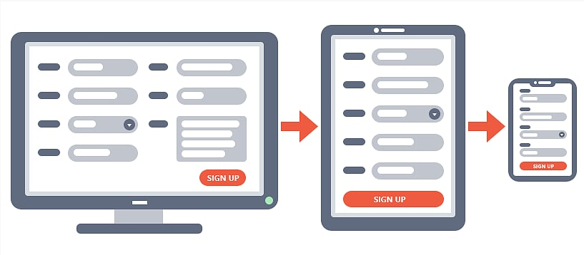
Are you developing a progressive web app (PWA) for both desktop and mobile devices? Then you can seamlessly use rich DevExtreme UI controls in it as well.

Alternative Recommendations

Since our DevExtreme hybrid mobile tools are going in maintenance mode, we've come up with a few possible replacements that are available today. Let's take a look:

  • DevExtreme SPA Framework provides client-side application capabilities such as routing, navigation between views, app layouts, and view rendering and management. The modern frameworks we mentioned above like Angular, React, Vue, Iconic, etc. have these same capabilities out-of-the-box or as a separate npm packages that you can add. In a future major release, we plan to provide you new responsive app layouts that based on these modern frameworks and they will use DevExtreme controls in them. In essence, you'll have a File->New type of project template using Angular, React, etc and it will provide you a way for you to create new responsive web apps with DevExtreme controls.

  • DevExtreme Visual Studio Multi-Channel App Wizard is very useful because it allows you to get started quickly by building you a mobile solution based on your data. This wizard creates an OData web service, then scaffolds a DevExtreme SPA Framework application, and also generates the views based on the new OData service. I'm happy to say that we'll replace this wizard with similar tools that can generate an ASP.NET MVC/Core API back-end and Angular views that will be bound to it.

  • DevExtreme Visual Studio Mobile Simulator represents an in-browser HTML container for modeling real devices using screen size, orientation, and user agent. Google Chrome has a similar built-in feature. Moreover, it also simulates touch events. We recommend switching to Chrome's built-in tool.

  • DevExtreme Visual Studio Mobile View Designer is a tool for visually creating mobile views with DevExtreme controls using drag-n-drop operations. This tool isn't used much according to it our usage statistics and user feedback. Creating views via markup is a common task these days for web developers. We don't have any plans to replace this tool, but if you need, you can find free or commercial tools for mobile app prototyping.

  • DevExtreme Visual Studio Native Packer can create a native app package locally for uploading to Apple App Store, Google Play, and Windows Store. This functionality is available today from the PhoneGap Build service and we recommend using it instead.

  • DevExtreme Visual Studio Courier App is used for remote debugging of DevExtreme hybrid mobile apps by accessing a local web-server from the Internet using your mobile device via an HTTP proxy. These days, you can find several different tools to perform remote debugging of your mobile apps. For instance, if you target React Native, you can use the Expo Client app. If you target Angular then Ionic View is your choice. You can also use the ngrok service to access your localhost remotely. We recommend using one of these other remote debugging tools going forward.

  • DevExtreme iOS and Android Themes mimic native mobile apps appearance and behavior. We are going to replace the Android mobile theme with a modern Material Design one. The iOS mobile theme is going to be substituted with the improved Generic theme that will look very similar.

Wrapping up

So to recap, we are placing the DevExtreme hybrid mobile tools into maintenance mode because:

  • There are many great client-side hybrid mobile app frameworks available today
  • To avoid costly breaking changes and issues with mobile frameworks and vendors
  • DevExtreme will shift focus on providing great UI controls for existing popular client-side and hybrid frameworks

As noted above, we have plans to replace some of these tools so that you can continue to build great UI in your apps that are client-side, hybrid mobile, PWA, etc.

Help us by sharing your mobile strategy with us. Do you plan to develop mobile using one of the following?

  • Responsive website with PWA features
  • Hybrid Ionic
  • React Native app
  • Xamarin
  • Native mobile app
  • Or something else?

Please leave a comment below or email me and your feedback will help us plan for future releases.

Thanks!


Email: mharry@devexpress.com

Twitter: @mehulharry


Now available - The DevExpress NuGet Package Portal: nuget.devexpress.com!

$
0
0

Check out our new portal for everything related to DevExpress NuGet packages:

nuget.devexpress.com

This new DevExpress NuGet portal will give you helpful information like getting started, resolving issues, using NuGet without an IDE, etc.

Get Your Personal NuGet URL

We're providing a personal NuGet URL for every registered DevExpress customer login. So if you haven't generated your personal URL yet then click on the 'Obtain Your NuGet Feed URL' button on the this homepage:

More Platforms Supported

In 2017, DevExpress provided several NuGet packages (mostly for our Web platforms). Today, we're expanding this offering to include in even more platforms:

.NET Core & Free Trial

I'm happy to announce that we're also offering our .NET Core controls via NuGet. Now you can try our .NET Core products on any platform: Windows, Mac OS, or Linux. You can also use an IDE of your choice: Visual Studio, Visual Studio Code, Visual Studio for Mac, or JetBrains Rider:

The following support .NET Core:

If you have a DXperience Universal license then you'll see these .NET Core packages in your NuGet feed. If not, then we have a free 30 day trial available for you, whether you are a customer or not. That means you get access to all the NuGet packages we make available, as a trial for 30 days.

Note, that if you are a customer without DXperience Universal license then you can try NuGet packages that are not included in your DevExpress subscription currently with this free 30 day trial. And during your trial, you'll have access to our excellent support team.

Getting started

I recommend reading this blog post to learn how get your NuGet key.

FAQ

We've gathered the most popular issues that our customers have reported and created a helpful FAQ:

These topics can help you to get started, solve possible problems, and get additional information about DevExpress NuGet.

Are you using the DevExpress NuGet packages? Please leave a comment below (or email me) and your feedback will help us plan for future releases.

Thanks!


Email: mharry@devexpress.com

Twitter: @mehulharry

DevExtreme - Access v18.1 Features Today for Early Testing

$
0
0

While the DevExtreme team is working hard on new features for the v18.1 final release, they've been publishing several pre-releases on GitHub.

We'd love to get your feedback, so please get involved by downloading, testing, and letting us know your experience.

DevExtreme v18.1 Pre-releases

Note: This is pre-release software, so please, consider yourself warned.

Early Testing

Many of the v18.1 upcoming features are inspired by existing/reported customer issues. By providing early build access, we'd like to know if our solution will address the problem or if the scope of the problem is bigger than we originally thought.

Your testing and feedback can help us to change and deliver the final implementation. As you know, the best time to fix or improve source code is before the final RTM release. This way, we can avoid future unexpected breaking changes that may creep in.

So please get involved because taking part in early testing results provides several benefits such as:

  • Confidence that feature implementation fits your application specifics;
  • Fewer breaking changes after the final release (because we'll include fixes before the next major release);
  • Increase overall product quality;
  • Align team efforts with customer needs;

How to test?

If you'd like to test out the features in your application then follow the installation instructions from that release description.

Look through the releases page (pre-releases are marked with a special red label). The release will have a short "what's new" section.

Alternatively, you can use the feature list available for alpha testing. Feel free to leave comments, report GitHub issues, or create tickets in our Support Center.

The DevExtreme pre-release documentation is also available here: https://js.devexpress.com/Documentation/18_1/

Note: Some parts of DevExtreme (ASP.NET MVC Controls, Visual Studio Tools, etc.) are not developed in the DevExtreme GitHub repo. However, you'll be able to download our pre-release installations. We'll notify you once we have something to show for these other pieces that are not available via GitHub.

DevExtreme Roadmap

To provide transparency with our DevExtreme customers, we'll be publishing a DevExtreme 2018 roadmap on https://js.devexpress.com soon. Because the client-side web world is notorious for changing drastically in a short period of time, we plan to update this new roadmap as needed.

A public roadmap helps you to understand our vision for certain solutions.

DevExtreme targets several platforms such as jQuery, Angular, React, Vue, ASP.NET MVC, and likely more in the future. DevExtreme is no longer one single repository but several that are developed simultaneously in many public and private repos. Therefore, the roadmap will include links to feature discussion pages (mostly on GitHub) where you can leave your feedback and discuss your questions directly with the DevExtreme developer team.

To see what's coming out in 2018, then vote on your favorite features, and finally to get updates on our progress, here's what I recommend:

  1. Go to the recently publishedDevExtreme 2018 Roadmap. This is a styled as a survey to allow you to vote on our proposed upcoming features. Your votes are important to us so please go to the link above and give us your feedback.
  2. Then, check back regularly on the roadmap on the DevExtreme website for updates.

Subscribe and Get Notified

The best way to stay current with DevExtreme is to get notifications. There are lots of options that you can choose from too:

  • Subscribe to DevExtreme social networks accounts (we'll announce each pre-release)
  • Subscribe to GitHub Releases RSS feed
  • Use specialized notification services

Try the latest DevExtreme pre-release version and please give us your feedback, thanks!


Email: mharry@devexpress.com

Twitter: @mehulharry

DevExtreme ASP.NET Core Templates Deprecation for VS2015 - v18.1

$
0
0

Starting with the v18.1 release, the DevExtreme ASP.NET Core project templates will not be available in instances of Visual Studio 2015. You'll need to have Visual Studio 2017 or higher to use these templates.

Here's why:

  1. In Visual Studio 2015, only the .NET Core projects based on project.json are supported. However, these projects have been replaced with the MSBuild/csproj (see announcement).

  2. The .NET Core Tooling for Visual Studio 2015 is still in the 'preview' stage and will not be developed further.

Therefore, you will not be able to create new DevExtreme ASP.NET Core projects in Visual Studio 2015. You can still open and work with existing projects. However, for creating new projects, you will need Visual Studio 2017 (or higher).

Workaround

If you don't have Visual Studio 2017 installed then you can use the following workaround:

  1. Create a new standard ASP.NET Core application
  2. Then manually add DevExtreme resources

However, I don't recommend using project.json for new projects.

There is also a free community edition of Visual Studio 2017 available too.

Please leave me a comment below if you doing any ASP.NET Core development in Visual Studio 2015. Thanks!


Email: mharry@devexpress.com

Twitter: @mehulharry

Access v18.1 of DevExpress ASP.NET Web Controls Today - v18.1 CTP Available

$
0
0

The official v18.1 release of the DevExpress ASP.NET tools is only weeks away. And our developers will continue to work hard until we reach the 'code freeze' date. However, they want to get your feedback on features and controls that they've developed so far.

Today, we're making available a special v18.1 CTP (community technology preview) that includes new controls and features. This release includes all the DevExpress ASP.NET line of controls for ASP.NET WebForms, MVC, Bootstrap WebForms, and Bootstrap Core.

However, it does not include all of the features and controls that will be part of the official v18.1 release. Hey, we have until code freeze date to finish those features.

Note: This is pre-release software, so please, consider yourself warned.

What's Included

There's a ton of new features and some new controls too. Each item below is either linked to an online demo or a corresponding support ticket that describes the feature.

Here's what's included in this v18.1 CTP:

DevExpress ASP.NET WebForms and MVC

Let's start with the classic ASP.NET WebForms and MVC controls:

RichEdit

The DevExpress ASP.NET RichEdit control for ASP.NET WebForms and MVC is getting these excellent new features:

Spreadsheet

The DevExpress ASP.NET Spreadsheet control for ASP.NET WebForms and MVC is adding:

ListBox, ComboBox, TokenBox

FormLayout

TabControl/PageControl

DevExpress ASP.NET Bootstrap for ASP.NET Core

The DevExpress Bootstrap ASP.NET Core GridView controls gets the following enhancements:

We're also adding these new controls and a new way to work with our client-side API:

DevExpress Bootstrap ASP.NET WebForms

The DevExpress ASP.NET Bootstrap controls for ASP.NET WebForms is enhancing the three controls and adding a new one:

GridView

FormLayout

ListBox

New control

Download

Download the v18.1 CTP here: v18.1 DevExpress ASP.NET CTP - Installer

Please note that the v18.1 CTP installer can only be installed in trial mode. This CTP will not be necessary (or available) after the official release.

The DevExpress ASP.NET Bootstrap controls for ASP.NET Core are only available via NuGet packages and you can download those here: NuGet - v18.1 DevExpress ASP.NET Core CTP

Try the latest DevExpress ASP.NET v18.1 CTP and please give us your feedback, thanks!


Email: mharry@devexpress.com

Twitter: @mehulharry

New Client-Side API - DevExpress Bootstrap ASP.NET Core Controls (coming soon v18.1)

$
0
0

In the next major release, v18.1, we've updated the client-side API format for all DevExpress Bootstrap ASP.NET Core controls. The changes in the API make it more intuitive and will improve your development experience.

Let's see what is changed.

camelCase Methods

Camel case (stylized as camelCase ...) is the practice of writing compound words or phrases such that each word or abbreviation in the middle of the phrase begins with a capital letter, with no intervening spaces or punctuation. -Wikipedia

In JavaScript, it's common to use lower camel case for method names where the first letter is lowercase. Therefore, all methods that were previously written like this:

GetItem()
GetEnabled() / SetEnabled()
GetIconCssClass() / SetIconCssClass()
GetText() / SetText()
GetVisible() / SetVisible()

Starting with v18.1, they'll now use camelCase:

getItem()
setEnabled() / getEnabled()
setIconCssClass() / getIconCssClass()
setText() / getText()
setVisible() / getVisible()

Event Handling

There's big changes in event handling because with the v18.1 release, we're making it easier to work with event handlers.

For example, let's say that you want to handle the client-side Init and Click events of the DevExpress Bootstrap ASP.NET Core Button control. Then you would use the following JavaScript functions as handlers for the respective events:

function onButton1Init(s, e) {
   // ...
}
function onButton1Click(s, e) {
   // ...
}

This improves on the old way of declaring functions and then attaching the handlers for events:

button1.Init.AddHandler(onButton1Init);
button1.Click.AddHandler(function(s, e) {
   // s - sender = button1;
   // ...
});
button1.Click.AddHandler(onButton1Click);

New Functions: 'on', 'off', & 'once'

New for the v18.1 release, is the ability for every control to provide the on function. The on function accepts an event name and a handler function:

on = function (eventName, handler){
...
   return this;
}

These new functions return the object they're called on, and so calls to them can be chained. This allows you to write fluent syntax to assign event handlers:

button1
   .on('init', onButton1Init)
   .on('click', function(args) {
       // this - sender = args.sender = button1
       // ...
   })
   .on('click', args => { // es6 or TS
       // this - external context;
       // args.sender = button1
       // ...
   })
   .on('click', onButton1Click);

Detach with 'off'

There's also a corresponding off function that allows you to detach handlers:

button1
   .off('init', onButton1Init)
   .off('click', onButton1Click);
button1
   .off('init', onButton1Init)
   .off('click'); // remove all handlers for the click event
button1
   .off() // remove all event handlers

'once' Function

We also added the once function that is identical to the on function above, except that the handler will be removed after its first invocation.

JavaScript Promises

Also with the v18.1 release, we will provide overload functions that return JavaScript Promises for callback methods, e.g. BootstrapGridView.performCallback(). So without promises, we would use this approach:

grid.performCallback('myParameter', function (result) {
    // This callback function will be executed when the result comes from the server
    // The 'result' argument is a value received from the server
    console.log(result);
});

By using JavaScript Promises then we can write fluent code instead:

grid.performCallback('myParameter')
    .then(function (result) {
       // The 'result' argument is a value received from the server
       console.log(result);
    } );

If you use async/await syntax (supported in ECMAScript 2016+), then the code can be simplified:

// The `result` argument is a value received from the server
let result = await grid.performCallback('myParameter');
console.log(result);

VS IntelliSense

Last, but not least, with the official 18.1 release, we will provide type definitions for the new client-side API so that you get IntelliSense in Visual Studio.

Old API Still Available

The old client-side API has been marked as deprecated in the v18.1 release (and beyond). However, it has not been removed from v18.1. I recommend using the new API in your projects, but there is no need to change the current applications immediately.

Rest assured that you'll be able to upgrade to v18.1 and get all these great changes without your previous client-side code breaking.

Try v18.1 CTP Today

You can access the v18.1 CTP of the DevExpress Bootstrap for ASP.NET Core via NuGet:

Use the https://nuget.devexpress.com/early-access/api NuGet feed to install the DevExpress.AspNetCore.Bootstrap package.

Or use the following dotnet CLI command to install the controls:

dotnet add package DevExpress.AspNetCore.Bootstrap -s https://nuget.devexpress.com/early-access/api -v 18.1.2-pre-18082

Learn more about the limited time v18.1 CTP here.

Feedback

Your feedback is valuable to us. For these new changes to the Client-Side API, we've created a support ticket where I'd love for you to give us your input: T620627

Thanks!


Email: mharry@devexpress.com

Twitter: @mehulharry

ASP.NET MVC Query Builder - (coming soon in v18.1)

$
0
0

Use the powerful DevExpress Query Builder with your DevExpress ASP.NET MVC controls, starting with the v18.1 release!

The Query Builder component allows an end-user to visually build queries using our UI controls. This saves the end-user from learning and writing SQL statements. Once the queries are built, you can then apply those queries on existing DevExpress controls like the ASP.NET MVC GridView. This puts the power of ad-hoc querying in your end-users control.

Here's a screenshot of the MVC Query Builder control, click on the image for a larger version:

The Query Builder was first introduced as part of our XtraReports' Web Report Designer and then was released as a separate control for ASP.NET Web Forms. Many of you have requested this as an independent control for ASP.NET MVC and now it's available in v18.1 release.

Features

We've packed a ton of great features in the DevExpress ASP.NET MVC Query Builder:

  • The database schema is automatically obtained and displayed within the QueryBuilder's UI. You can also customize the database schema at runtime by implementing a custom schema provider to reduce the list of tables and views available for an end-user
  • Relationships between tables are automatically resolved based on foreign keys
  • An enhanced filter editor features the Advanced Mode allowing you to specify a filter string manually instead of using a visual editor. The code completion is available
  • Ability to visually shape retrieved data (sort, group and filter), which automatically edits 'ORDER BY', 'GROUP BY' and 'WHERE' query clauses
  • Ability to use the 'SELECT DISTINCT' clause
  • Aggregation of columns’ data
  • Preview entire SELECT statement
  • Preview the Query execution results

How do you plan to use the Query Builder in your ASP.NET MVC projects? Drop me a line below.

Thanks!


Email: mharry@devexpress.com

Twitter: @mehulharry

ASP.NET & MVC Spreadsheet - New Client-side API and Reading View (v18.1)

$
0
0

Customers of the DevExpress ASP.NET Spreadsheet control have given us some great feedback about their particular use case scenarios. We've taken this feedback and enhanced the DevExpress ASP.NET Spreadsheet control in the next major release, v18.1. It'll be available for both the DevExpress ASP.NET WebForms and ASP.NET MVC versions of the Spreadsheet control.

Client-side API

Many of the customer use cases that we investigated involved issues with editing the Spreadsheet's cells. To address these scenarios, we've added several client side methods and events to the ASPxClientSpreadsheet object:

  • CellBeginEdit Event - Occurs before the cell editor is opened.
  • CellEndEdit Event - Occurs before the cell editor is closed and the entered value is committed.
  • CellCancelEdit Event - Occurs before the active cell's editor is closed and the entered value is rolled back.

These three help you to manage when the cell begin, end, or cancel cell editing events are invoked. There are also event parameters that allow you to identify a cell element (column and row position), its value, entered formula (if any) and the name of the sheet on which the editing cell is located.

We've also added client side methods that allow you to process the data input programmatically:

  • ApplyCellEditing Method - Applies a value stored within the editor to the active cell.
  • CancelCellEditing Method - Cancels editing of the active cell.
  • SetCellEditorText Method - Specifies an editor's value of the edited cell.

These methods can be used for implementing scenarios like custom client side validation, update external controls, or implement a complex scenario such as a "Custom in-place editor".

Custom In-Place Editor

Previously, you were limited to only a couple of editors that we provided but with these enhancements to the DevExpress ASP.NET Spreadsheet, you can use any control for editing the cell value:

We've also added several client side methods that allow you to get the Spreadsheet's properties such as the current sheet name and rendered cell coordinates. For a full list of the client-side methods, properties, and events please take a look our documentation on the ASPxClientSpreadsheet's members.

Reading View Mode

Before v18.1, the Spreadsheet control had only one mode/view: Editing. By default, all the editing features were enabled for the document loaded into the control. Editing could be restricted using the document protection feature or the Spreadsheet ReadOnly property.

I'm happy to say that we're introducing a new mode for the Spreadsheet: Reading View.

When this mode is on, the document opened inside the control cannot be modified by the end user. The built in ribbon is transformed into a special toolbar that has a lightweight render compared to the “classic” ribbon. This mode is handy for mobile devices or in the scenarios when the Spreadsheet is used mainly for viewing data instead of editing.

The Reading View can be turned on using the built-in ribbon button or using the new client and server side API (SetViewMode Method). We've also added the ViewModeChanged event to give you even more control of the Spreadsheet when the view mode changes.

If you need more room for the Reading View then you can customize the toolbar or even hide it to provide more space for document content on small screens.

Are you looking forward to any of these ASP.NET Spreadsheet enhancements? Drop me a line below.

Thanks!


Email: mharry@devexpress.com

Twitter: @mehulharry


DevExtreme Charts - Client-side Data Aggregation (v18.1)

$
0
0

Data aggregation in charts in an important feature and in the v18.1 release, we've significantly improved it. Let me explain.

These days with big data, data aggregation is important to organizations in many areas such as statistics, data analytics, planning, business strategies, etc. Data aggregation's main goal is to visualize large amounts of data in a more readable form.

The DevExtreme Chart widget has been providing data aggregation for several releases. However, the feature wasn't very flexibile because you could not:

  • choose the aggregate function because only the median filter was available
  • change the aggreagtion intervals or configure aggregation differently for each series. In fact, all you could do is turn the feature on/off for the entire chart.

Here's what it looked like prior to v18.1:

 $("#chart").dxChart({ 
    dataSource: dataSource, 
    useAggregation: true, 
    ...     
    series: [{}] 
});

Improved Data Aggregation

In v18.1, we completely reworked the data aggregation feature to address these issues and expand its capabilities.

Now you can:

Here's how easy it to set a custom aggregation method with DevExtreme charts in v18.1:

$("#chart").dxChart({
   dataSource: dataSource,
   ...
   series: {
      valueField: "carCount",
      aggregation: {
      enabled: true,
      method: "max"
      },
   ...
   }
}); 
  • specify different aggregation methods for different series

$("#chart").dxChart({
    dataSource: dataSource,
    ...
    series: [{
        valueField: "dailyIndex",
        aggregation: {
            enabled: true,
            method: "avg"
        },
        ...
    }, {
                valueField: "monthlyIndex",
                ...
    }]
}); 

Use Synthetic Data Objects

Using a custom aggregate function, you can generate synthetic data objects for a series based on real data objects from the data source, as it is done in the following example for the range area series:

$("#chart").dxChart({
    dataSource: dataSource,
    ...
    series: [{
        type: "rangeArea",
        rangeValue1Field: "minTemp",
        rangeValue2Field: "maxTemp",
        aggregation: {
            enabled: true,
            method: "custom",
            calculate: function (aggregationInfo, series) {
                if (!aggregationInfo.data.length) {
                    return;
                }
                var temp = aggregationInfo.data.map(function (item) { return item.temp; }),
                    maxTemp = Math.max.apply(null, temp),
                    minTemp = Math.min.apply(null, temp);
                return {
                    date: aggregationInfo.intervalStart,
                    maxTemp: maxTemp,
                    minTemp: minTemp
                };
            }
        },
        ...
    },
    ...
    ]
});

Manage Interval Length

We also provided the capability to manage the length of aggregation intervals. You can specify the length in pixels using the aggregationGroupWidth option or in axis units using the aggregationInterval option.

$("#chart").dxChart({
    dataSource: dataSource,
    argumentAxis: {
        argumentType: "datetime",
        aggregationInterval: "month"
    },
    ...
    series: {
        valueField: "carCount",
        aggregation: {
            enabled: true,
            method: "avg"
        },
        ...
    }
});

Are you looking forward to the improved data aggregation capabilities of the DevExtreme Charts? Drop me a line below.

Thanks!


Email: mharry@devexpress.com

Twitter: @mehulharry

DevExpress ASP.NET - Adaptive FormLayout v18.1

$
0
0

With all the varying sizes of screens that your ASP.NET websites may run on these days, we've added a great new feature to help you display your forms on multiple devices.

In the next major release, v18.1, the DevExpress ASP.NET and MVC FormLayout control ships with a new mode that allows you to create adaptive layouts with different column counts. So once you enable it, the FormLayout's elements will automatically reflow based on the editor size. This allows you to create, for example, a two-column layout for narrow screens and a three-column layout for wider screens:

Custom Layouts

You will be able to customize your grid layout depending on the FormLayout size. Attached is an example that demonstrates three layouts, but the number of possible variants is not limited. You can create different layouts for each of your devices, if necessary. Column and row spans are also fully supported.

Our R&D team worked hard to make this more powerful, fast and flexible. Let me describe how to create a layout required for your application, and show how this mode works.

1. Create General Layouts

Let's say that I want to create three different layouts that would allow me to display all form editors in different columns based on the screen width:

  1. 0px to 700px width - two columns
  2. 701px to 1100px width - three columns
  3. 1101px to 3000px width - four columns

First, encapsulate all the editors in one LayoutGroup and populate the LayoutGroup.GridSettings.Breakpoints collection with LayoutBreakpoint items:

[ASPx]<dx:ASPxFormLayout runat="server" id="MyFormLayout" width="100%"><Items><dx:LayoutGroup Width="100%" Caption="Registration form"><GridSettings StretchLastItem="false"><Breakpoints><dx:LayoutBreakpoint MaxWidth="700" ColumnCount="2" Name="XS" /><dx:LayoutBreakpoint MaxWidth="1100" ColumnCount="3" Name="M" /><dx:LayoutBreakpoint MaxWidth="3000" ColumnCount="4" Name="XL" /></Breakpoints></GridSettings>
...

The LayoutBreakpoint.ColumnCount property sets how many columns the LayoutGroup should display until the FormLayout reaches the LayoutBreakpoint.MaxWidth property value. The Name property is a unique Breakpoint identifier. It will be used later.

2. Customize Column/Row Spans

Now we can customize the column and row spans for every LayoutItem. For the 'First name' item, I want it to occupy two cells in a row when the LayoutGroup aligns items in two columns. Then, I want the item to occupy three cells in a row when the LayoutGroup aligns items in three columns. And finally, I want the item to occupy two cells in a row again when the LayoutGroup aligns items in four columns.

No row span is required: the item is placed only within its own row. Here's the resulting SpanRules:

[ASPx]<dx:LayoutItem Caption="First name" VerticalAlign="Middle"><SpanRules><dx:SpanRule ColumnSpan="2" RowSpan="1" BreakpointName="XL"></dx:SpanRule><dx:SpanRule ColumnSpan="3" RowSpan="1" BreakpointName="M"></dx:SpanRule><dx:SpanRule ColumnSpan="2" RowSpan="1" BreakpointName="XS"></dx:SpanRule></SpanRules>
 ...

Note that I used the SpanRule.BreakpointName property to bind each SpanRule to a corresponding group layout (use the values that are set in LayoutBreakpoint.Name properties). For brevity, I skipped several items, because they are customized in a similar way. However, you can find the details in the attached project below.

The next one is an item with a RatingControl. I want the item to occupy one cell in a row, but two cells in a column when the LayoutGroup has three or four columns. Then I want the item to occupy one cell in a row and one cell in a column when the LayoutGroup has two columns. Here's the resulting SpanRules:

[ASPx]<dx:LayoutItem Caption=" " VerticalAlign="Middle"><SpanRules><dx:SpanRule ColumnSpan="1" RowSpan="2" BreakpointName="XL"></dx:SpanRule><dx:SpanRule ColumnSpan="1" RowSpan="2" BreakpointName="M"></dx:SpanRule><dx:SpanRule ColumnSpan="1" RowSpan="1" BreakpointName="XS"></dx:SpanRule></SpanRules>
...

Finally, an item with a Button. I want the Button to occupy one cell when the FormLayout is wide:

[ASPx]<dx:SpanRule ColumnSpan="1" RowSpan="1" BreakpointName="XL"></dx:SpanRule><dx:SpanRule ColumnSpan="1" RowSpan="1" BreakpointName="M"></dx:SpanRule>

However, when the FormLayout becomes narrow, the Button should occupy the entire row. Since the LayoutGroup has only two columns when the FormLayout width is less than 700px:

[ASPx]<dx:LayoutBreakpoint MaxWidth="700" ColumnCount="2" Name="XS" />

I add the following SpanRule to the LayoutItem settings:

[ASPx]<dx:SpanRule ColumnSpan="2" RowSpan="1" BreakpointName="XS"></dx:SpanRule>

The default value of ColumnSpan and RowSpan properties is 1. I explicitly added them to markup to illustrate this.

Now take a look at the GridSettings.StretchLastItem setting. If GridSettings.StretchLastItem is enabled and there is some free space after the last item in a row, the last item will be stretched to the row's end.

IMPORTANT NOTE: If you add custom content inside a LayoutItem then please make sure that it is responsive. Unresponsive content prevents an item from collapsing and the adaptive grid layout may appear to be broken.

3. Wrap Captions

You can also have the caption location wrap around the control when there is not enough space to display it next to the control. You can see this behavior in the top gif animation above. Initially, the captions are located to the left of the control when there is enough space. However, once we resize and reach our breakpoints, the caption move above the control.

The GridSettings.WrapCaptionAtWidth property allows you control this behavior.

4. Default Breakpoint

One last piece of info you should be aware of is the default breakpoint. For example, let's say we have the following breakpoints setup:

[ASPx]<Breakpoints><dx:LayoutBreakpoint MaxWidth="500" ColumnCount="1" Name="S" /><dx:LayoutBreakpoint MaxWidth="800" ColumnCount="2" Name="M" /></Breakpoints>

We have an S breakpoint for the 0px - 500px FormLayout width and the M breakpoint for the 501px - 800px width. But if your FormLayout has the width is larger than 800px, the default breakpoint will work. It's possible to set the ColumnCount property for this breakpoint at the LayoutGroup level (or at the FormLayout level):

[ASPx]<dx:LayoutGroup Width="100%" Caption="Registration Form" ColumnCount="3">

And specify the ColumnSpan/RowSpan properties at the LayoutItem level:

[ASPx]<dx:LayoutItem Caption="City" VerticalAlign="Middle" ColumnSpan="2">

Download Sample

Download and run the attached sample project to evaluate this new responsive mode on your local development machine.

Over the last few years, we've steadily provided many responsive and adaptive features to keep our ASP.NET controls modern and up with latest trends. In fact, in the last release (v17.2), we added adaptive support to our Popup control.

We'd love to hear your feedback about the FormLayout control's new Adaptive features and API. Please leave a comment below or contacting our support team if you've got some longer feedback.

Thanks!


Email: mharry@devexpress.com

Twitter: @mehulharry

DevExpress ASP.NET TabControl, PageControl - Tab Swipe (v18.1)

$
0
0

Over the last few years, we've added many responsive and adaptive features to keep our ASP.NET controls modern and relevant with the latest trends. In fact, in the last release (v17.2), we added adaptive support to our Popup control and in this release, we've added Adaptive features to our FormLayout control.

Well, now there's a new feature for the DevExpress ASP.NET TabControl and PageControl that improves usability on mobile devices. Both of these controls now allow for using touch swipe gestures to scroll tabs:

Touch gestures improve user experience on mobile devices. Now your website visitors do not need to tap on small tab arrows. They can just swipe on the tabs.

This feature is available with the DXperience v18.1 release and you can use it with either the DevExpress ASP.NET WebForms or ASP.NET MVC controls.

EnableTabScrolling

To enable this feature, set the EnableTabScrolling setting to true and your end-users will see the tab scroll buttons.

Then, the Tab swipe support is enabled automatically on touch devices.

Download Sample

Test this feature today on your local machine by downloading the attached sample project:

We'd love to hear your feedback about the Tab swipe support. Please leave a comment below, thanks.


Email: mharry@devexpress.com

Twitter: @mehulharry

DevExpress ASP.NET Spreadsheet, RichEdit - Scalability - Amazon Web Services & Azure (v18.1)

$
0
0

Last year, a few customers reported to us the lack of scalability in the DevExpress ASP.NET RichEdit and Spreadsheet controls. These rich controls tend to be larger in memory footprint but the real issue was that they did not work on scalable environments like Microsoft Azure and Amazon Web Services.

After investigating, we figured out a great solution which we released as new feature called: 'stateless mode'. We released this feature in the v17.2 release as a CTP (community technology preview). I recommend that you read the blog post to learn more about 'stateless mode':

Scalability of ASP.NET Office Controls - Azure, Web Gardens, Farms, & Cloud Support (CTP - v17.2)

After releasing the CTP, we've received your feedback and have resolved several issues related to 'stateless mode'. Our customers also confirmed that the new feature helps to solves all the usage scenarios we targeted. Therefore, we're now taking it out of CTP and providing the final version in the v18.1 release. But wait, there's more...

Amazon Web Services

Our initial CTP only supported Microsoft Azure. I'm happy to announce that we now support both Microsoft Azure and Amazon Web Services for scalability!

How to enable it?

To turn on the new feature, set the desired document provider in your project's Global.asax file:

void Application_Start(object sender, EventArgs e) {
    ...
    var provider = new DevExpress.Web.SqlOfficeStateProvider.SqlOfficeStateProvider(connectionString);
    // or
    //var provider = new DevExpress.Web.RedisOfficeStateProvider.RedisOfficeStateProvider(connectionString);
    DevExpress.Web.Office.DocumentManager.StateProvider = provider;
    ...
}

In the sample code above, the connectionString refers to the connection string for your storage.

GitHub Sample

To help you test this, we've created and published a sample repo on GitHub:

https://github.com/DevExpress/aspnet-office-solutions

This repo consist of several solutions and projects:

  • Document state providers:
    • RedisOfficeStateProvider - Redis using document state provider
    • SqlOfficeStateProvider - SQL Server using document state provider
  • New solutions examples for Amazon Web Services:
    • AWS-SqlOfficeStateProvider-Starter - Amazon Web Services solution example using the SqlOfficeStateProvider
    • AWS-RedisOfficeStateProvider-Starter - Amazon Web Services solution example using the RedisOfficeStateProvider

Learn more details on the repo's Readme file.

Logify

Last year we released a new exception logging tool called Logify. If you're using the DevExpress ASP.NET RichEdit and Spreadsheet controls in a scalable evironment like Microsoft Azure then consider also using Logify for exception reporting. We've tested our ASP.NET controls on Microsoft Azure and Logify works handles exception reporting seamlessly.

https://logify.devexpress.com/

Give Us Your Feedback

Are you excited by the DevExpress Office Controls support for scalability? Drop me a line below.

Thanks!

Email: mharry@devexpress.com

Twitter: @mehulharry

ASP.NET & MVC - Rich Editor Control Enhancements (v18.1)

$
0
0

The DevExpress ASP.NET RichEditor is getting some useful end-user enhancements for the v18.1 release. Many of these features below came as a direct result of your (customer) feedback, so thank you. The features are available for both ASP.NET WebForms and MVC versions of the RichEdit too. Let's take a look...

Table of Contents

With this release, we've added support for interactive table of contents. End-users can now move to a specific position within a document instantly. Several types of tables are supported:

  • Table of Contents
  • Table of Figures
  • Table of Tables
  • Table of Equations

You can add/update tables and mark their entries using the Rich Editor's Ribbon UI. Our new API offers numerous options to manage interactive tables.

Test drive the online demo then take a look at the documentation to learn more.

AutoCorrect

Our ASP.NET Rich Text Editor also ships with an AutoCorrect feature that helps you to fix capitalization errors, create numeric lists, hyperlinks and emails, as well as automatically insert symbols and other pieces of text.

You can enable the built-in AutoCorrect feature using the following server-side properties:

  • CorrectTwoInitialCapitals - specifies whether the control should correct words that start with two capital letters by changing the second letter to lowercase
  • DetectUrls - specifies whether the control should detect URI strings and format them as hyperlinks
  • EnableAutomaticNumbering - specifies whether the control should automatically start numbered or bulleted lists when the specific symbols are typed
  • ReplaceTextAsYouType - specifies whether the control should search a replacement for the typed string in the AutoCorrectReplaceInfoCollection collection

Try out the online demo and learn more by reading documentation.

Table AutoFit

A Table in the RichEdit control can now automatically resize columns to fit to its content width or extend to the width of the document window:

Input Method Editor Support (IME)

We've also added support for your end-users to use an Input Method Editor (IME). An IME allows you to use a Latin-based keyboard to enter Japanese, Chinese, Korean, and Tigrinya symbols. The IME is enabled when an end-user switches the desktop key input to a supported language:

Stateless Mode

With our new stateless option, you can use the DevExpress ASP.NET RichEdit control in scalable environments (cloud, web farms, etc). Learn more about this new feature by reading this blog post.

Give Us Your Feedback

Are you excited by the DevExpress ASP.NET RichEdit's new features? Drop me a line below.

Thanks!


Email: mharry@devexpress.com

Twitter: @mehulharry

ASP.NET Bootstrap Core - CLI Templates for ASP.NET Core

$
0
0

The .NET Core command line interface (CLI) allows you to create new projects directly from the console.

We're introducing a set of CLI templates that you can use to create starter cross-platform projects with DevExpress ASP.NET Bootstrap and Dashboard Controls.

This means that you can create ASP.NET Core projects with DevExpress controls on your MacOS, Linux, or Windows consoles!

Install DevExpress CLI templates

Get started by first installing the DevExpress CLI templates. Type the following command in your console:

dotnet new -i "DevExpress.DotNet.Web.ProjectTemplates::\*"

When the template installation command is finished, it will display a list of installed templates on your machine:

You can also run the dotnet new --list command to see this list.

Create new projects

You are now ready to create an ASP.NET Core project with DevExpress controls. Since ASP.NET Core projects mainly use packages, you'll need to use our NuGet packages which are available via the DevExpress NuGet portal.

To get your NuGet feed, please refer to the https://nuget.devexpress.com/#feed-url page.

Note, our templates have one required parameter - feed-{url} (the refers to your personal DevExpress NuGet feed).

You'll need to specify this parameter for creating new projects. For example, if you want create a new project that uses the DevExpress Bootstrap Controls for ASP.NET Core then use the following command:

dotnet new dx.bootstrap -nuget-feed https://nuget.devexpress.com/{auth_key}/api

To create a project with our dashboard:

dotnet new dx.dashboard -nuget-feed https://nuget.devexpress.com/{auth_key}/api

Use -h flag to get a full list of the different parameters on our new CLI commands:

To see list of available functionality that manage of template parameters, use the -h flag:

dotnet new dx.bootstrap -h
dotnet new dx.dashboard -h

Take a look at this video that shows our CLI templates in action:

Learn more

Our new DevExpress CLI templates support ASP.NET Core v2.0 and higher.

Learn more about Microsoft ASP.NET Core CLI by following this getting started guide.

Give Us Your Feedback

What do you love about working with ASP.NET Core CLI templates? Drop me a line below.

Thanks!


Email: mharry@devexpress.com

Twitter: @mehulharry

ASP.NET Core Bootstrap - New Controls (v18.1)

$
0
0

The DevExpress ASP.NET Bootstrap controls for ASP.NET Core is introducing several new controls with our latest release.

These controls are fantastic because they support Bootstrap out-of-the-box and can be run from multiple platforms (MacOS, Linux, & Windows)! Let's take a look.

New ASP.NET Core Bootstrap CardView Control

ASP.NET Core Bootstrap CardView Control

v18.1 ships with our new ASP.NET Card View control for Bootstrap Core. Its features include:

ASP.NET Core Bootstrap CardView Control

Demo

New ASP.NET Core Bootstrap Scheduler Control

v18.1 ships with our new ASP.NET Bootstrap Scheduler control. Its features include:

ASP.NET Core Bootstrap Scheduler Control | DevExpress

Demo

New ASP.NET Core Bootstrap FormLayout Control

Our new Bootstrap ASP.NET Core Form Layout Control allows you to eliminate the restrictions and time consuming limits associated with pixel-based form design.

The Form Layout control supports data binding. You simply bind the Form Layout control to a data source and specify which fields are to be displayed. It is also adaptive, which it makes it possible to use on any device:

ASP.NET Core Bootstrap FormLayout Control | DevExpress

Demo

New ASP.NET Core Bootstrap Sparkline Control

The DevExpress Bootstrap Sparkline control allows you to display a single series chart within containers such as our Grid control. Its features include:

Demo

ASP.NET Core Bootstrap Data Editors

ASP.NET Core Bootstrap Upload Control

The DevExpress Bootstrap Upload Control allows end-users to upload files to the server via the browser. End-users can select a file by invoking the standard Open File dialog or by dragging the file to the Upload control.

Demo

ASP.NET Core Bootstrap TagBox

Our Bootstrap Tag Box control allows users to select values from a drop-down list or to enter them manually.

ASP.NET Core Bootstrap TagBox | DevExpress

Demo

ASP.NET Core Bootstrap Time Editor

The DevExpress Bootstrap Time Edit control allows you to display and edit date-time values. End-users can modify values by typing directly into the edit box or clicking spin buttons to increment or decrement months, days, hours, minutes or seconds.

ASP.NET Core Bootstrap Time Editor | DevExpress

Demo

Navigation

New ASP.NET Core Bootstrap Toolbar

The ASP.NET Core Bootstrap Toolbar Control allows you to supply your web application with a lightweight adaptive toolbar interface. A toolbar is presented as a set of buttons arranged across groups.

Demo

ASP.NET Core Bootstrap Popup Menu

The DevExpress ASP.NET Core Bootstrap Popup Menu is a context sensitive menu that can be associated with a control on a web page.

Demo

Like it?

We'd love to hear your feedback about the new Bootstrap controls for ASP.NET Core. Drop me a line below, thanks.


Email: mharry@devexpress.com

Twitter: @mehulharry


ASP.NET Bootstrap - GridView Enhancements (v18.1)

$
0
0

With our latest release, we introduce several major features for the DevExpress ASP.NET Bootstrap GridView control.

We offer two versions of ASP.NET controls that are built specifically for the Bootstrap framework: ASP.NET WebForms and ASP.NET Core. The features below apply to the ASP.NET WebForms version of our Bootstrap GridView control. Let's take a look.

Bands

Our Bootstrap Grid View control now supports the popular column header and data cell bands feature.

  • Column Header bands allow you to arrange column headers across multiple rows.
  • Data cell bands allow you to create banded data row layouts allowing cells to occupy multiple rows.

ASP.NET Bootstrap GridView Control - Bands

Demo

Cell Merging

Much like Microsoft Excel, the Grid's cell merging option allows you to improve usability by avoiding the duplication of common information. Neighboring data cells across different rows can be merged whenever they display matching values.

You can manage visibility of the Cell merging feature by using the SettingsBehavior.AllowCellMerge and GridViewDataColumnSettings.AllowCellMerge properties.

ASP.NET Bootstrap GridView Control - Cell Merging

Demo

Column Resizing

End-users can now resize grid columns by dragging a column header's border. Take a look at the SettingsResizing property to see the options related to column resizing.

ASP.NET Bootstrap GridView Control - Column Resizing

Demo

Merged Column Grouping

Our ASP.NET Bootstrap GridView now includes a 'Merge Column Groups' mode. In this mode, you can merge grouped columns by dragging the appropriate column header(s) to the group panel and arrange them across a line.

Merged grouping can be controlled by using the SettingsBehavior.MergeGroupsMode property.

ASP.NET Bootstrap GridView - Merged Column Grouping | DevExpress

Demo

Header Filter - Instant Find

v18.1 introduces a simple and quick way to find column filter values. The Find Panel is enabled by default and allows users to enter a search string and initiate a search against all filter values displayed in the header drop-down.

Control the Find Panel's visibility by using the Settings.ShowHeaderFilterListBoxSearchUI and DataColumn.SettingsHeaderFilter.ListBoxSearchUISettings.Visibility properties.

ASP.NET Bootstrap GridView Control - Header Instant Find | DevExpress

Give Us Your Feedback

How are you using the DevExpress ASP.NET Bootstrap GridView control? Drop me a line below.

Thanks!


Email: mharry@devexpress.com

Twitter: @mehulharry

ASP.NET & MVC - Grid Performance Enhancements (v18.1)

$
0
0

With the v18.1 release, we have improved performance of the DevExpress ASP.NET GridView control's adaptive mode. In fact, these enhancements are available for both ASP.NET WebForms and MVC.

Using new internal algorithms, we've significantly improved the layout recalculation logic of the ASP.NET and MVC Grid View in adaptive mode. The control's client Initialization is now up to 6 to 18 times faster when compared to earlier versions.

Adaptive Mode

The DevExpress ASP.NET & MVC GridView controls allow you to build adaptive or responsive page layouts with ease. The grid can automatically resize or hide grid data when the browser window is resized. The layout behavior can be customized by using the SettingsAdaptivity property.

This feature is great for your end-users who view your website from mobile devices.

Performance

Take a look at this animation to see the difference:

The previous version on the left is much slower to update than the improved current version on the right. Here's


GridView v17.2GridView v18.1Performance Efficiency
10 columns / 20 rows1,668 ms280 ms6 times
30 columns / 100 rows52,936 ms2,817 ms18 times

Demos

Test drive the online demos on your devices today:

Thanks!


Email: mharry@devexpress.com

Twitter: @mehulharry

ASP.NET & MVC - Scheduler Enhancements (v18.1)

$
0
0

With our latest release, we have introduced several new features for the DevExpress ASP.NET Scheduler control. These features are available for both the ASP.NET WebForms and ASP.NET MVC versions of the Scheduler.

Standalone Storage Control

The DevExpress ASP.NET Scheduler is a big control that provides several great features and a beautiful user interface (UI). We got some great feedback from you, our customers, who shared with us scenarios of using the Scheduler's features without the UI.

Therefore, we're now providing a new control that helps you to use the Scheduler's functionality without using the Scheduler's UI.

v18.1 ships with a new SchedulerStorageControl. This is a non-visual component that provides nearly the same functionality as our ASP.NET Scheduler. It also allows you to integrate all scheduler-based data operations using third-party web controls.

This stand-alone control allows you to do things like:

  • Display and edit appointments using a custom UI
  • Show reminder notifications without the full scheduler (lighter render)
  • Bind Date Navigator to a Storage Control

The new SchedulerStorageControl also provides a Client-side API to:

  • retrieve the resources data
  • CRUD operations for appointments
  • manage reminders

The Server-side API is the same as the scheduler control.

Demo  Documentation

Resource Navigator - Tokens

Our Resource Navigator ships with a new navigation mode. In this mode, all available resources are displayed as tokens. End-users can display or hide resources by adding or removing corresponding tokens.

This allows your end-users to select individual resources to be displayed in the scheduler view. They can also Search for a resource by name.

This feature is also great for mobile-users to quickly tap on resources they'd like to filter by.

To enable this feature set the ResourceNavigatorProperties.Mode property to "Tokens".

Demo

Date Navigator: New Highlight Modes

Our Date Navigator has added two new modes to highlight dates with appointments. Now there are three highlight modes available in the Scheduler:

  • Bold - date is displayed in bold text
  • Labels - small colored bricks representing appointments
  • Custom - allows you to define custom highlighting logic

Demo

Month View Adaptivity

The Scheduler's Month View now supports an adaptive display mode. All appointments are transformed to a more compact view on smaller screens.

In fact, we've also improved the appointment rendering for small screens. Previously, appointments often were not even shown due to the lack of space. Now with this latest release, we render more compact appointments and date headers.

Give Us Your Feedback

Which ASP.NET Scheduler enhancement is your favorite? Drop me a line below.

Thanks!


Email: mharry@devexpress.com

Twitter: @mehulharry

DevExpress ASP.NET, MVC, Bootstrap, & Core Editors - Performance Improvements & Custom Filtering (v18.1)

$
0
0

With the v18.1 release, we have added two major improvements for all DevExpress ASP.NET list-based controls: ListBox, ComboBox, and TokenBox.

  • Improved performance
  • Custom filtering

These improvements are available for all ASP.NET platforms: ASP.NET WebForms, MVC, Bootstrap, and ASP.NET Core Bootstrap. Let's take a look.

Performance - Client-Side Mode

Let's start with the problem: several customers reported issues with editors and large data sources. Therefore, binding the ListBox, ComboBox, or TokenBox to a data source with several thousands of records (or more). The performance gets worse when using multiple (large data) editors on the same page.

So I'm happy to report that we've solved these issues and dramatically increased performance. The list edit controls can now be used in client mode, therefore, you don't need to use callbacks (even for large number of items). Take a look at this animation to see the difference:

I've said it before and I'll say it again: I love it when our devs can squeeze out even more performance improvements from our controls.

Faster render

The improved performance of these editors can help speed up your websites. Take a look at these tables to see the difference with and without optimizations:

List Box Initialization

No. of ItemsTime, without optimizationTime, WITH optimization
5,000600 - 700 ms130- 180 ms
50,0007 - 8 sec700 - 900 ms
500,000out of memory exception7 - 8 sec

Combo Box Filtering

No. of ItemsTime, without optimizationTime, WITH optimization
5,000200 - 500 ms30- 60 ms
50,00060 sec200 - 600 ms
500,000browser does not respond3 - 7 sec

This results in lighter web pages that load faster and respond smoother:

Render-size Comparison

ControlVersion 17.2Version 18.1
Combo Box (10, 000 items)~1 MB~350 KB
List Box (10, 000 items)~940 KB~370 KB
List Box w/CheckBoxes (10, 000 items)~4.2 MB~370 KB

Custom Filtering

These editors also now support custom filtering which allows you to do several new filtering options:

  1. Create your own filter algorithm and override the default filter in either the client or server modes
  2. Implement custom highlighting logic
  3. Implement server-side custom filtering via Filter Expression using the Criteria Operator syntax
  4. Implement client-side custom filtering via custom code in the event handler (processing each item’s visibility separately)
  5. Added the new client API method which allows you to preset a filter: SetText(string text, bool applyFilter)

Multi-Column Search

You can now also search by multiple terms and columns. For example, here we match the rows for the terms USA and re for any columns:

Accents & Umlauts Filtering

With the improvements in the customer filtering API, you can now create scenarios like accent/umlaut insensitive search.

This allows you to easily search for items that contain accents or umlauts without you having to enter those special characters. For example, by entering mu, the filter matches both Mu and :

We've created a demo with the CustomFiltering event so you can see how to implement this in your projects.

Code Reuse - FTW

These features will also be included with the embedded list editors in our GridView, CardView, VerticalGrid, and TreeList controls. This code reuse allows the embedded controls to "bubble up" new features to the parent control too.

Demos

Test drive these improvements online here:

Feedback

What do you love about these features of the DevExpress ASP.NET List Editor controls? Drop me a line below.

Thanks!


Email: mharry@devexpress.com

Twitter: @mehulharry

ASP.NET Core Bootstrap - GridView Control Enhancements (v18.1)

$
0
0

With the v18.1 release, we've added several major features to the DevExpress Bootstrap GridView control for ASP.NET Core. Let's take a look.

Server Mode - Binding to Large Datasets

The Bootstrap Grid View control now supports data binding in server mode. In this mode, the Grid View loads only the minimum amount of data required for display purposes and delegates all data processing (such as grouping and sorting) to the database server.

Demo

Batch Editing

Our ASP.NET Core Bootstrap Grid View control supports data editing in batch mode. Batch modifications allow you to eliminate unnecessary server updates (visual, re-sorting, selection updates, etc.) and speed up grid performance. You update the grid once, after all necessary changes have been made on a client.

ASP.NET Core Bootstrap GridView - Batch Editing | DevExpress

Demo

Bands

With this release, our Bootstrap Grid View control supports column header and data cell bands.

  • Column Header bands allow yo to arrange column headers across multiple rows.
  • Data cell bands allow you to create banded data row layouts allowing cells to occupy multiple rows.

Demo

Cell Merging

Much like Microsoft Excel, the Grid's cell merging option allows you to improve usability by avoiding the duplication of common information. Neighboring data cells across different rows can be merged whenever they display matching values.

Demo

Column Resizing

End-users can now resize grid columns by dragging a column header's border.

Demo

Merged Column Grouping

Our ASP.NET Bootstrap GridView now includes a 'Merge Column Groups' mode. In this mode, you can merge grouped columns by dragging the appropriate column header(s) to the group panel and arrange them across a line.

ASP.NET Core Bootstrap GridView - Merged Column Grouping | DevExpress

Demo

Header Filter - Instant Find

v18.1 introduces a simple and quick way to find column filter values. The Find Panel allows users to enter a search string and initiate a search against all filter values displayed in the header dropdown.

ASP.NET Core Bootstrap GridView Control - Header Instant Find | DevExpress

Demo

Like it?

We'd love to hear your feedback about the Bootstrap GridView for ASP.NET Core improvements. Drop me a line below, thanks.


Email: mharry@devexpress.com

Twitter: @mehulharry

Viewing all 398 articles
Browse latest View live


<script src="https://jsc.adskeeper.com/r/s/rssing.com.1596347.js" async> </script>