We wanted to thank everyone who voted in our 2019 Roadmap Survey. We value your feedback and thank you for sharing your thoughts with us. The following is a summary of our official 2019 roadmap.
Important Note: In nearly every instance, we selected features/products that received the highest vote count. In many instances, total votes for features that appear on this roadmap failed to break the 50% mark. This does not mean that the feature/product did not win the vote - it simply means that it received a plurality - not a majority.
Table of Contents
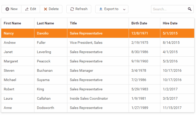
DataGrid & TreeList
Record Reordering (v19.1)
This feature received 69% of the vote in our survey.
We’ll give you the ability to reorder DataGrid rows and change TreeList parent-child node relationships via drag-and-drop.
Excel-Like Editing Mode (v19.1)
We announced this feature in our 2018 Roadmap but it wasn’t ready to ship when v18.2 was released. We have received useful feedback on this feature and are going to ship it this year.
Cross-Component Drag-and-Drop (v19.1 or v19.2)
This feature received 69% of the vote in our survey.
Some business scenarios require that users move items from one collection to another or from one hierarchy to another. We hope to support cross-component item drag-and-drop operations.
Accessibility Enhancements (v19.1 or v19.2)
In v18.2, we improved the DataGrid’s keyboard navigation capabilities with our ‘focused row’ feature. We now want to address remaining accessibility gaps. We will make it possible to navigate to and work with any existing DataGrid and TreeList element (such as grouping, sorting, paging) via the keyboard.
TreeList
New Filtering Modes (v19.1)
This feature received 75% of the vote in our survey.
We’ll hope to extend the filtering capabilities of the TreeList with the following features:
- Enable search only through tree leaves
- Include filtered nodes children into filter results.
Remote Data Paging (v19.2)
This feature received 58% of the vote in our survey.
At present, if you expand a node, the TreeList loads all child nodes and then paginates them locally. We want to give you the option to load nodes individually. This feature will work with both the pager control and through virtual scrolling - Just like our DataGrid.
Scheduler
Adaptivity & UX Enhancements (v19.1)
This feature received 50% of the vote in our survey.
We want to enhance our Scheduler to look and behave better on small screens (mobile devices). You can find some examples of this adaptive behavior in its ASP.NET counterpart here. If you’ve encountered specific usability issues with Scheduler, please share them with us.
Standalone Recurrence Editor (v19.1)
We have a recurrence editor that is a part of the Scheduler appointment form and can’t be used separately. We expect to ship the Recurrence editor as a standalone control in 2019.
Performance - Virtual Scrolling (v19.2 or later)
This feature received 50% of the vote in our survey.
To help improve overall performance and usability, we hope to add a new virtual scrolling mode to our Scheduler control. When enabled, only visible appointments will be rendered.
HTML/Markdown Editor
Multiline Toolbar (v19.1)
At present, Toolbar items are hidden within a dropdown menu on small screens. If the number of items is large (as it is in the HtmlEditor) the menu gets too long and becomes difficult to use. We’ll introduce one more adaptive mode that will create a second horizontal line of toolbar items instead of creating a dropdown menu.
Mentions Support: via @ (v19.1)
‘Mentions’ allow you select users or user groups by typing @ when composing rich text content. It’s widely used in team collaboration tools and project management applications.
Resize of Media Blocks (v19.1)
We’ll give you the ability to resize images and video blocks via the mouse.
Upload Images via Drag-and-Drop & Copy/Paste (v19.1 or v19.2)
You will be able to embed images as base64-formatted content or upload it to a web server via drag-and-drop or copy-paste actions and reference it as a URL.
Tables Support (v19.2)
We’ll give you the ability to insert and edit data tables.
Inline Formatting Toolbar (v19.2 or later)
You’ll be able to reveal an inline formatting toolbar when selecting content that requires formatting.
Data Editors
Additional Action Buttons (v19.1)
This feature received 83% of the vote in our survey.
Extend built-in editor action buttons with custom actions. You can find some examples of this feature here.
Data Form
Dynamic Updates without a Full Re-render (v19.1)
This feature received 82% of the vote in our survey.
We recently added partial update support to several controls. This update can also be applied to the Form control (for those who dynamically update forms and do not want to initiate a full form re-render).
TreeView
Node Reordering (v19.2)
This feature received 69% of the vote in our survey.
Change parent-child relationships of TreeView nodes via drag-and-drop.
Cross-Component Nodes Drag-and-Drop (v19.2)
This feature received 69% of the vote in our survey.
Move a node from one hierarchy to another using drag-and-drop.
New Dropdown Button Control (v19.1)
A button with a built-in dropdown menu. You can find this kind of control in many modern web applications. Please, refer to the Bootstrap implementation for an example.
New Floating Button Control (v19.1)
The concept of a Floating Button began with Material Design guidelines. We’ll support a simple Floating Button and a Floating Button with a pop-up menu.
New Drag-and-Drop Utilities (v19.1 or v19.2)
This feature received 78% of the vote in our survey.
We want to create a drag-and-drop utilities library so you can construct custom drag-and-drop functionality outside of our UI controls. One such usage scenario involves list sorting. We’ll make it extremely easy to implement such functionality.
New Kanban Board Control (v19.2)
This feature received 67% of the vote in our survey.
Kanban Board has become an essential control for task and project management in modern business web applications.
PivotGrid
Remote Data Paging (v19.1 or v19.2)
This feature received 63% of the vote in our survey.
In 2019, we will give you the option to use partial aggregated data loading from a remote server. This new feature will work with both the Pivot Grid’s pager control (horizontal and vertical) and via virtual scrolling.
Data Visualization
Chart Annotations (v19.1)
This feature received 77% of the vote in our survey.
Annotate your charts with custom labels.
Scrollbar as RangeSelector in Charts (v19.2)
This feature received 65% of the vote in our survey.
Enhance a chart scrollbar to show the chart preview with range selection capability. This feature can help visualize long time-based series with zooming/scrolling enabled.
Zooming in Polar Chart (v19.2)
This feature received 31% of the vote in our survey.
Enable zoom for the Polar Chart.
Based on feedback we’ve received to date, customization is crucial to many of you. We are going to dedicate significant resources to address limitations in this regard.
Legend Enhancements (v19.2 and v19.2)
This feature received 27% of the vote in our survey.
We are considering the following legend features:
Expected in v19.1:
- Add legend title
- Custom item order
- Item grouping
Expected in v19.1 or v19.2:
- Add a legend to the Bar Gauge
Expected in v19.2 or later:
- Custom item bullets
- Hide legend items for empty series
- Extract the legend as a standalone control
- Display a legend inside a Pie or Donut
Resolve Label Overlaps (v19.1 and v19.2)
This feature received 26% of the vote in our survey.
In certain usage scenarios, our JavaScript Charting library can properly resolve label overlaps. We want to improve our product so that it can address the following use-cases:
Expected in v19.1:
- Resolve labels overlaps in Funnel Chart.
- Resolve label overlaps in Bar Gauge.
Expected in v19.2 or later:
- Resolve cross-series label overlaps.
- Resolve labels overlaps for constant lines and strips.
Other Chart/Gauge Enhancements (v19.2 and v19.2)
Expected in v19.1:
- Word-wrap within legend items, labels and titles
- Extend available Chart/Gauge events (context menu event, element click or double click)
- Set the custom position of axis (enable quadrants)
- Manage exported chart layout (layout by columns, etc.)
Expected in v19.1 or v19.2:
- Display a tooltip only on point/series hover
- Support custom points, labels, tooltip rendering using templates
- Display custom text inside a Pie or Donut
- Enable z-index for constant lines (to bring them behind or in front of other series)
- Specify the size of a chart pane (for multi-pane charts).
Expected in v19.2 or later:
- Support custom styles of Chart/Gauge elements (gradients, patterns, background images, etc.)
- Display negative values for logarithmic scales
- Use multiple colors for a single series (based on value/argument)
- Display total value labels for stacked series
- Animate zoom-in and zoom-out transition.
Data Export
Export to Excel Customization Enhancements (v19.2 and v19.2)
Expected in v19.1:
Expected in v19.2:
- Multi-sheet export
- Export summaries as functions
Expected in v19.2 or later:
Export to PDF (v19.2 or later)
This feature received 48% of the vote in our survey.
We plan to offer a PDF export option in our DataGrid and Pivot Grid.
Data Layer
OData v4 Support (v19.1)
This feature received 58% of the vote in our survey.
OData v4 support enables remote grouping and summary operations within DevExpress ASP.NET Core - improving performance when using large datasets.
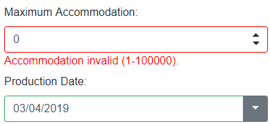
Data Validation (v19.2)
Asynchronous Validation
When a user submits a data form, you may need to execute asynchronous remote validation. For instance, you may want to check whether a user already exists in the database during registration. We’ll provide a straight-forward API for such usage scenarios.
Performance Enhancements
Virtual Scrolling and Lazy Loading Everywhere (v19.2)
This feature received 70% of the vote in our survey.
The vast majority of DevExpress users work with large datasets (from thousands to millions of records). These datasets are rendered as lists within our controls. Our DataGrid supports virtual scrolling with lazy data loading. We’d like to make this feature available everywhere. This feature can be applied to the following list of controls:
- TreeView
- Scheduler
- Lists
- DropDowns & Lookups
- Header filters in DataGrid, TreeList, PivotGrid
- Column choosers in DataGrid, TreeList, PivotGrid
Themes
Element and Font Size Customization (v19.1)
This feature received 78% of the vote in our survey.
Our users find the ‘compact’ themes very useful when generating a highly dense, data-intensive UI. We will introduce a compact Material UI theme and give you the ability to customize theme element and font size.
Chart Themes (v19.2)
This feature received 70% of the vote in our survey.
We will update our Charting library so you can customize its appearance via the Theme Builder.
Reporting
New Web Report Designer Features (v19.1)
- Combine Multiple Reports into One
We will give you the ability to combine multiple reports within the Report Designer, allow you to define print order and print all as a single document. This will address limitations associated with report merging (which is only available at runtime). - Create Hierarchical Data Reports
We will give you the ability to create hierarchical data reports (tree structures) and define the offset of a given band’s content based on nesting level. - Create and Store Band Templates using the Report Gallery
This will allow your customers to share gallery content and to generate reports with unified headers or footers. - Bind a Report to JSON Data using the Data Source Wizard
You’ll be able to use JsonDataSource and provide basic authentication settings, custom header values and custom query parameters. - Create a Vertical Report using the Report Wizard
We will add vertical reports to the Report Wizard. - Customize the Report and Data Source Wizard
We will provide the ability to customize the Report and Data Source Wizard (insert new pages and customize the appearance of existing reports). - Bind a Report to ObjectDataSource Using the Data Source Wizard
This feature received 28% of the vote in our survey.
You’ll be able to use this data source type in the Data Source Wizard to bind a report to a collection of business objects.
New Web Report Designer Features (v19.2)
- Re-order Detail Reports in Report Explorer
This feature received 31% of the vote in our survey.
You’ll be able to move an entire detail report if it was created at the wrong report hierarchy level. - Embed PDF Documents into a Report Document
This feature received 44% of the vote in our survey.
You’ll be able to insert a PDF file into a report and define its content boundaries within a document. - Move Bands to a ‘Background’ Layer
This feature received 31% of the vote in our survey.
You’ll be able to combine multiple bands so that content is rendered in a more compact manner. See example here. - Display Empty Table Rows after Existing Data
This feature received 21% of the vote in our survey.
You’ll be able to repeat empty rows until the bottom of the page is reached (to conform to a report’s structure). For more information on this feature, please refer to the following support tickets: T602604, T666620. - Edit XRRichText Content
This feature received 50% of the vote in our survey.
You’ll be able to use an in-place editor to edit RTF content.
Report Designer: Data Federation (v19.1 and v19.2)
This feature received 55% of the vote in our survey.
You’ll be able to define the relationship between different data source tables, queries, sheets and object lists.
Web Document Viewer and Web Report Designer: Localization (v19.1)
This feature received 50% of the vote in our survey.
You’ll be able to translate Web Document Viewer and Web Report Designer user interface elements using the DevExpress Localization Service and download a JSON file with translations for your web page.
XRPivotGrid: Advanced Cross-Tab Reports (v19.1)
We will provide a new way to create cross-tab reports using an enhanced version of XRPivotGrid report control. This will allow you to use expression bindings to calculate data and define the appearance of each visual element within a cross-tab report without writing code.
XRRichText Control Support (v19.1)
We will port our XRRichText report control to .NET Core platform so you can display RTF / HTML content within a report.
JsonDataSource: Authentication support (v19.1)
You’ll be able to provide basic authentication settings, custom header values and custom query parameters.
XRControl Enhancements (v19.1)
- XRLabel: HTML-Inspired Text Formatting
We will allow you to display HTML content in XRLabel. We expect to provide support for the subset of pseudo-HTML tags currently supported by our WinForms controls. - XRCheckBox: SVG Glyphs
We will allow you to change the default glyph associated with XRCheckBox using a pre-defined SVG glyph list.
TypeScript Definitions (v19.1)
We will provide *.d.ts files required for TypeScript, so you can benefit from code completion in your development environment as a result.
PDF Export: Visual Signatures (v19.2)
You’ll be able to define visual signatures displayed in an exported PDF file using a new report control.
Printing Markdown Content (v19.2)
This feature received 57% of the vote in our survey.
You’ll be able to pass Markdown markup to a special report control. This control will use the HTML conversion to display Markdown content in a printed or exported document.
Rounded Corners (v19.2)
This feature received 32% of the vote in our survey.
You’ll be able to define corner radius for the borders of the XRLabel, XRPanel, and XRTable controls.
Report Parameter Enhancements (v19.2)
- Date Range Parameter
This feature received 26% of the vote in our survey.
You’ll be able to create a date range parameter and select its value at runtime using a single editor in the parameter panel. - Date and Time Parameters
This feature received 21% of the vote in our survey.
You’ll be able to create a date or time parameter. - Parameter Editor Grouping
This feature received 20% of the vote in our survey.
You’ll be able to logically group multiple report parameters in the parameter panel (display editors in a Group Box). - Visibility of Parameter Editors
This feature received 19% of the vote in our survey.
You’ll be able to hide a parameter editor based on the value of a different parameter.
Translate Report Documents to Different Languages (v19.2)
This feature received 45% of the vote in our survey.
You’ll be able to provide different translations for report controls.
Spreadsheet & Rich Text Editor
In v18.2, we announced CTPs of both our Spreadsheet and Rich Text Editor controls for ASP.NET Core. We will officially release these products in 2019 with the following new features:
Rich Text Editor (v19.1 and v19.2)
- Mail merge
- Spell checker
- Document protection
- RTF format support
- Printing
- Export to PDF
Spreadsheet (v19.1 and v19.2)
- Dialogs
- Formula bar
- Context menus
- Formula auto-complete
- Read/View modes
- Worksheet protection API
- Global custom functions
- Custom in-place editor API
- Printing
- Export to PDF
New File Manager Control (v19.2)
We plan to add a new Explorer-like component to manage files and folders. These will ship with a client-side responsive UI and REST API for file operations. We will include a set of helpers to connect to server files system and cloud services (Azure, Amazon, Google Drive, etc).
Office File API for .NET Core (v19.1 and v19.2)
This feature received 45% of the vote in our survey.
.NET Core Support will be offered for our Word Processing, Spreadsheet and PDF Document API.
The v19.1 release will include the following restrictions: export to PDF will be partially supported and image generation of PDF documents will not be implemented for Linux.
In v19.2, we will add embedded font support for PDF documents and RTL support for our Word Processing Document API on Linux.
Visual Studio Tools
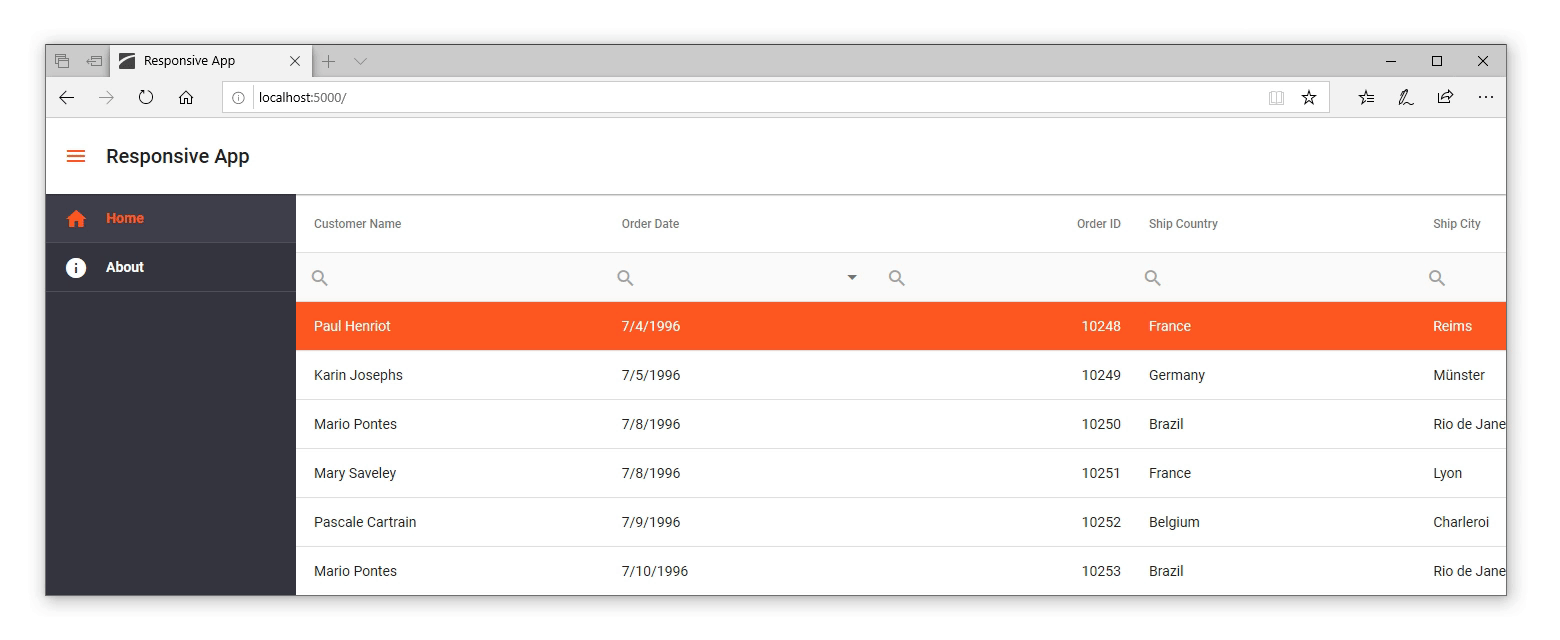
Visual Studio Project Templates with Responsive App Layouts (v19.1)
This feature received 70% of the vote in our survey.
In our v18.2 release cycle, we introduced a Drawer component and a set of responsive application layouts for Angular. We are going to replicate these layouts for ASP.NET Core and integrate them into new Visual Studio project templates.
CRUD Forms Generation in Visual Studio Scaffolder (v19.2)
This feature received 65% of the vote in our survey.
We recently introduced the scaffolding necessary to enable editing for CRUD list views (based on our DataGrid and TreeList controls). If you need to edit data objects with numerous properties, you may want to use a separate data Form instead of inline editing within the list view. We will extend the capabilities of our design time tools with a new Data Form Scaffolder.
XPO support in CRUD Web API Scaffolder in Visual Studio (v19.2)
This feature received 57% of the vote in our survey.
Our existing CRUD API scaffolder uses Entity Framework data models to generate API controllers. We hope to support XPO (eXpress Persistent Objects) as an ORM data model source in 2019.
ASP.NET Core 3 Support (v19.2)
A new major version of ASP.NET Core will be released in 2019. We will make certain that all our components, APIs, and Visual Studio tools are compatible with the updated framework and SDK.
As always, we welcome your feedback. Feel free to leave a comment and let us know what you think of our 2019 ASP.NET Core Roadmap.
The information contained within this blog post details our current/projected development plans. Please note that this information is being shared for INFORMATIONAL PURPOSES ONLY and does not represent a binding commitment on the part of Developer Express Inc. This roadmap and the features/products listed within it are subject to change. You should not rely on or use this information to help make a purchase decision about Developer Express Inc products.
![]()
![]()